Overview
Diving into the world of UI and exploring Spatial Design turned out to be way more fun and exciting than I thought. When Apple shared news about their new gadget, Apple Vision Pro, I instantly knew it would change how we experience VR/AR. That's when I got into this cool side project, playing around with Spatial UI.
Since I'm a regular user of Ubuntu, one day it hit me: what if Ubuntu could work on Apple Vision Pro with Spatial UI? So, I decided to make it happen. I'll be explaining the steps of my design process. It's a blend of learning and doing, turning an idea into a reality!
Setting Expectations
My goal with this project was to practice my visual design, interaction design and prototyping skills while also learning Spatial UI design.
- Personal Project: This is a personal project to develop and improve my skills. This project holds no specific metrics or outcomes aside from contributing to my personal growth.
- Practicing Visual & Interaction Design: I focused on high visual polish, consistency and a design language for this project.
- Trying new things: A key motivation behind this project was the exploration of new concepts. My goal was to getting a basic understanding of building Spatial UI experiences.
Why Spatial UI and Ubuntu?
Apple's approach in Spatial UI is driven by a commitment to creating immersive, user-friendly experiences. The emphasis on simple navigation, clear visuals, and dynamic adaptability aims to enhance user engagement in AR/VR environments. This commitment to user-centric design and innovation sets the tone for Spatial UI.
Translating this to Ubuntu involves understanding and incorporating similar principles. Users should feel familiar while using this version of spatial Ubuntu. I kept my focus on creating a seamless, immersive experience for users. Elements such as clear navigation, spatial awareness, and dynamic adaptation to the user's environment become key considerations. While maintaining Ubuntu's identity, adopting Spatial UI principles can contribute to a more engaging and user-friendly interface.
The Challenges I Faced
-
Adapting to Spatial UI: I have used desktops since I first learned about computers. Making Ubuntu follow Spatial UI principles meant changing it from the usual desktop style to a whole immersive setup. But, I made sure not to sacrifice usability for giving an OS a new look.
-
Maintaining Consistency: Even though Apple gave rules on how to design in Spatial UI, this project was different and special. Ubuntu isn't like traditional apps on MacOS or VisionOS, so I had to make my own custom components that followed the rules of Spatial UI.
-
Complying to Style Guide: Apple suggests using as many of its system components as possible, so I chose Apple’s SF Pro Display instead of Ubuntu's font for the main typeface. When it comes to colors, Apple recommends using white text and icons as much as possible for better visibility and user experience. This means I had to stick to these guidelines and couldn't use custom fonts or colors where I might have wanted to.
-
Balancing Aesthetics and Functionality: Even though this is just a concept, making the interface look good while keeping it practical was like walking a tightrope. There aren't many examples online because Apple hasn't released the product yet.
-
User Learning Curve: I had to create the new Ubuntu interface in a way that feels familiar to users, like something they've used before. Since AR/VR is still new for many people, making things similar to what they already know helps reduce the learning curve.
-
Designing On a New Material: Spatial UI's essence lies in a glass material. While I've played with the glassmorphism effect in my projects, this was a step beyond. I needed to handle colors and opacities carefully to enhance, not spoil, the Spatial UI experience.
Ideas and Process
Before jumping into creating cool visuals, I started by learning a bunch of stuff. I read through Apple's VisionOS guidelines, watched their keynotes and tutorials, checked out what others have done, and took a good look at how Ubuntu's interface looks right now.
Here were my main goals:
-
Craft an Original Experience: I wanted to create something not just good-looking but also user-friendly and engaging.
-
Give Ubuntu an Alternate Look: I aimed to use Spatial design principles to make Ubuntu's current look even better.
-
Imagine Linux in Virtual Reality: I dreamt up how Linux would work on those futuristic AR/VR devices.
Inspiration
I use Ubuntu for my work, so I know how it looks. To start my project, I looked closely at how Ubuntu's interface currently appears. I also grabbed some screenshots from Apple's keynotes to get ideas for VisionOS. This collection served as my moodboard, providing inspiration as I progressed through the design process.
Sketching
I utilized Excalidraw to create my initial sketches. These low-fidelity wireframes played a crucial role in giving me a preliminary idea of the design's appearance. Opting for Ubuntu in Spatial UI presented a unique challenge, as it involved developing a design for an operating system (Ubuntu) within another operating system (VisionOS). This posed an exciting challenge for me.
When sketching, I focused on key screens that users typically engage with while using Ubuntu, such as the Home screen, Settings screen, Software App, and Terminal.
Adhering to the spatial design principles, I ensured that vital information was centered for comfortable viewing. Windows were designed to be highly flexible in size, with their orientation and dimensions adapting to the content.
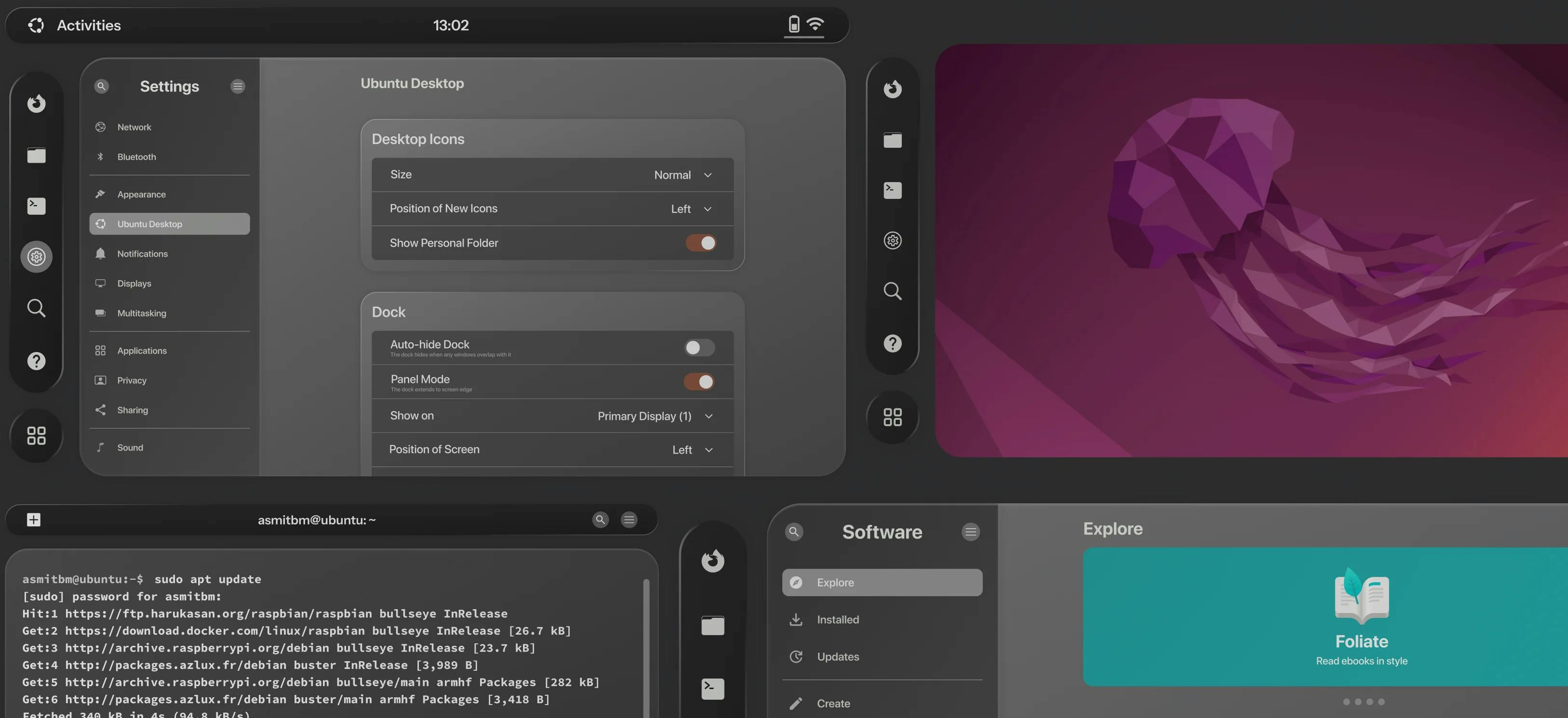
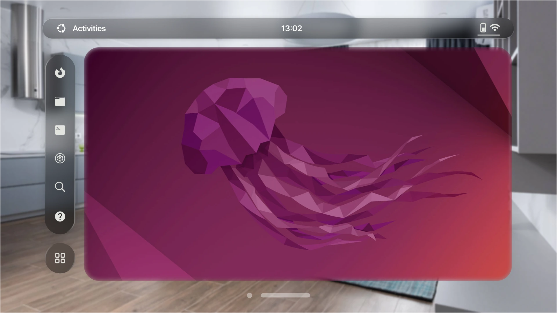
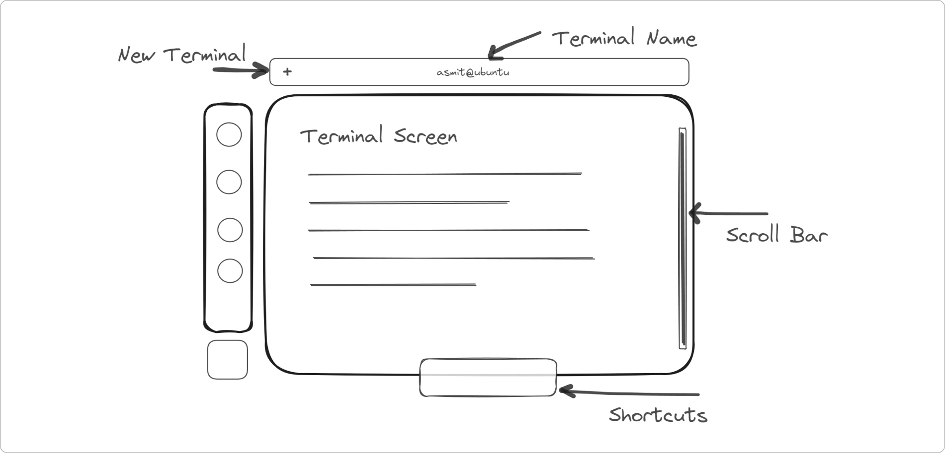
Home Screen:
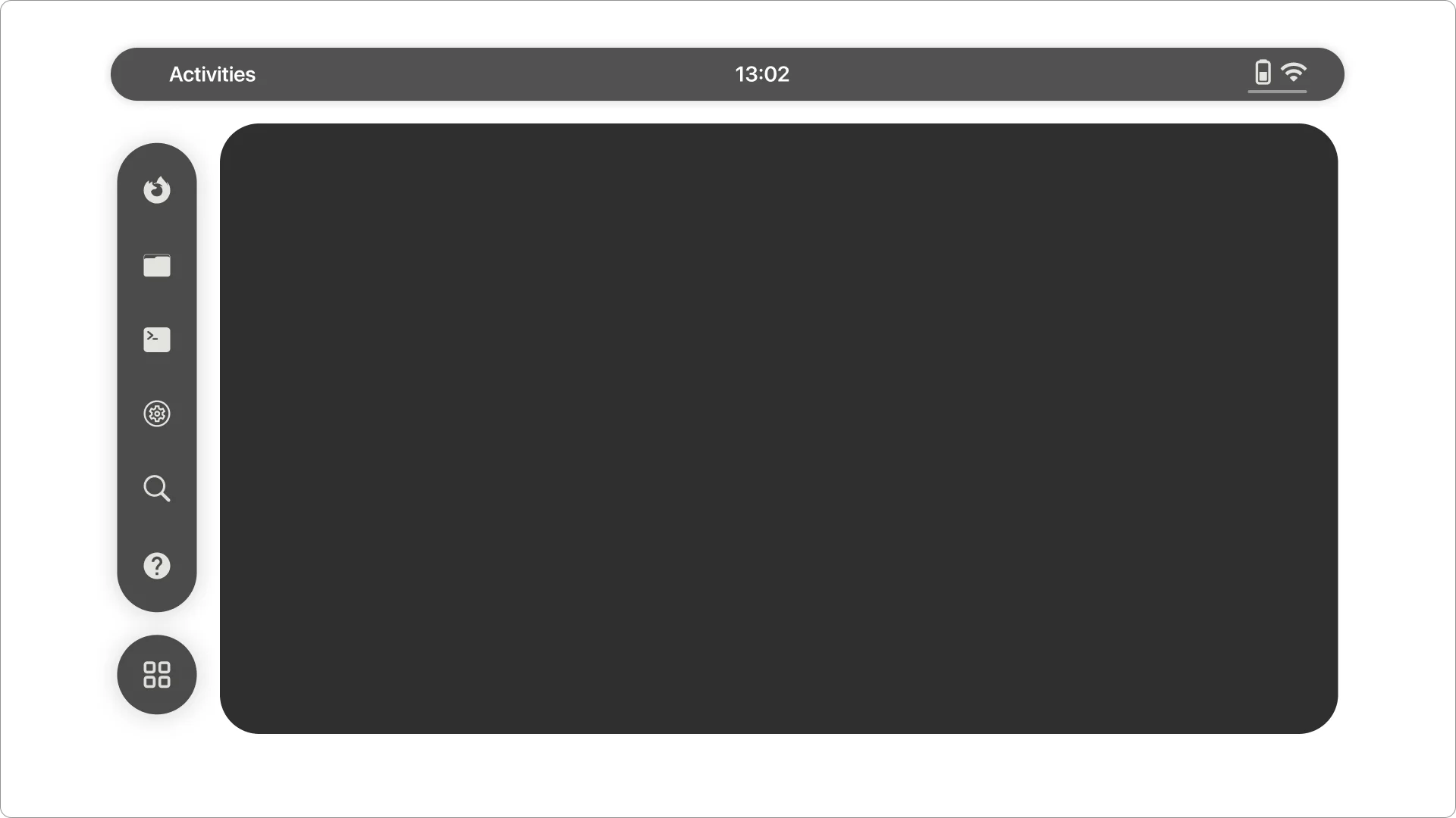
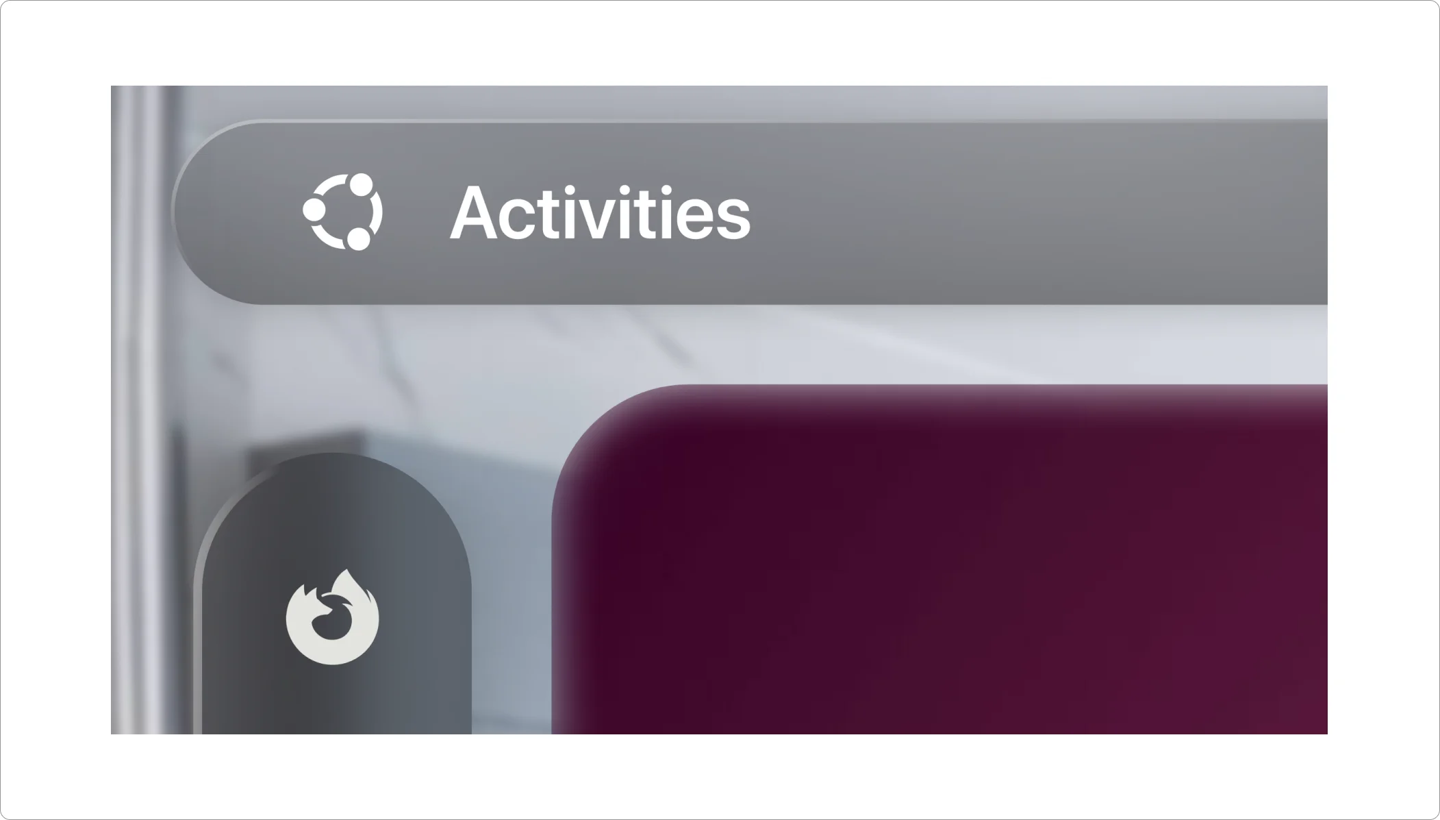
I began with a basic home screen at the center. I split the home screen into three parts: the main wallpaper screen for all the content, the top panel displaying the current time, activities tab, and a shortcut to quick settings, and the vertical navigation bar containing apps.
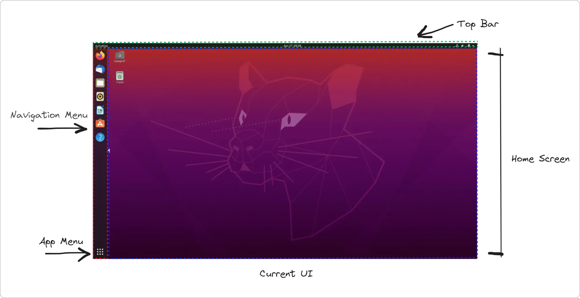
Notice how I dissected each section into its own component, giving the new Spatial UI a well-organized and structured appearance.
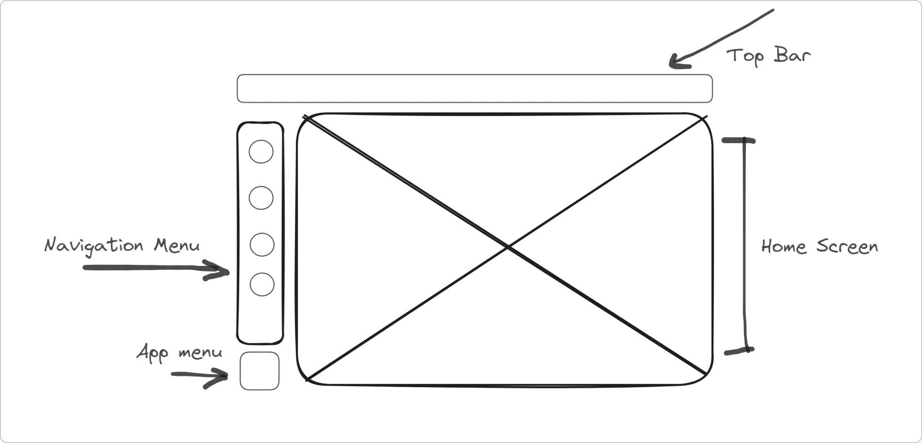
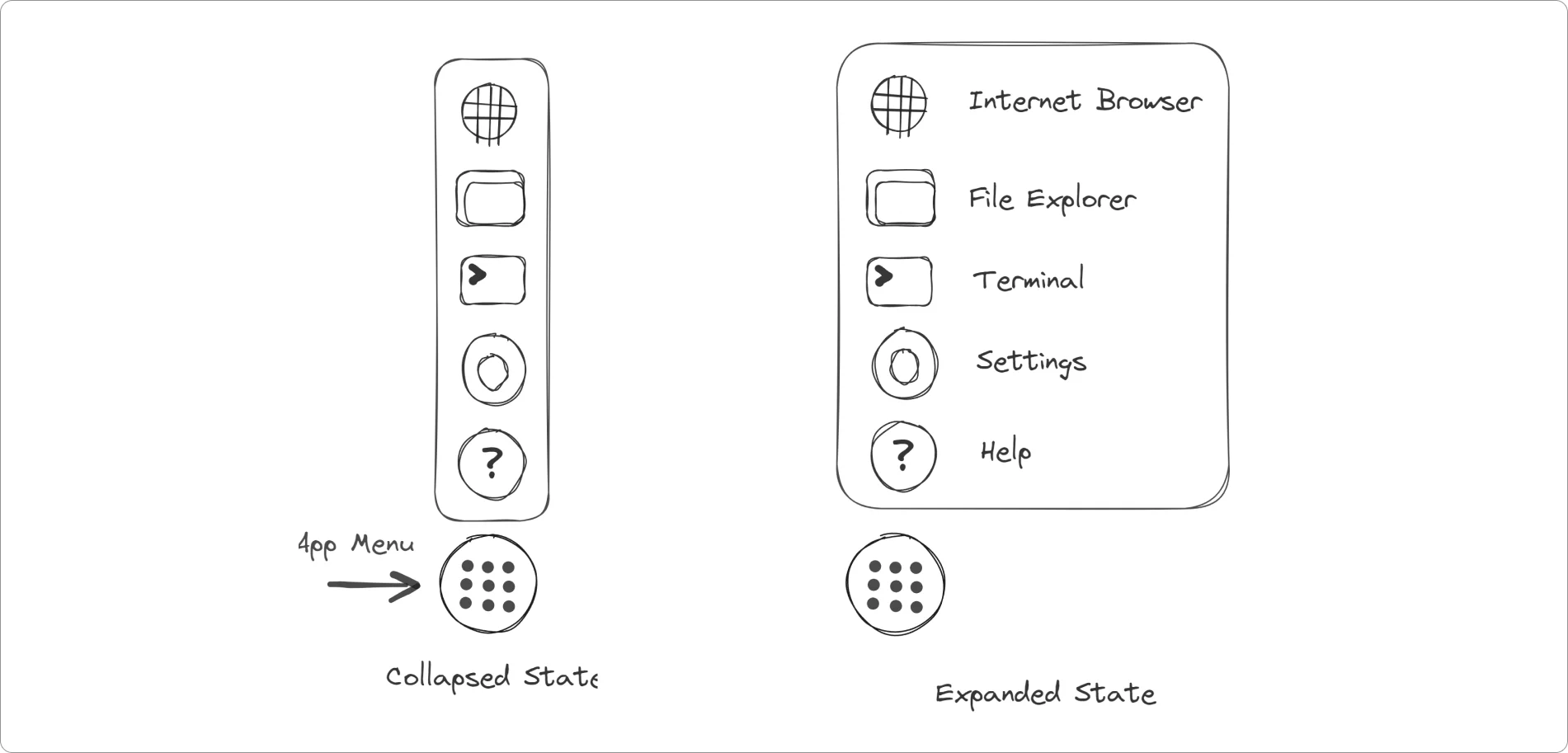
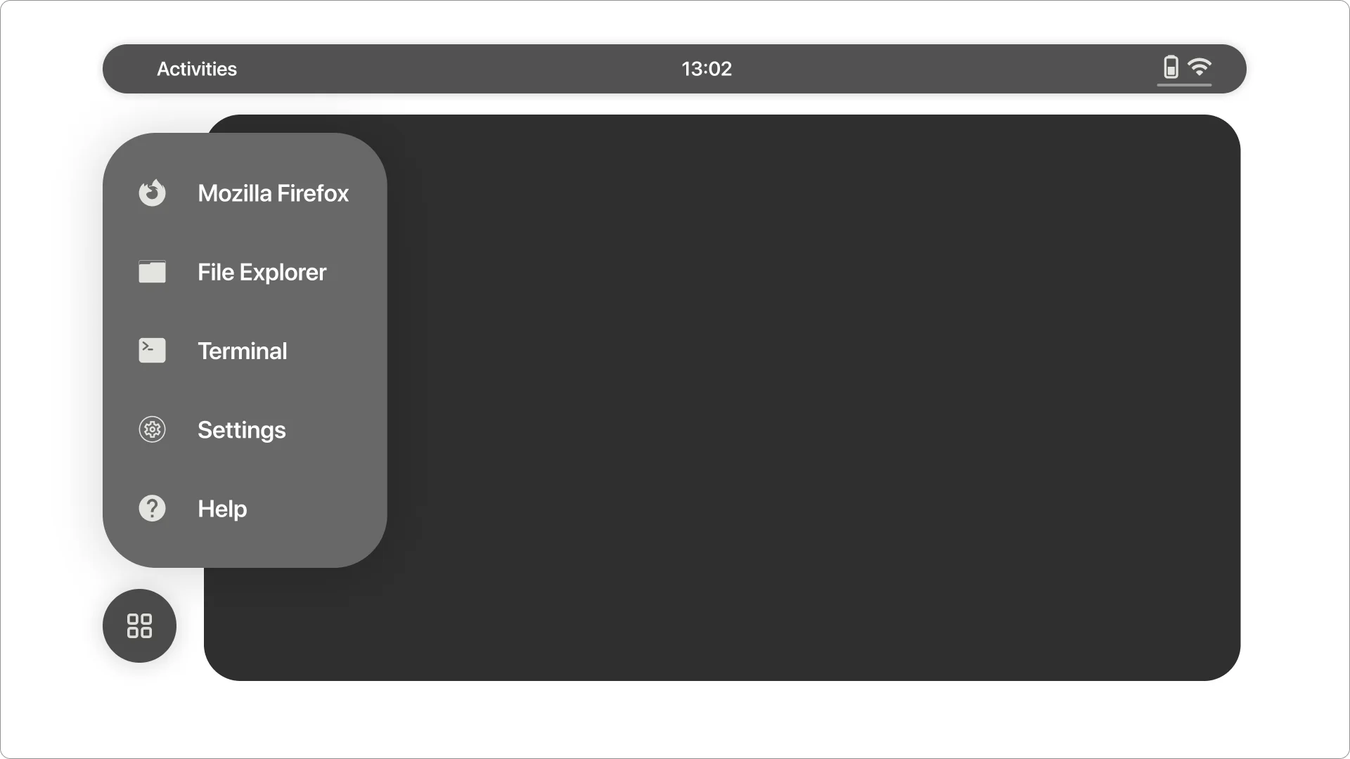
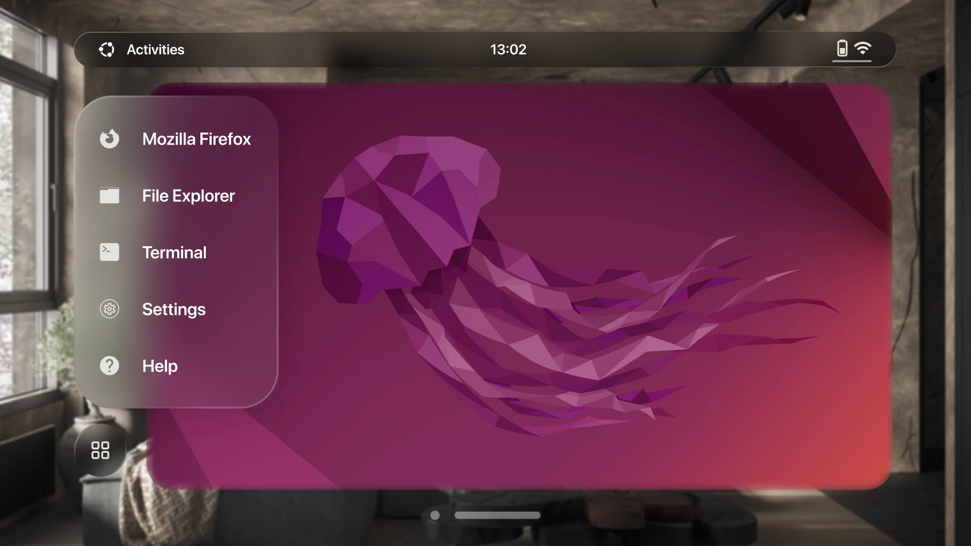
App Menu Navigation Bar:
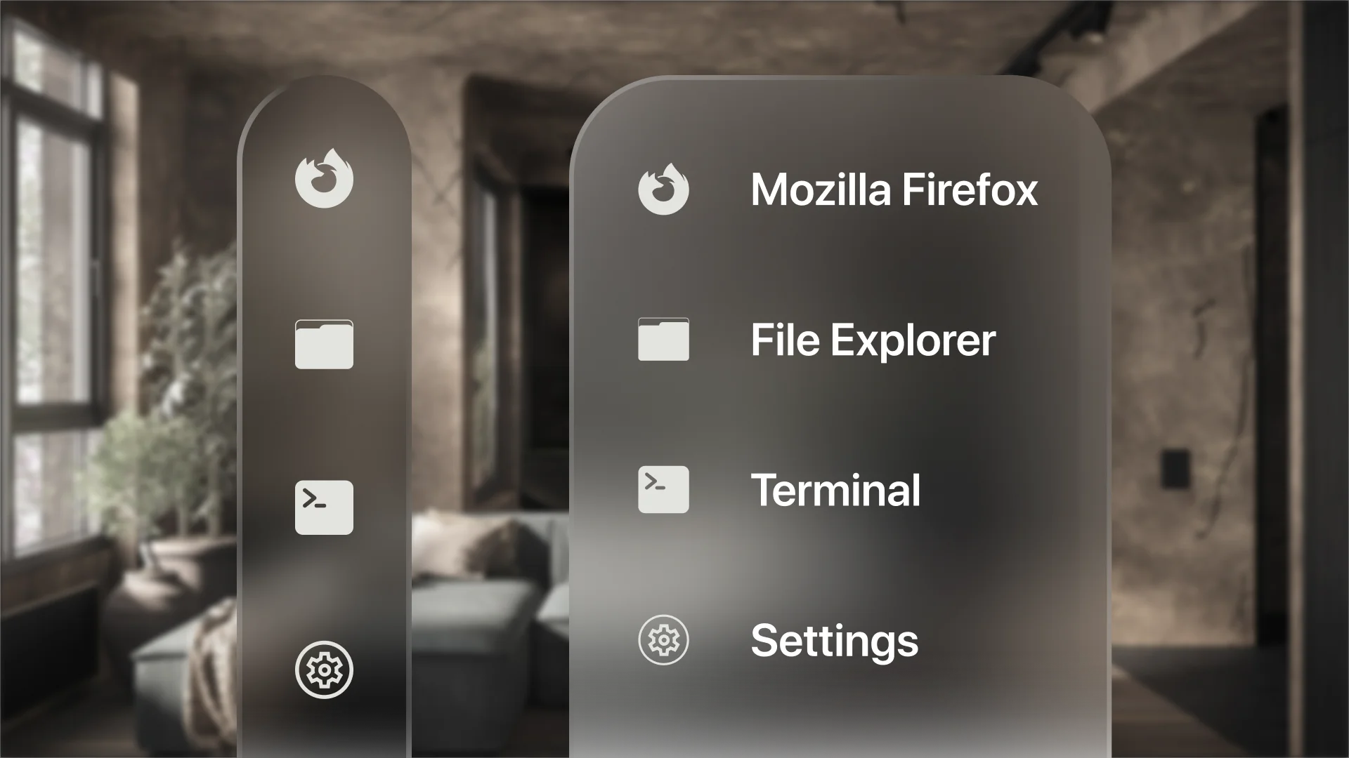
The current design of the vertical navigation bar includes a collapsed menu where the app menu is separate from the main apps. Therefore, I opted to exclude it from the main app menu and designated a dedicated space for the app menu.
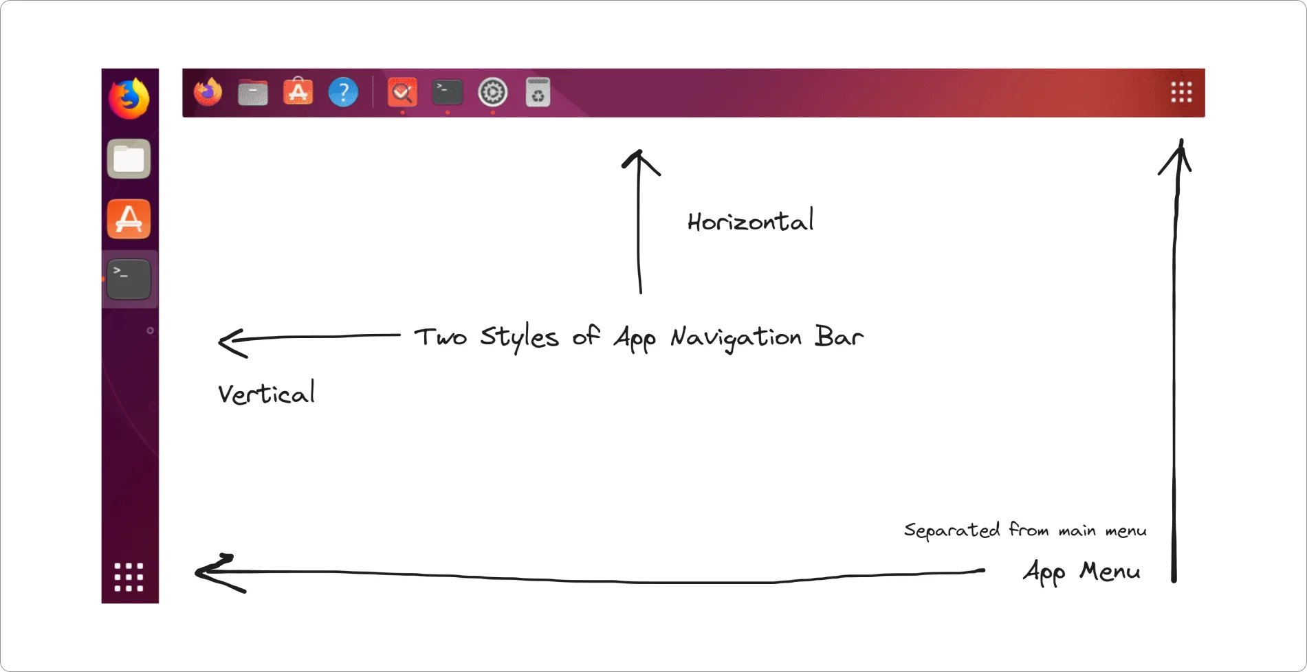
Next, I outlined a vertical navigation bar for the main navigation, featuring various icons to facilitate seamless navigation for users on this spatial UI platform. The view can be collapsed or expanded based on the user's input.
Top Bar:
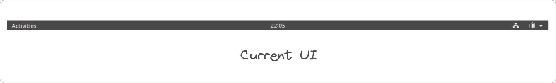
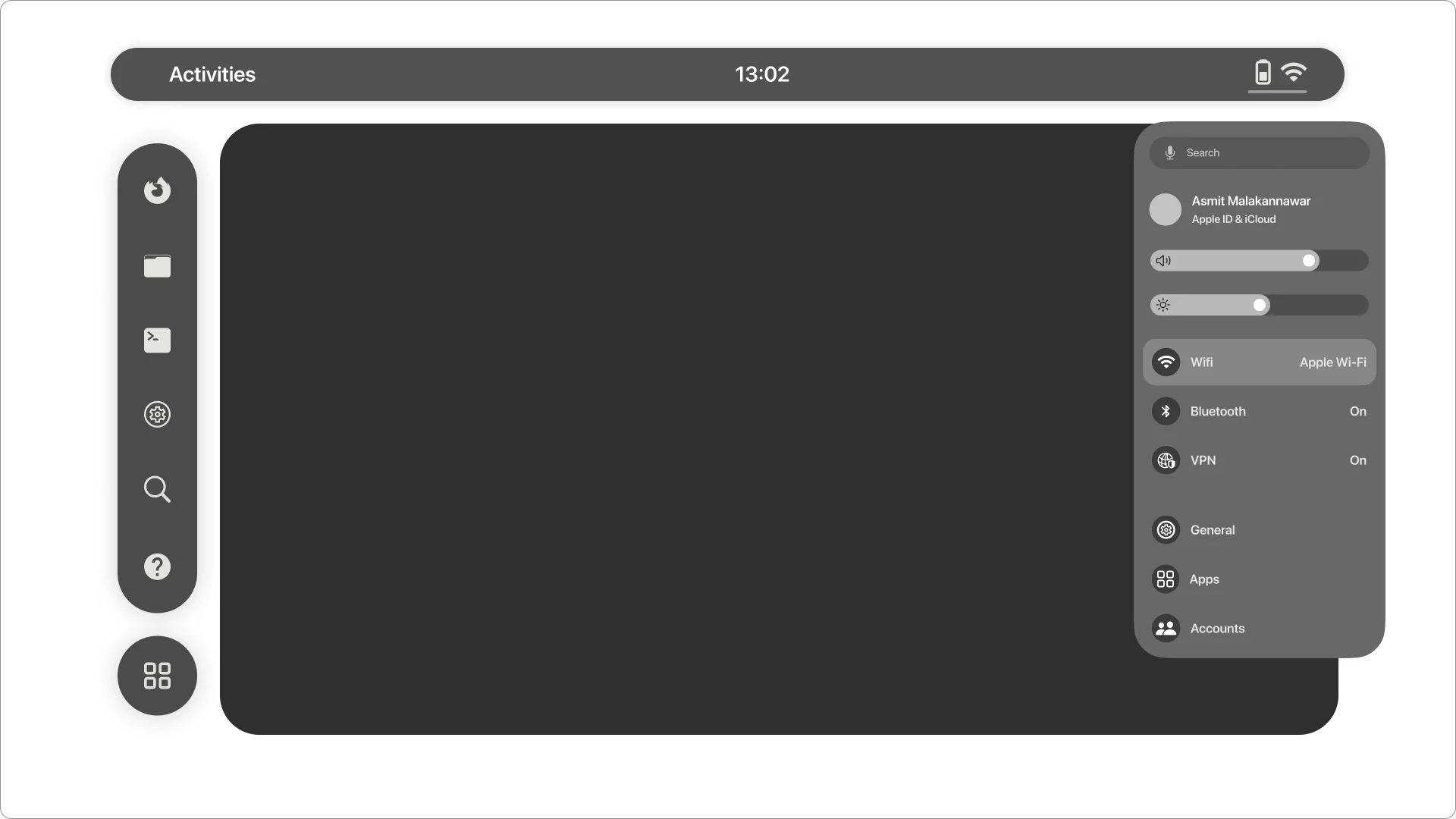
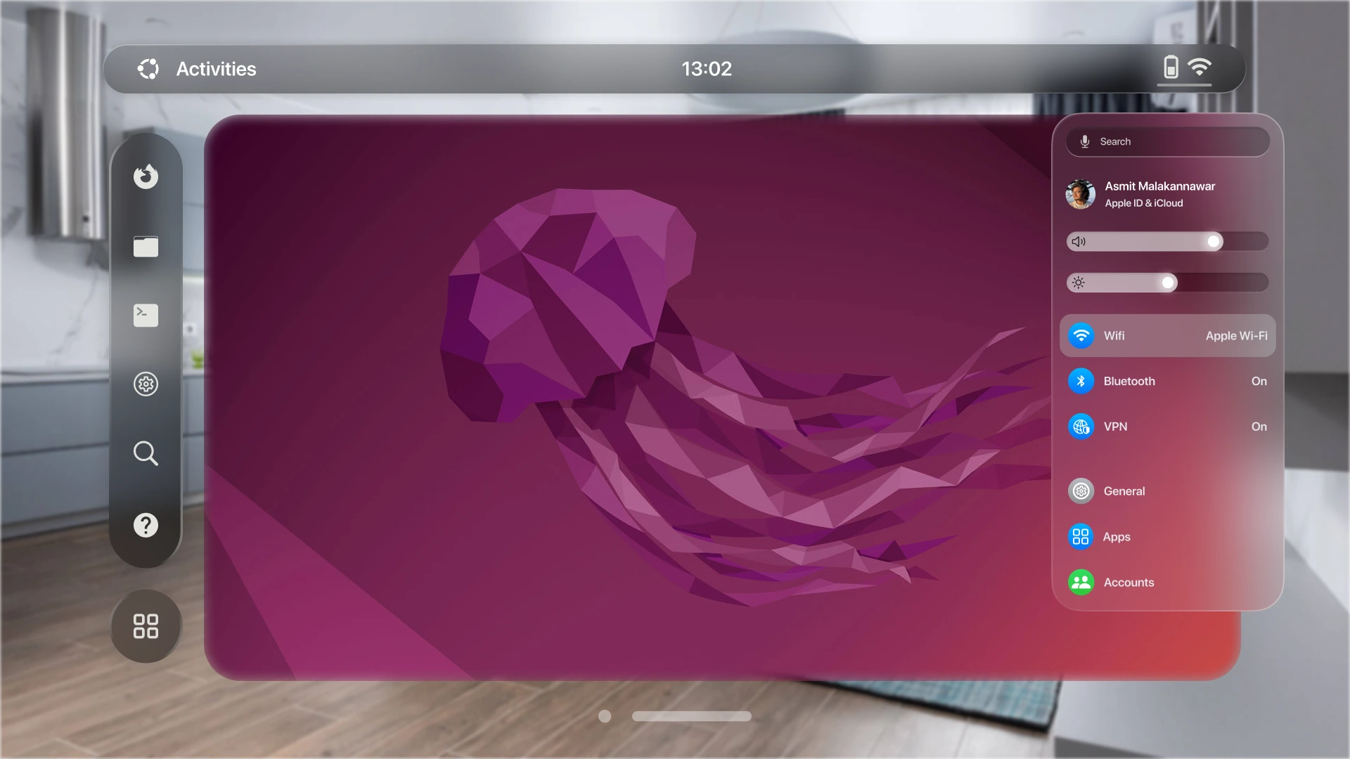
Following that, I drew the top bar, comprising three elements: Activities, the current time, and battery and WiFi status. It also included a small bar for accessing quick settings.
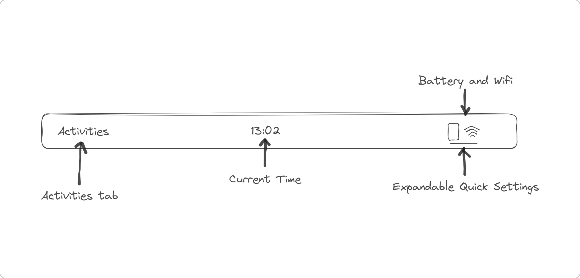
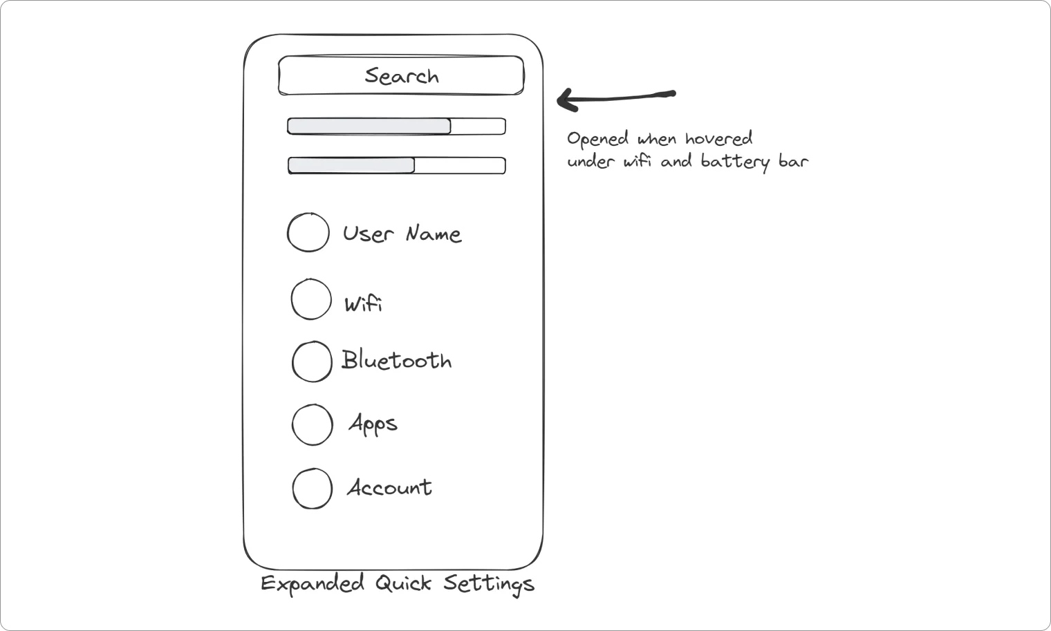
Quick Settings:
The quick settings of current Ubuntu UI had options like volume control, brightness control, wifi, bluetooth, battery level, settings, lock/unlock and power off. While these options are sufficient for desktop version of Ubuntu, for Spatial version I had to include some different options.
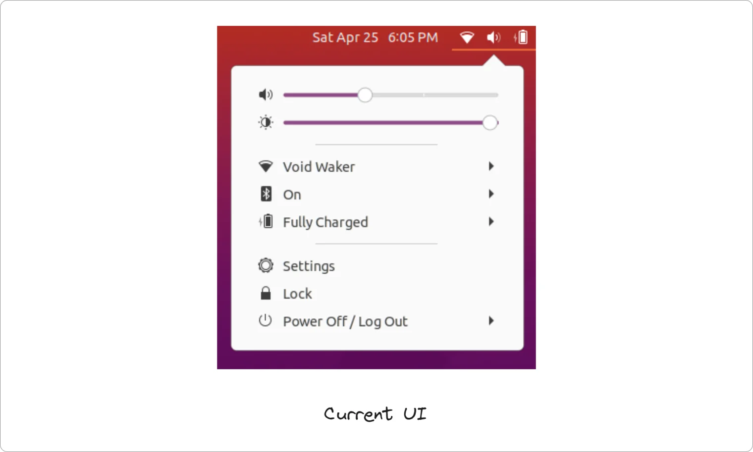
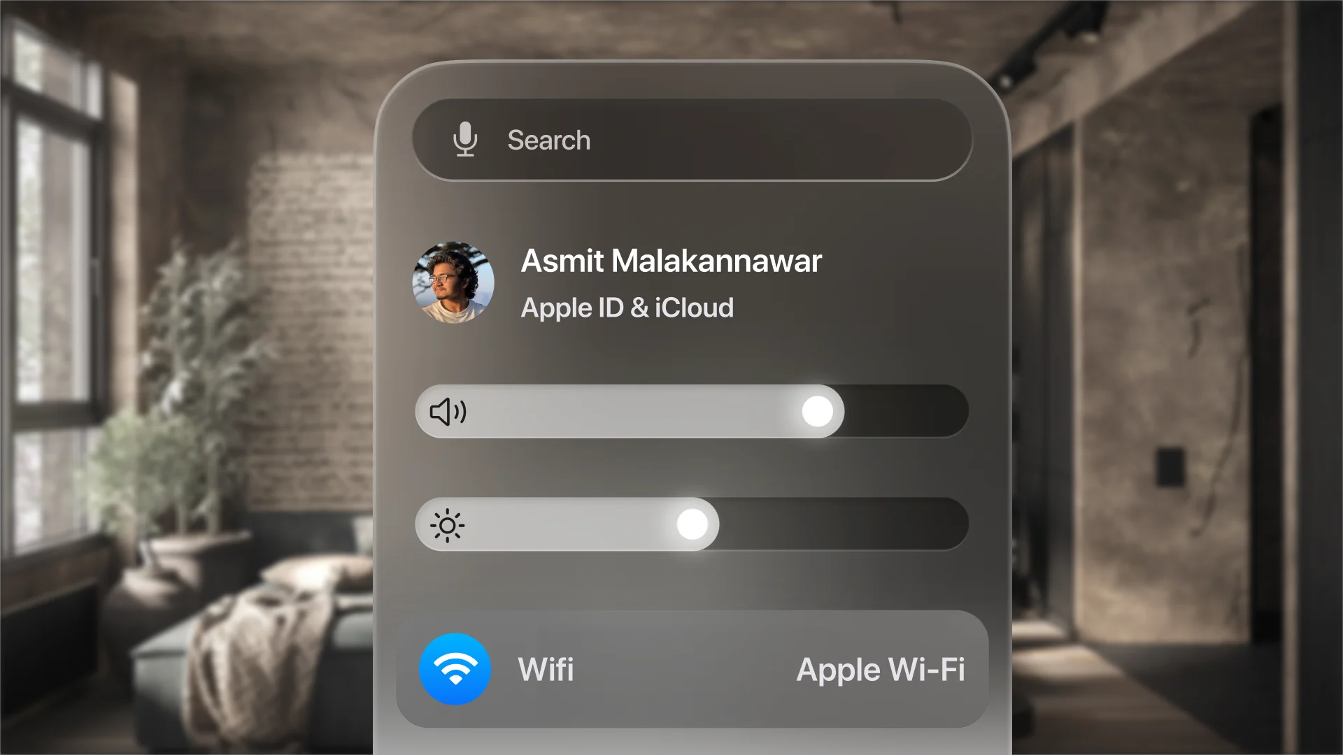
The UI for quick settings looks familiar to what Ubuntu has to offer. The quick settings box opens when users hover over the tiny bar beneath the battery percentage level. Within this box, users can access settings such as WiFi, Bluetooth, VPN, Apps, and more. Additionally, I included a logged-in account indicator, similar to MacOS, to show which user is currently using the device.
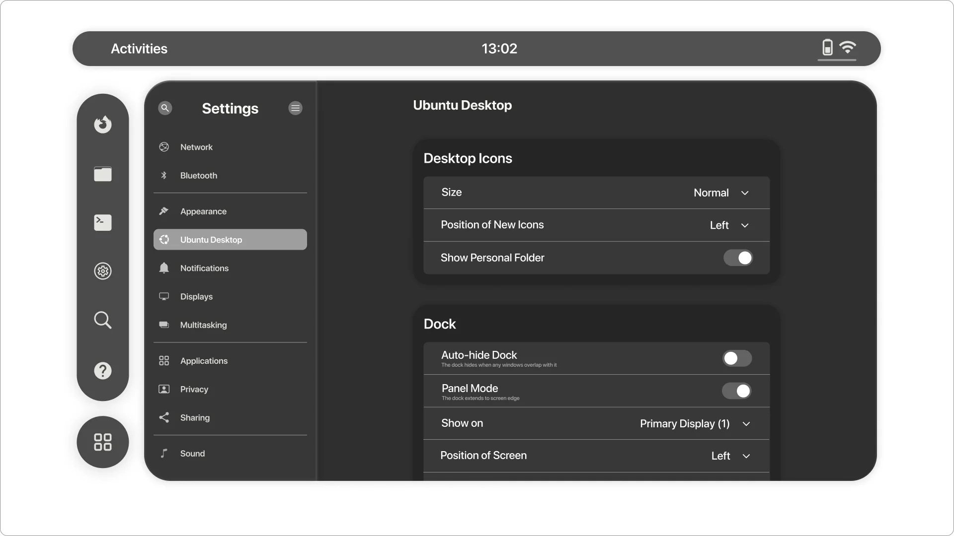
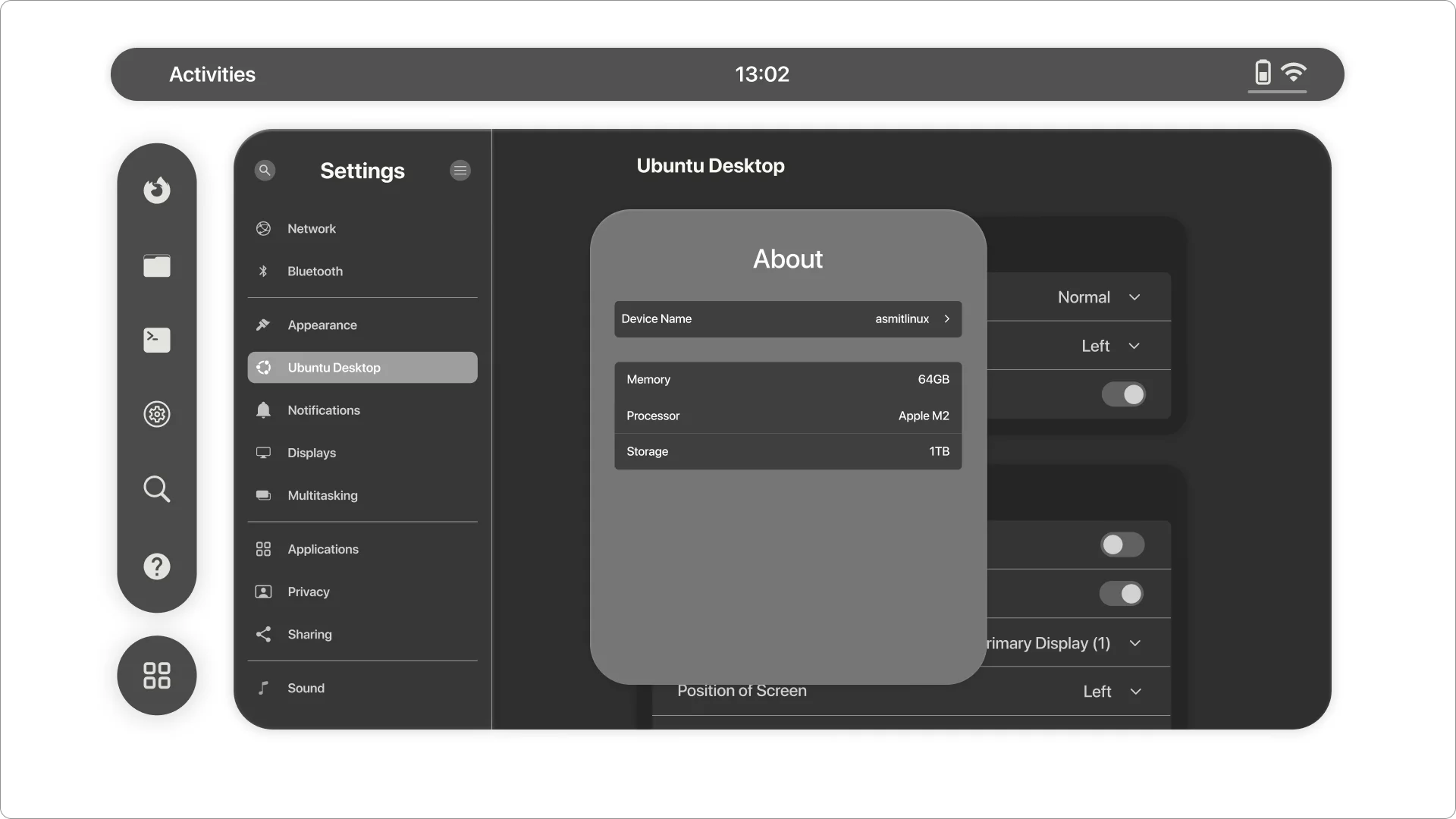
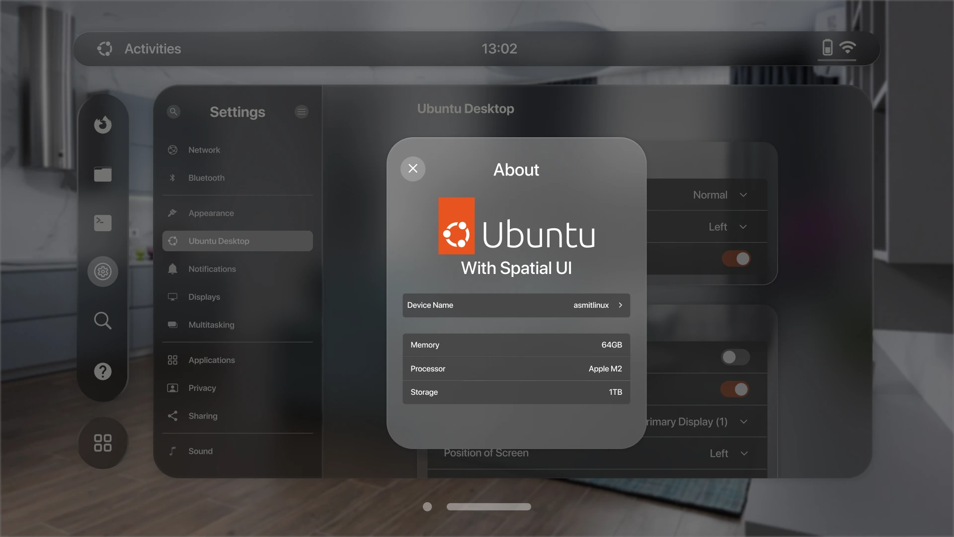
Settings Screen:
Next, I sketched the settings screen, incorporating all the fundamental options found in the Ubuntu UI.
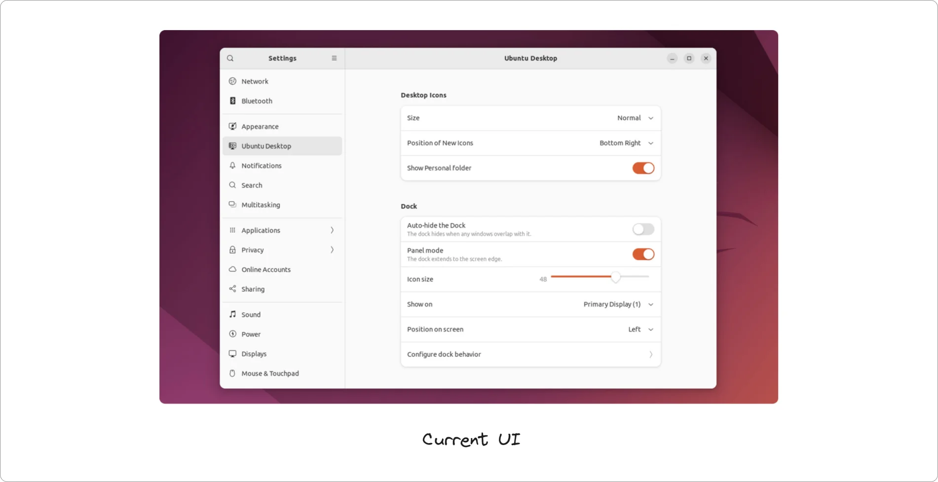
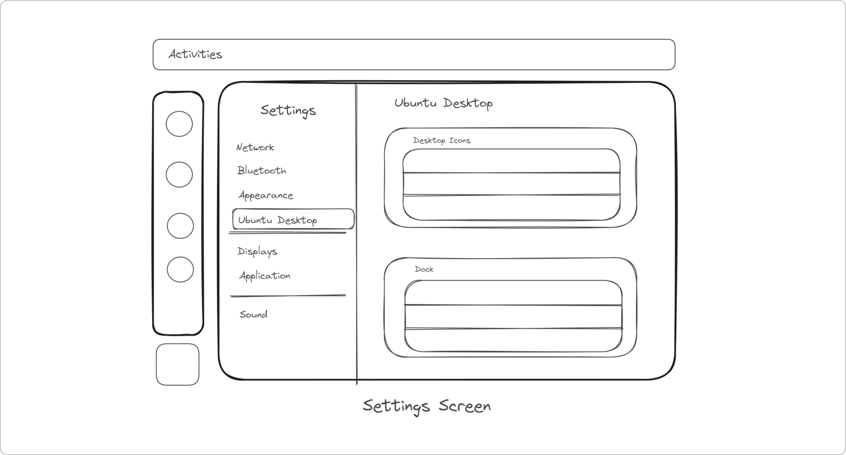
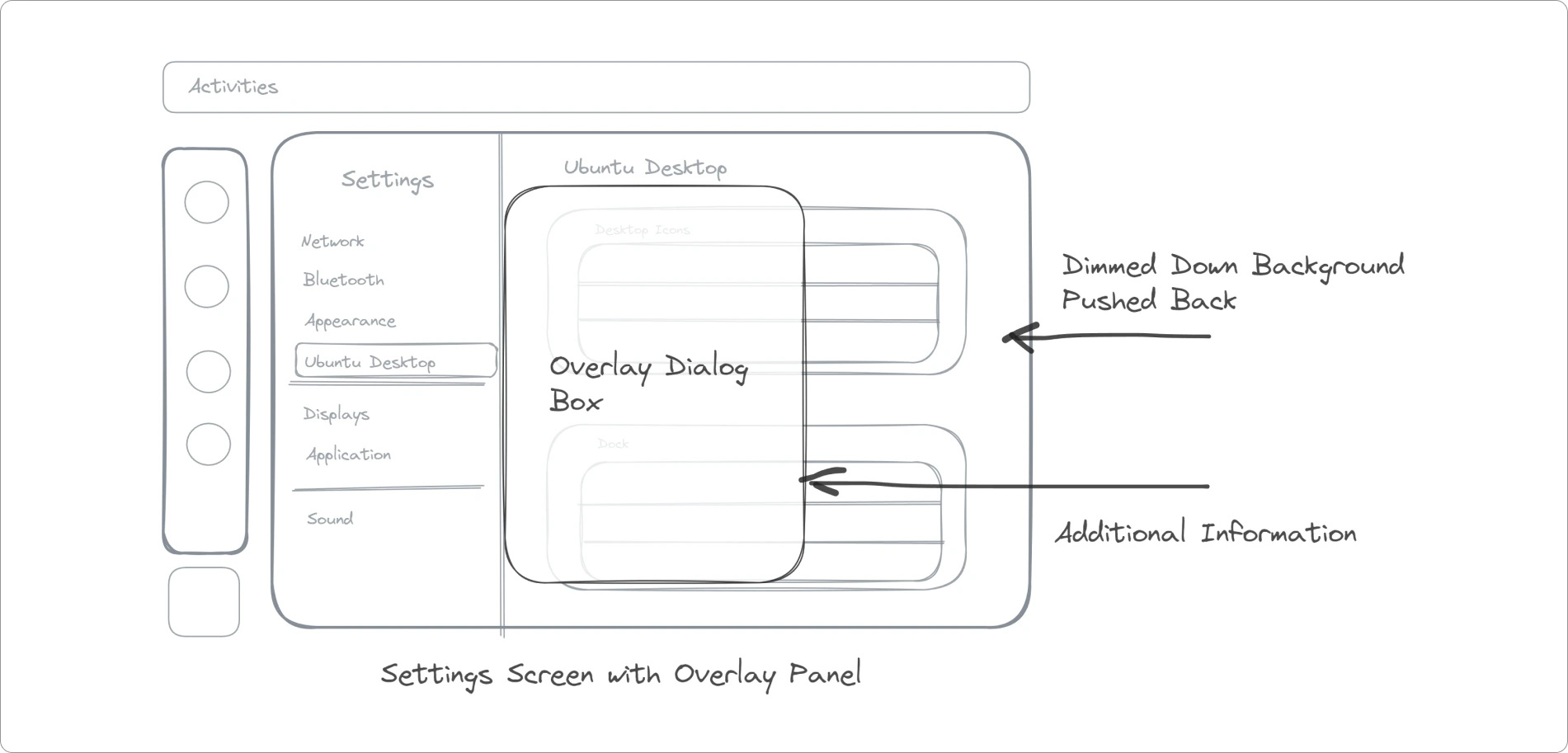
Additionally, I introduced an overlay box, referred to as Sheets in Spatial UI. Sheets function as modal views, positioned at the center of the app. These modals share the same Z position as the parent window, causing the parent window to recede and dim. This design choice enhances the user experience by focusing attention and preventing interaction with the parent view until the sheet is dismissed.
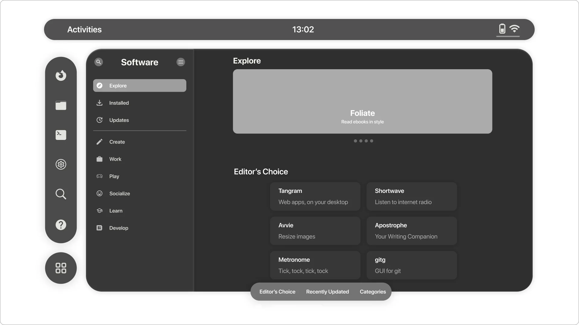
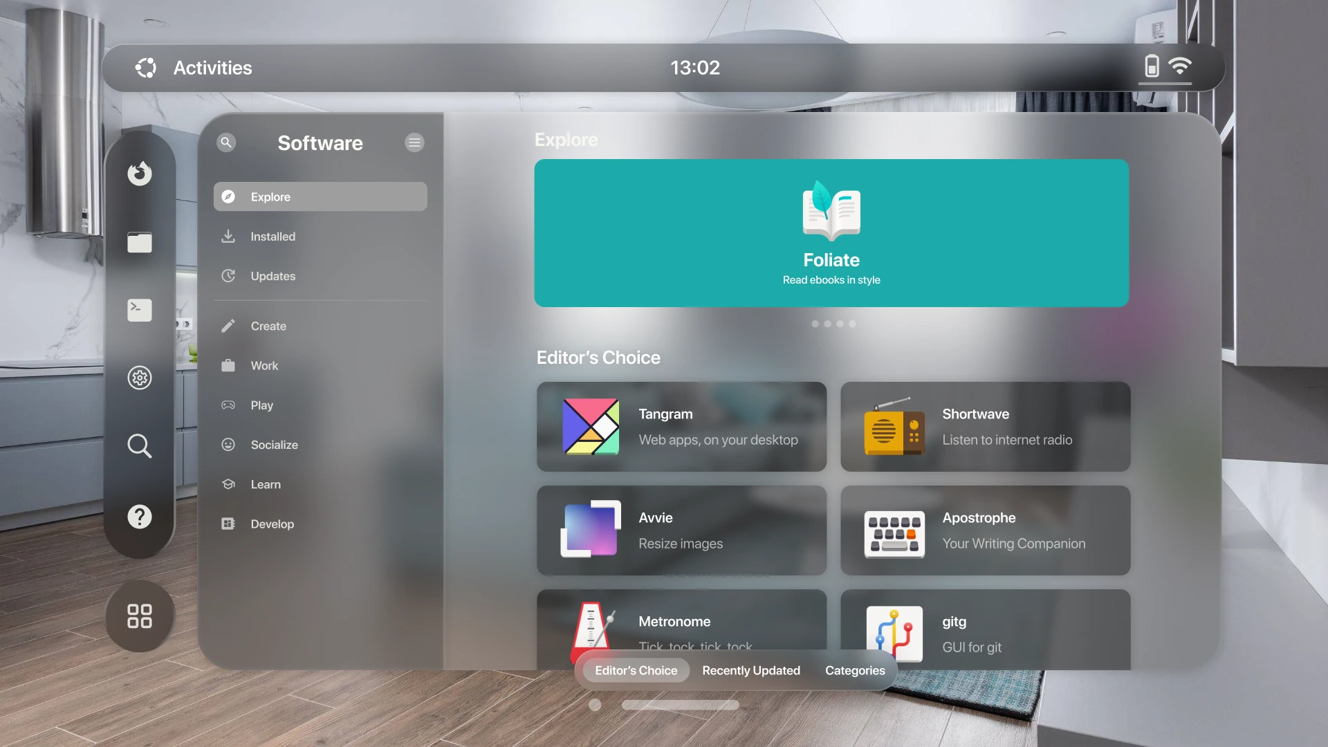
Software App:
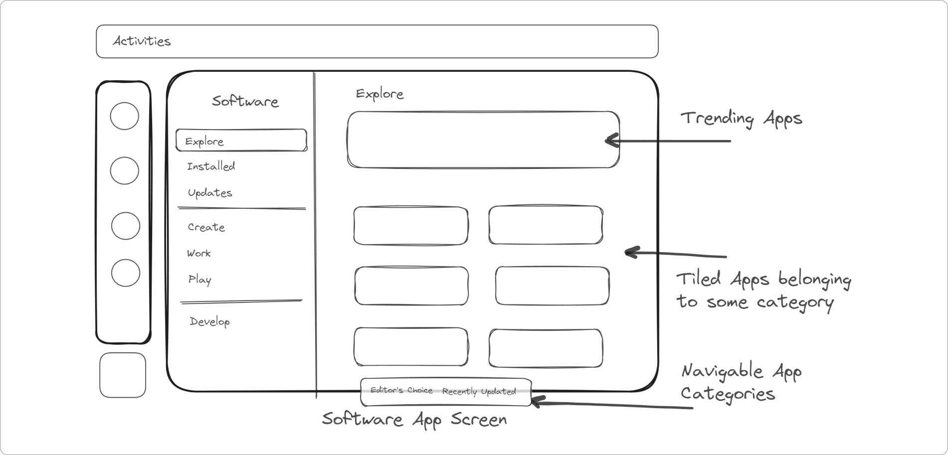
The interface remains similar to what we currently have in GNOME Software, but there's an updated navigation bar at the bottom of the window. This allows users to easily switch between various app categories.
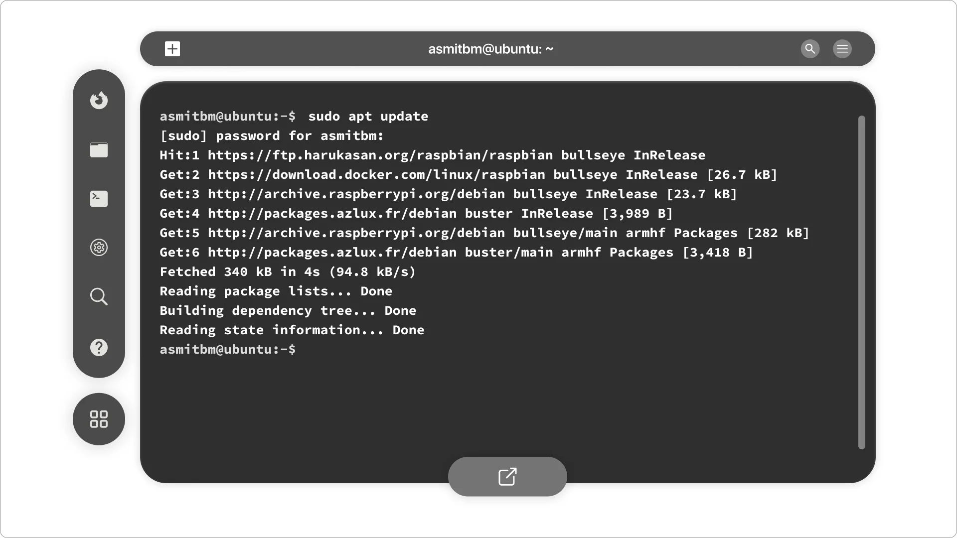
Terminal:
Lastly, there's the terminal. You can easily use it on VisionOS by connecting an external keyboard or using a virtual one. The terminal is crucial for Linux, so I added a shortcuts tab at the bottom to make things more convenient and boost productivity.
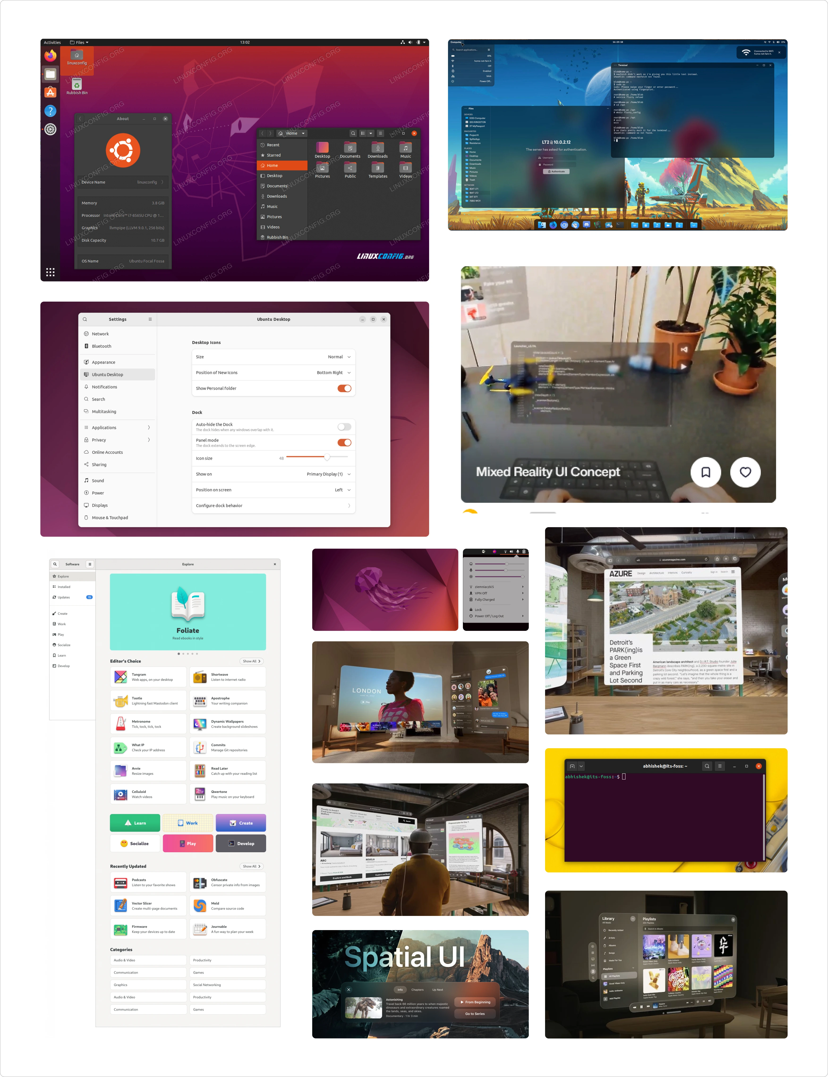
Mid-fidelity Designs
After making sketches and learning the basics of Spatial UI, I moved on to making mid-fidelity designs.
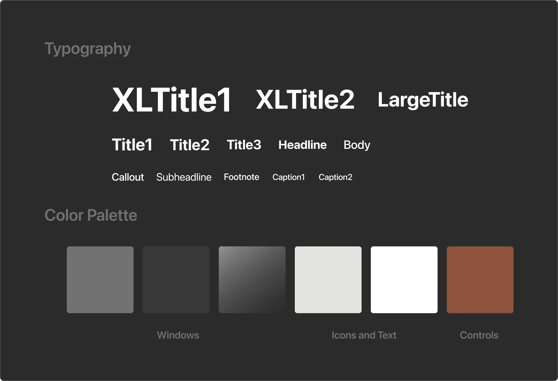
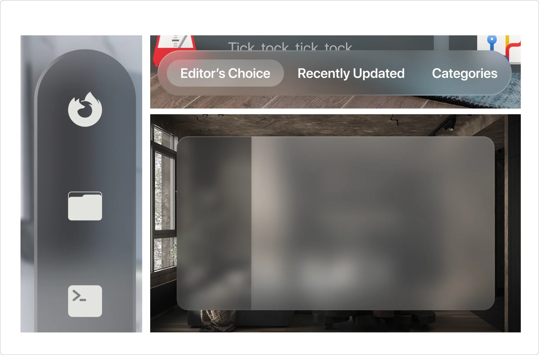
I kicked off by selecting the essential app icons for this UI, such as wifi, bluetooth, Mozilla Firefox, file explorer, terminal, settings, search, help, and app menu. I opted for monochrome icons because adding too many colorful opaque icons can feel constricting and make the interface feel heavy.
![]()
The style guide uses Apple's SF Pro Display font for Spatial UI, and the standard colors for windows, text, and controls.
Home Screen:
I increased the size of the main vertical navigation bar and made all the app icons the same on the home screen.
Home Screen With Extended App Menu Navigation Bar:
Upon an extended gaze over the navigation bar, the expanded navigation bar emerges, displaying the names in front of each app.
Home Screen With Quick Settings:
Similar to the navigation bar, when a user gazes over the bar beneath the battery level, the quick settings panel opens up.
Settings Screen:
Settings Screen With Overlay:
Software App:
Terminal:
Final Designs
Glass is a key player in Spatial UI design, dynamically responding to lighting conditions. In contrast to iOS and macOS, Spatial UI doesn't have a fixed light or dark appearance. Instead, it adjusts how things look to fit the environment, smoothly shifting from day to night. This adaptability guarantees that the UI maintains an exceptional look in different scenarios and lighting conditions.
To achieve this, I've opted for two types of backgrounds—one with a bright background depicting daytime and another with a dimmer background portraying evening.
Home Screen:
Home Screen With Extended App Menu Navigation Bar:
Take a closer look at how the light reflects on the UI and how the glass material seamlessly blends with the background, creating a dynamic effect.
Home Screen With Quick Settings:
I have used darker glass material to increase the contrast for standard components like input fields and sliders.
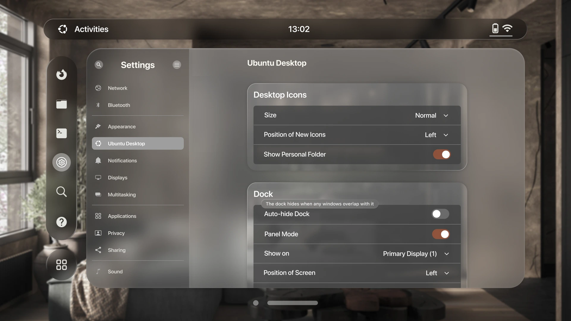
Settings Screen:

When I shared my designs with my mentor, Elio Qoshi, he mentioned that the description text under the options was too small to read, which could impact the user experience. I acknowledged the issue and came up with a solution: tooltips. Using tooltips allowed me to present the descriptions more clearly.
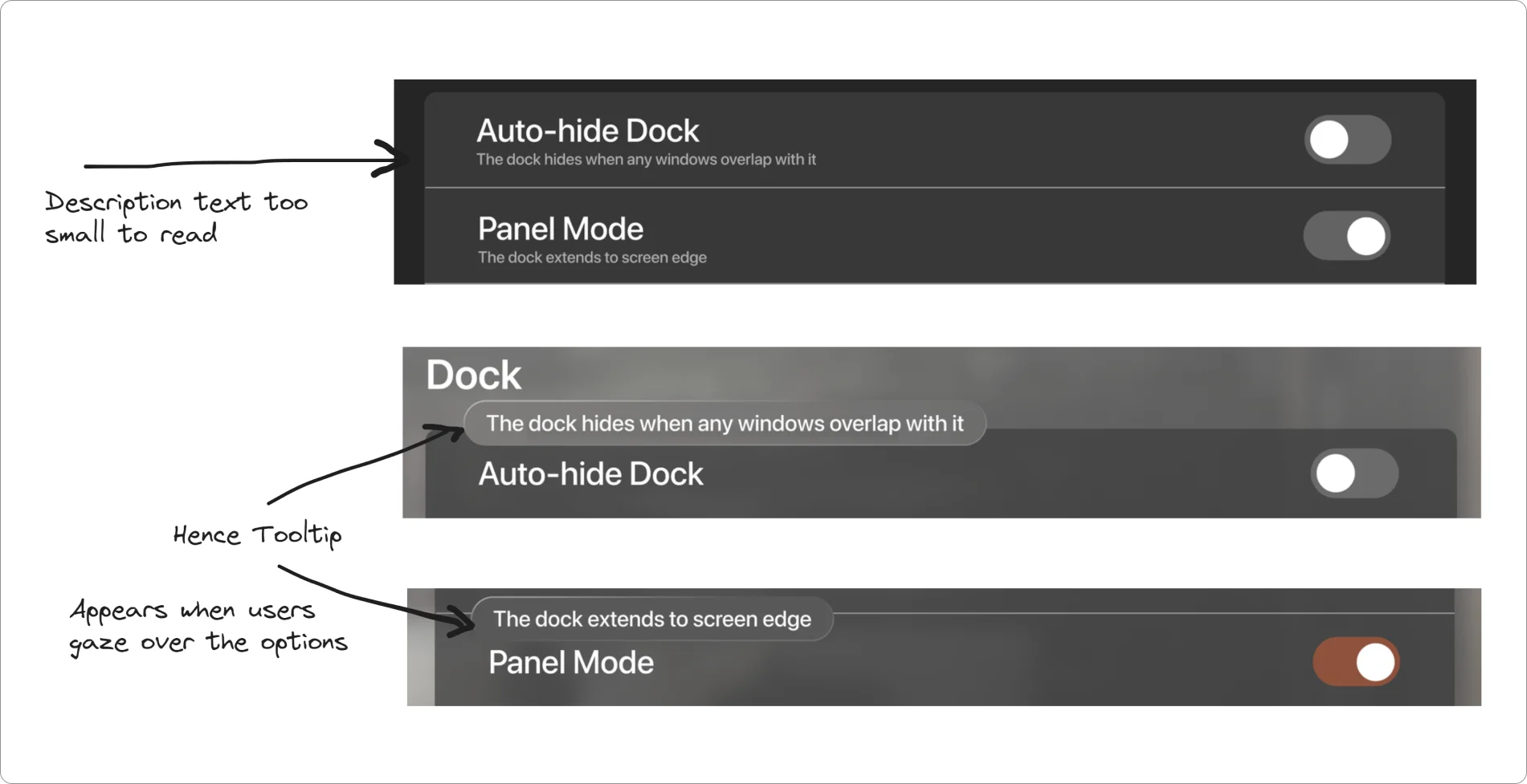
A tooltip appears when users gaze over an option for an extended period, let's say 3 seconds.
Settings Screen With Overlay:
Notice how the background dims and recedes, drawing the user's attention to the overlaid window.
Software App:
I added a toolbar at the bottom of the software window. It helps you easily browse through different categories of apps. Placed with thoughtful depth, it creates a clear hierarchy for easy access.
Terminal:
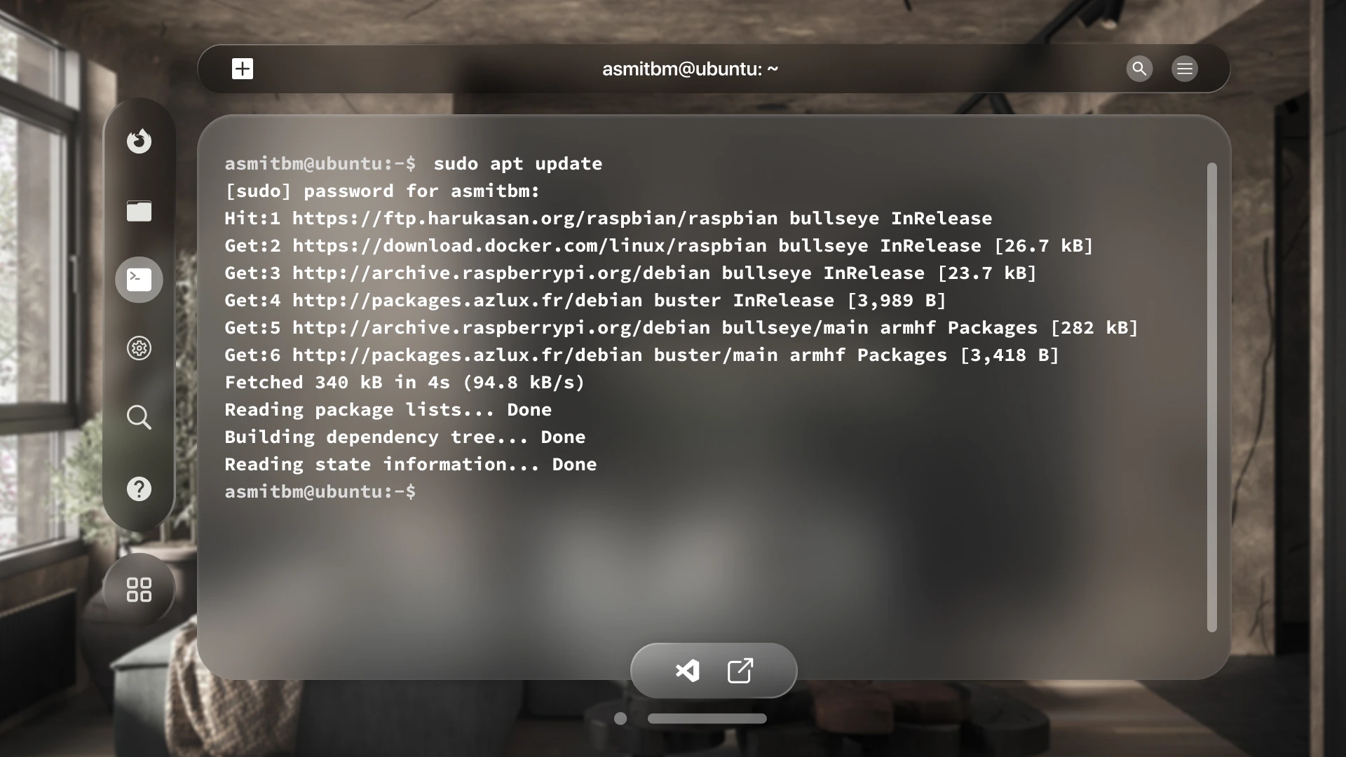
In the toolbar, there are two handy shortcuts in the terminal—one for an Integrated Development Environment (IDE) and another to open the default browser. This setup makes productivity a breeze.
The toolbar overlaps the main window, providing a sense of depth without diverting users' attention from the main content.
Design Contemplations
I primarily utilized the VisionOS Design Library and Templates for fundamental elements, incorporating custom components or icons sparingly and only when essential. This approach ensures the best user experience and maintains consistency in the overall design.
Ergonomics:
Adhering to Spatial UI principles and considering ergonomics, users will primarily interact with their eyes and hands on this platform. I've strategically positioned my designs at the center in front of the user to ensure correct placement of the content. Additionally, recognizing the natural range of motion of the neck, it's generally easier for people to move their heads right and left rather than up and down.
Soft Edges:
The main screen has soft edges to blend in nicely with your surroundings, making it feel lighter and more real. It's like looking through a window, giving you a glimpse of what's behind it, such as other apps or people.
Light, Shadows and Contrast:
Introducing a light source creates a subtle realism effect, enhancing immersion. The bars and windows feature delicate shadows in the corners, serving as cues to users about the direction of the light source.
Since the UI is made of glass material, Spatial UI principles suggest using a darker glass material alongside lighter materials to establish contrast between different sections of the app, drawing attention to interactive elements.
Figma Community File
For you to explore and play around with this UI. If you intend to implement this UI in a software, please remember to provide proper credits :)
My Thoughts
I was curious about spatial UI and I decided to explore it and turned my findings into a case study. I learned a lot about spatial design, like paying attention to details such as ergonomics, materials, colors, icons, and text. The focus was on making the user experience better by keeping the design simple and clean.
While the idea of Linux on an AR/VR headset may seem impractical presently, it points towards the direction the future is heading. The purpose of this project was not merely reproducing the current UI on glass material but envisioning how we can elevate user experience in the AR/VR landscape.
If this becomes a reality in the future, users will need time to get used to the new UI since VisionOS relies on eyes, hands, and voice as primary inputs and Linux is known for commands. Spatial UI offers the potential to create minimal designs with a heightened focus on core content and user experience.
This case study isn't striving for perfection but serves as an idea of discovery and learning in this evolving concept. The primary goal is to grasp the principles and understand how these concepts will shape our digital experiences in the future.
Thanks for reading, until next time!