Project
The AsyncAPI Initiative is a specification and growing set of open-source tools to help developers define, build, and maintain asynchronous APIs and event-driven architecture (EDA).
A brief overview of the generated documentation.
An AsyncAPI document is like a special file that describes and adds notes to the parts of a particular Event-Driven API. This file has to be in either JSON or YAML format. You can use this document to generate both documentation and code.
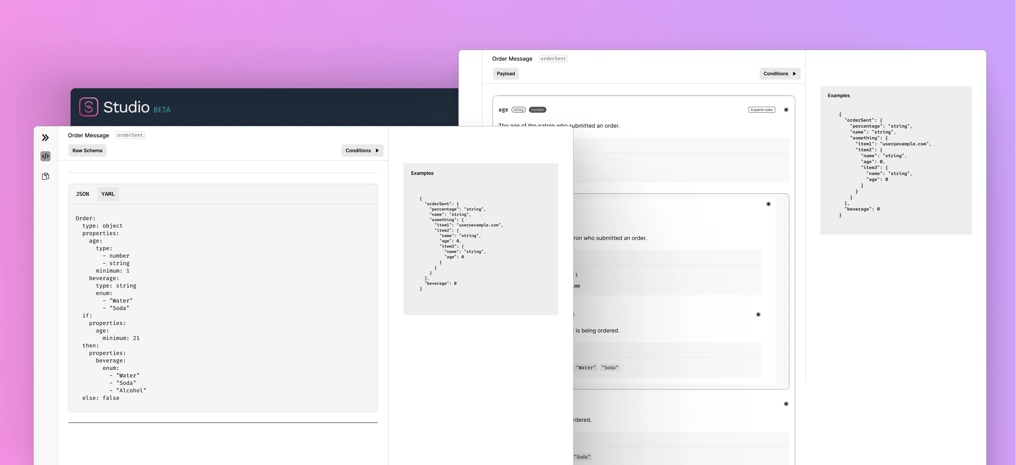
The AsyncAPI Studio is a visual tool helps you make an AsyncAPI document. It checks if it's correct, shows you what it looks like, updates it to the newest version, and visualizes event flows. The same documentation can be also generated by non-visual tools like Generator and CLI.
I was chosen as AsyncAPI Mentee for 2023 program, mentored by Missy Turco and Fran Méndez.
Overview
Problem
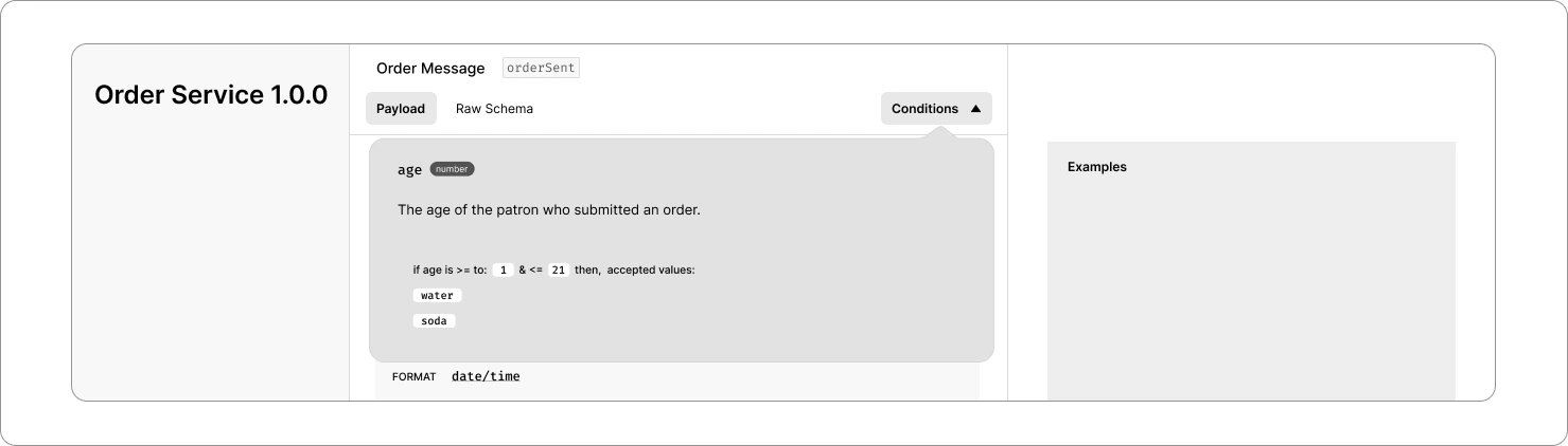
The most important component of the generated docs is the Payload component. The inspiration for the improvements came from browser developer tools where users can toggle all levels of an object easily. This is what it looks like currently:
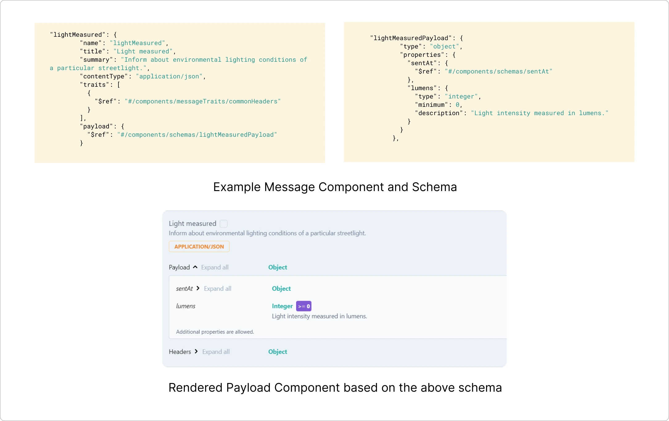
The primary goal was to improve the experience of interacting with the Payload component and rendered documentation by introducing features like collapsing and expanding all levels, providing better visibility for metadata, and addressing challenges related to displaying conditions and validations.
Outcome
I conducted a comprehensive evaluation of the current generated docs, utilizing research-supported principles of accessibility and usability. After months of research, I designed a payload component that is more intuitive and straightforward. My primary focus was on improving the user experience, and I plan to keep enhancing the user interface by implementing an existing design system.
Researching About Problems in Current Design
The project encountered several challenges early on:
- Sibling Property Impact: Informing users about how changing conditions might affect other related properties.
- Union Types: Rendering multiple union types, presented challenges.
- Space Constraints: Limited space posed challenges in presenting various metadata within schema properties.
- Complex Metadata: Rendering complex metadata, including constraints, examples, read-only/write-only status, and external documentation links, was proving challenging.
- Conditions Rendering: Concerns were raised about the effectiveness of rendering conditions at the property level.
Addressing Challenges Step by Step
A big thank you to my mentors, Missy and Fran, for guiding me through the technical aspects and helping me with laying the groundwork for this project.
I was completely new to AsyncAPI Spec and JSON Schema. Took a first few weeks to extensively learn about JSON Schema, experimenting with edge cases, and addressing user user pain points that had been raised.
The Process
Sibling Property Impact:
I began by figuring out how to inform users about changes in related properties. In the JSON Schema, most objects were related, so modifying one property could affect others.
I tested these ideas:
- Making a small notifications tab.
- Using pop-up toast notifications for recent changes.
- Adding alerts similar to the VS Code terminal at the bottom right.
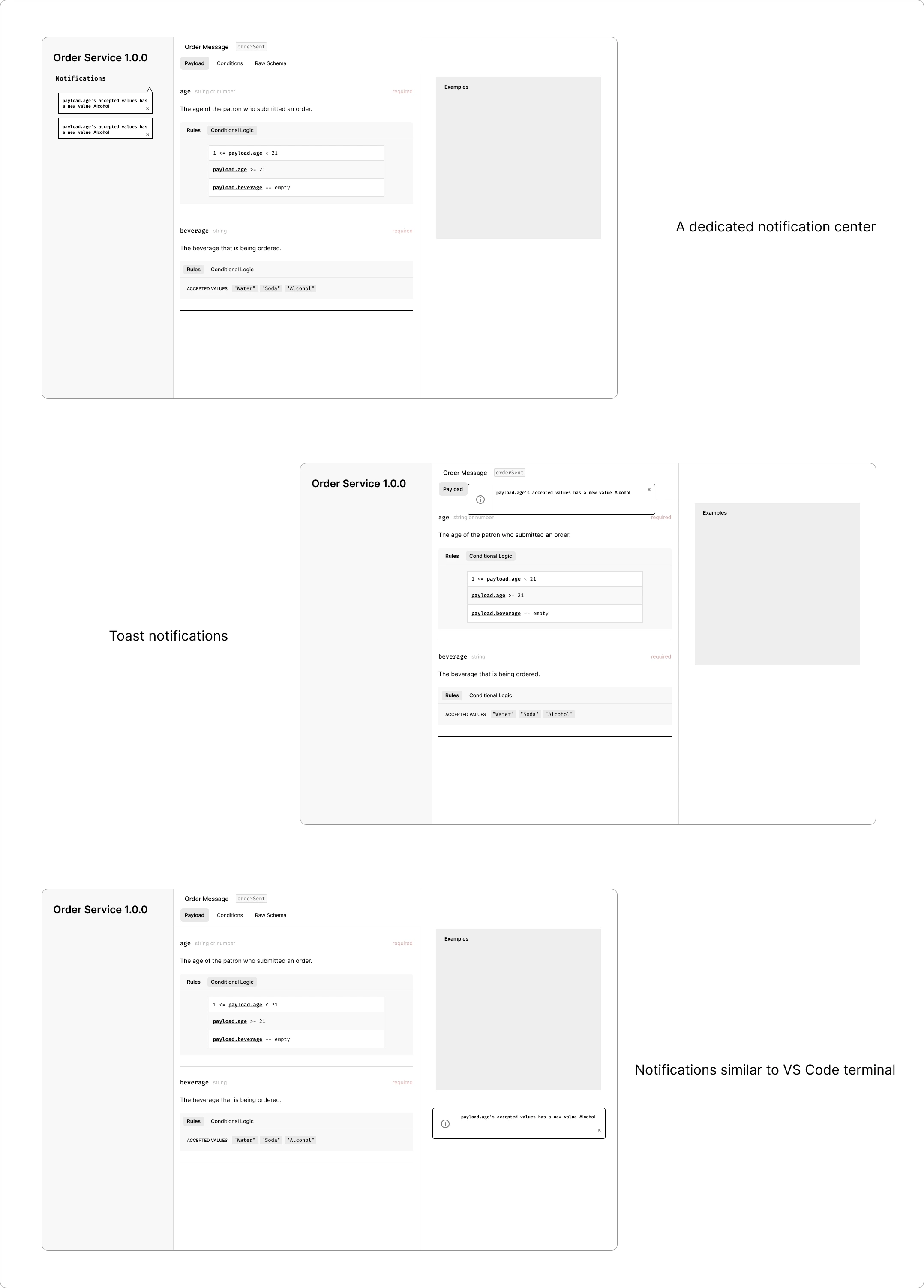
However, these brought up more issues:
- People might not regularly check a separate notifications section.
- Since this documentation can be viewed offline, tracking recent changes becomes challenging.
- It would need extra space, and we were already running low on space.
After talking with the team, we decided to highlight the modified parts directly in the documentation. This way, users can quickly notice which sections have been updated.
Working on Simplifying Payload Component
Here I worked on each and every part of the Payload component which is made up of types, rules, conditions, etc.
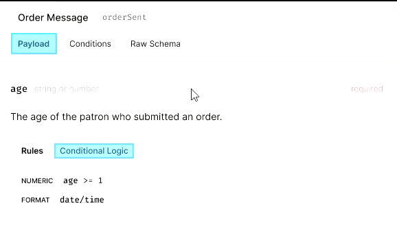
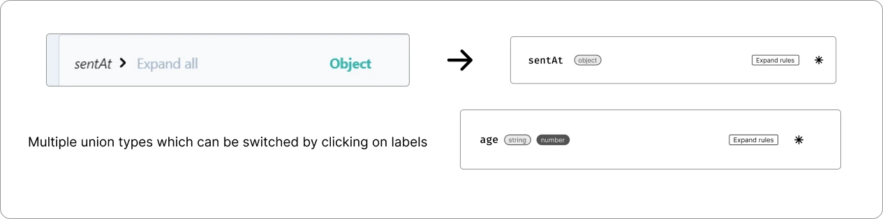
Rendering Multiple Union Types:
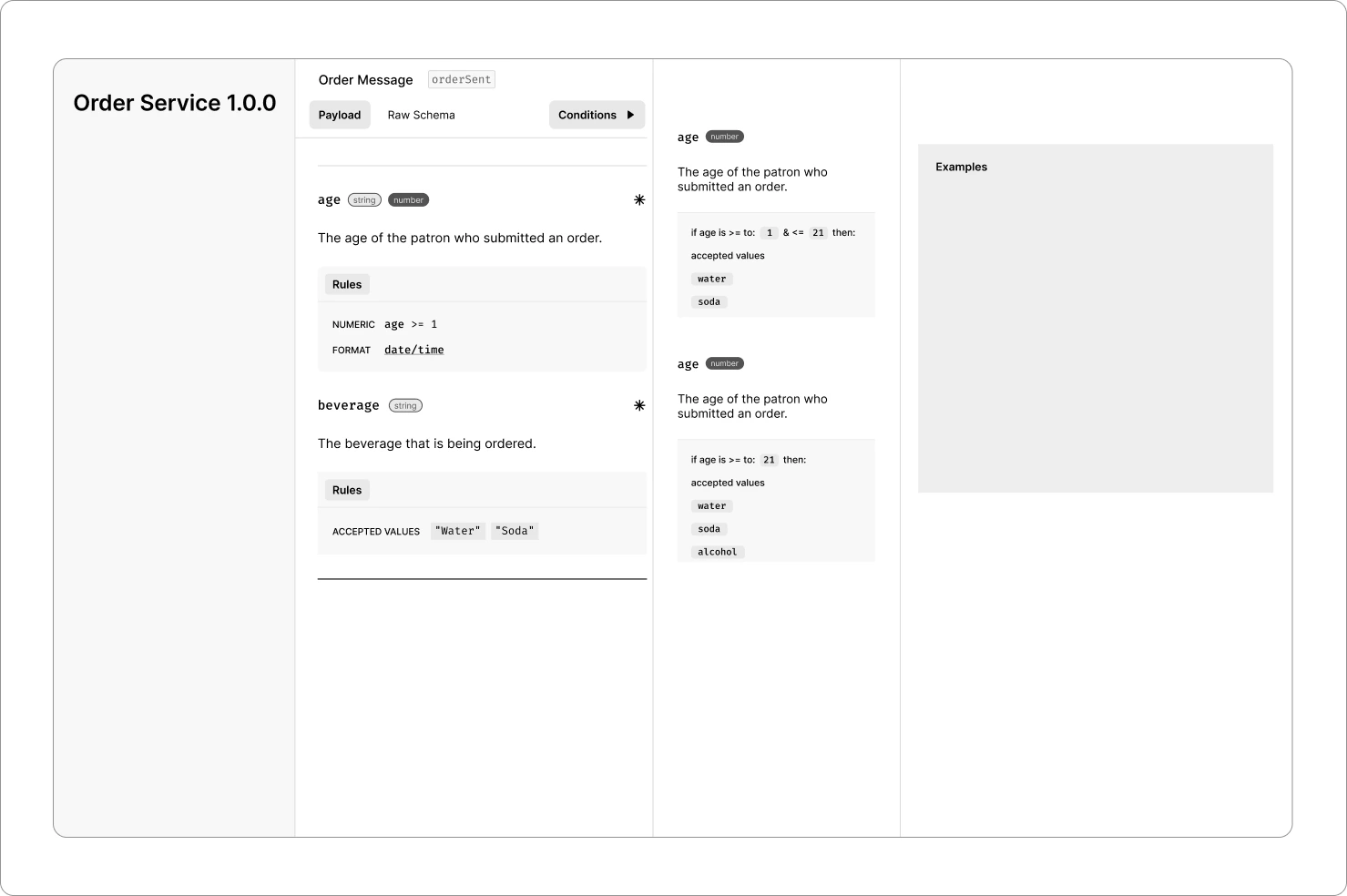
Redesigning Rules and Conditions Component:
I used badges to group the types. Now, when it comes to the part about Conditional Logic, I tried to explain it in a simple way like how we learn basic CS Fundamentals instead of using numbers and variables. While I was doing this, I had a thought: What if users want to pick certain conditions?
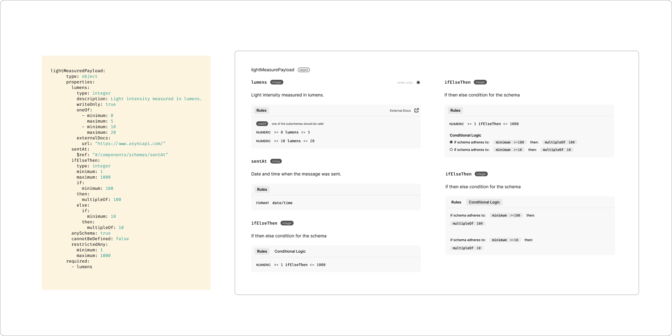
In this case, I've added radio buttons that allows users to choose specific conditions provided by the payload. With these radio buttons, users can pick different conditions and use the alert system mentioned earlier. This way, users can experiment with various conditions and receive alerts each time they make a change.
This posed another challenge, both the "if" and "then" parts can get really large to make it fit in a single line. This required redesign of the Conditions tab entirely.
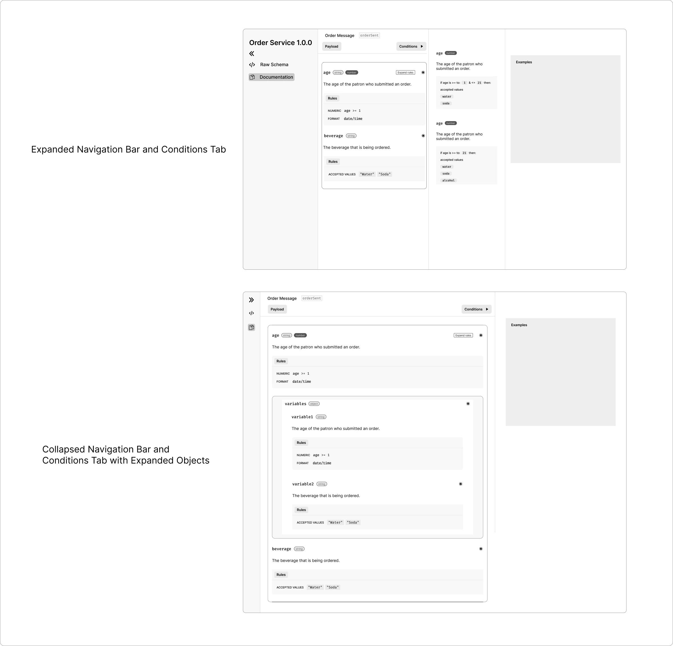
A Separate Conditions Tab:
We discussed the idea of presenting all the conditions at the top as a tab. This would provide users with an overview of the conditions contained within the payload. Based on my UX research, I discovered that toggling between the payload and conditions tab could potentially disrupt the user experience and cause users to overlook certain conditions. As a solution, I proposed implementing a collapsible sidebar for the conditions.
The issue we encountered here is the horizontal space demands of the conditions tab, which could potentially lead to cluttering on smaller screens. Fran and I explored the idea of introducing a dropdown menu for conditions, wherein the conditions for a particular payload would be listed in a dropdown format.
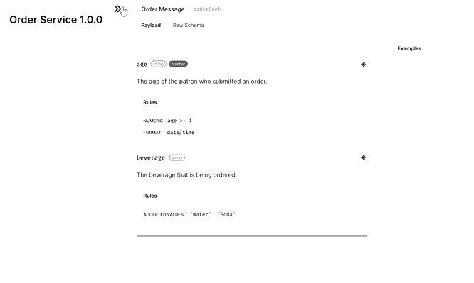
Rendering Conditions As a Dropdown Box:
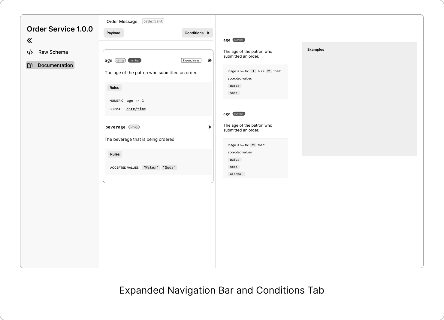
I moved the 'conditions' button to the horizontal navigation bar, right next to 'payload' and 'raw schema.' The 'conditions' tab is now a dropdown menu that displays all the conditions in a scrollable list.
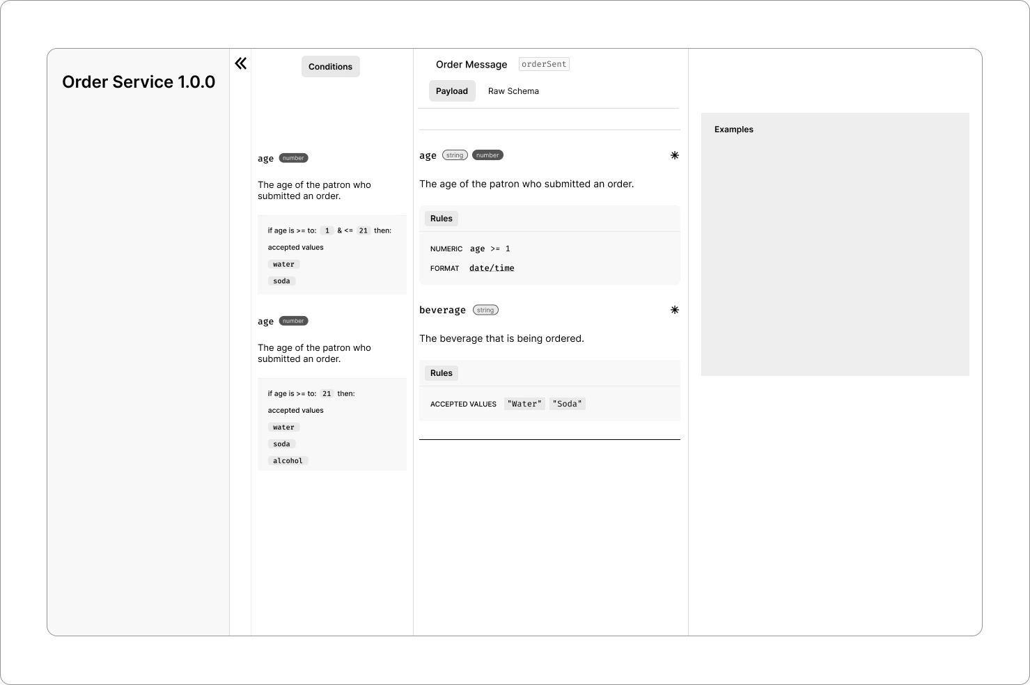
Rendering Conditions As a Separate Scrollable Column:
Here, I've left the condition button in the same spot, but I've adjusted the design to accommodate the scrollable conditions list. We encountered some space-related issues again. After going through more ideas, we chose to use collapsible panels whenever we could. We got inspiration from Adobe Creative Suite and Arc Browser, which use smart ways to organize their multi-panel tabs.
Collapsible Panels:
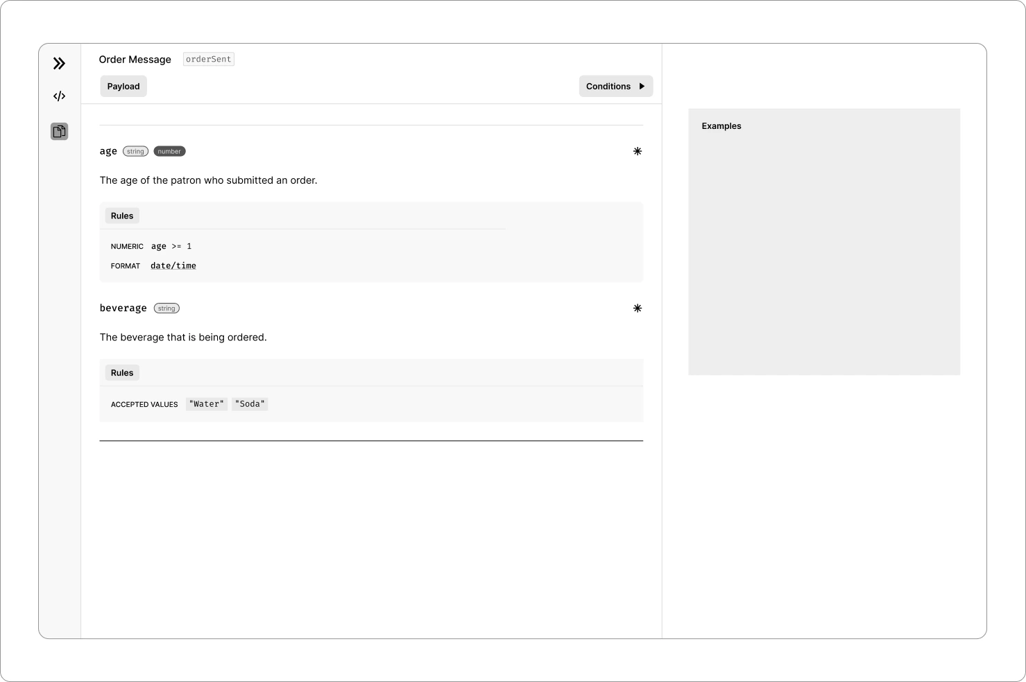
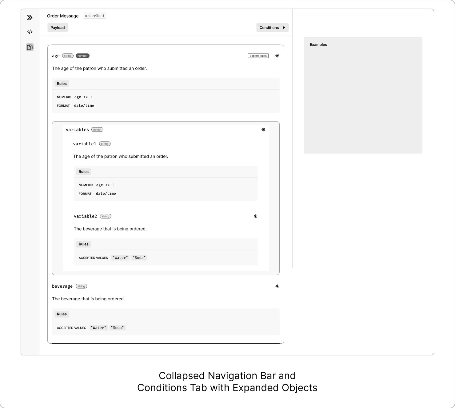
Building on the previous design, I opted to include payload documentation and raw schema in distinct tabs within the side navigation bar. This allows users to effortlessly switch between the two. Each panel could have its own tab, such as Payload, Conditions, Examples, and Raw Schema. Each tab should likely include a title and an option to minimize or close.
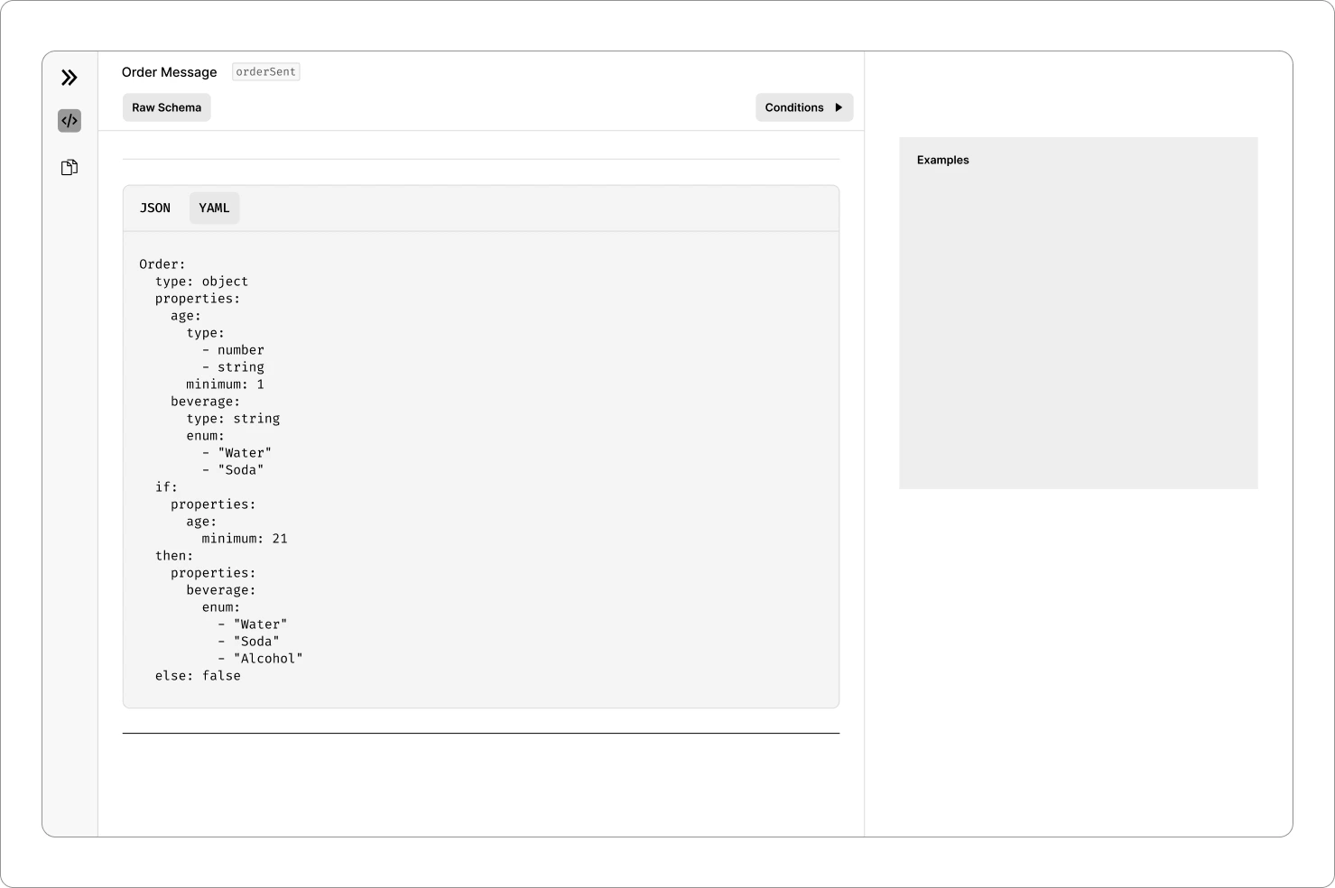
Nesting of Objects:
Until now, we've been designing for a single object and its properties. However, to ensure compatibility with future updates, there will be multiple objects stacked one below the other. I researched and tried various methods of nesting.
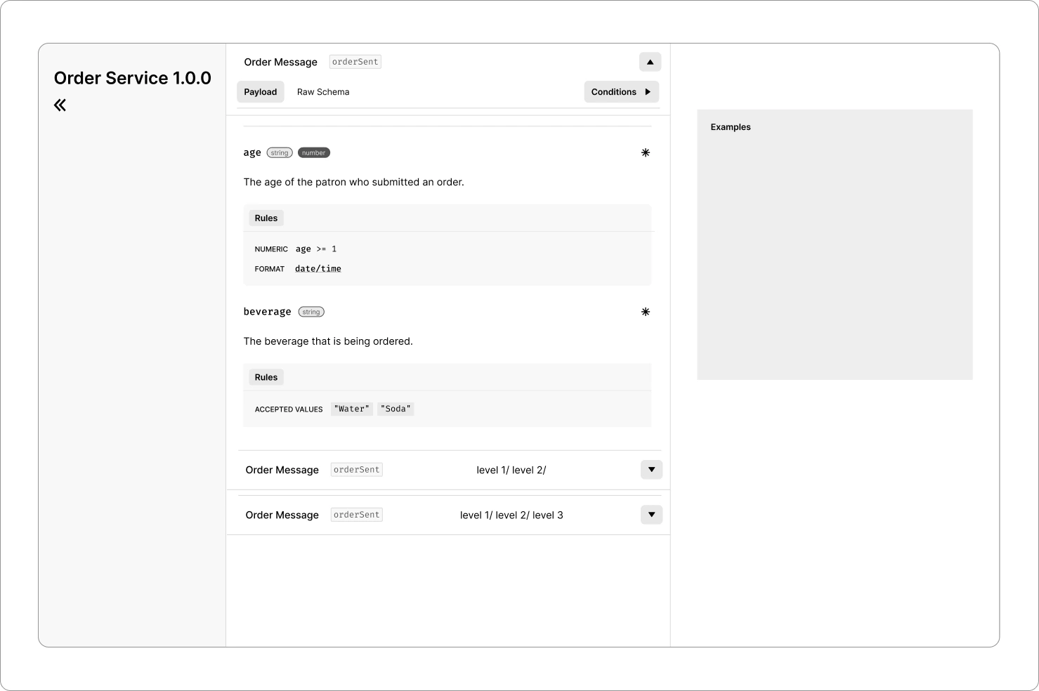
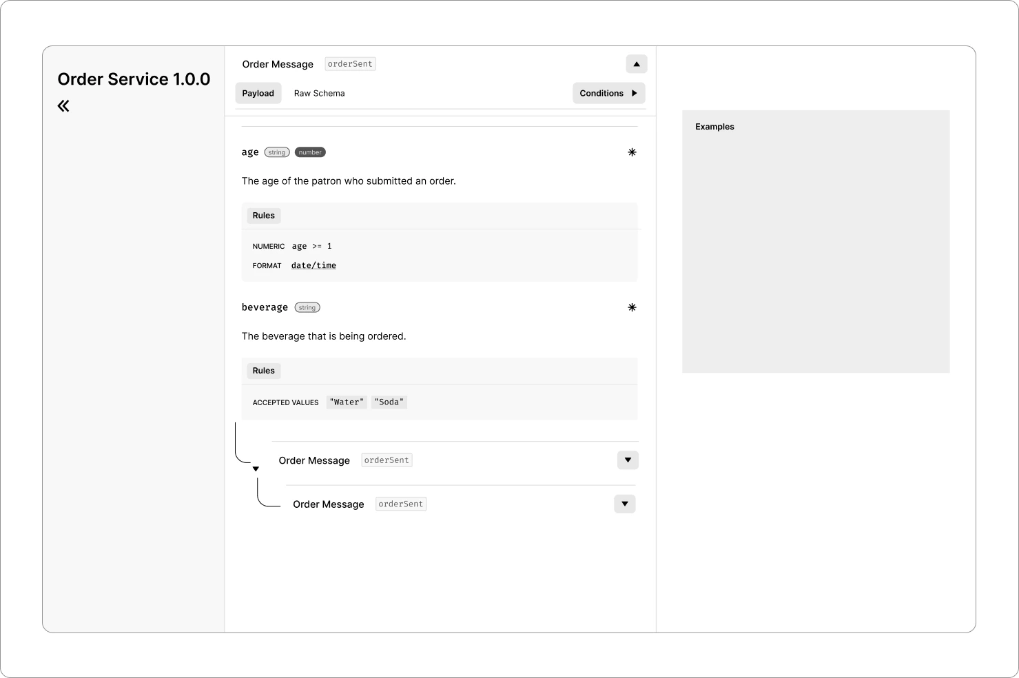
These two ways of nesting objects ended up being a bit tricky and caused space problems. There wouldn't be enough room to show the content inside, especially when there are many objects.
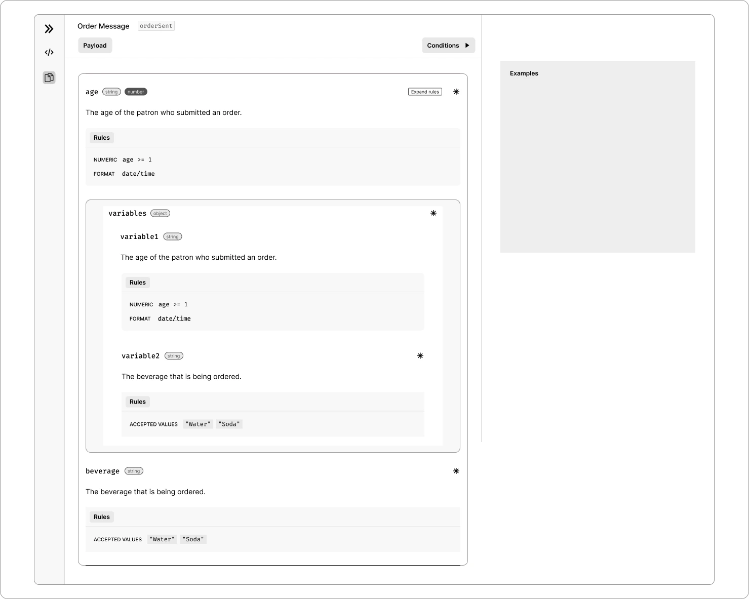
In this design, I stuck with the structure that AsyncAPI Studio currently uses, but we revamped all the labels and conditions, making it look much neater and more polished.
Combining All Design Decisions
After months of trying different things, studying user feedback, and analyzing data, we've landed on this design. Because AsyncAPI is an open-source project relying on volunteer contributions, progress on this project took a while. While the UX part is mostly complete, there's still some work left on the UI. The idea is to use the existing design system and revamp the UI for generated docs.
My Learnings From This Project
This project had a bit of a challenging start. It's one of the most complicated projects I've tackled, and it taught me a bunch of new things:
- Designing for every possible scenario in JSON Schema.
- Creating a design that can handle a large scale, ensuring accessibility for enterprise-level use, where thousands of users might use the product, and its features might expand in the future.
- Collaborating with the lead designer and founder across different functions is an ongoing effort, and making solid design decisions early on is crucial.
Future Considerations & Areas of Improvement
As this was my initial project in UX designing for developer tools, my grasp of application and layout structure was quite basic. To enhance this, my plan is to establish a consistent layout and design system, ensuring a uniform look and feel.
I'm also gearing up to conduct usability tests with our target users. This will help gather feedback on the overall user experience and functionalities of the platform, guiding us on which areas need the most improvement.
Thanks for reading, until next time!