Context
In our fast-paced lives, we're constantly soaking in information, especially news. This app is here to make on-the-go reading more enjoyable, giving users a quick way to catch up on what's happening around them.
Problem Statement
When we’re reading on the go, we often get interrupted by events such as the train arriving or social interactions with other people. Many interesting articles get abandoned or added to the ever growing “read later” list. How can you design an experience so readers can read effectively while on the go?
Solution
An effortless swipe through dynamic news feed that transforms on-the-go reading into an engaging and enjoyable experience. This approach gamifies user's news consumption, allowing them to effortlessly navigate through the content, ensuring focus on what matters most.
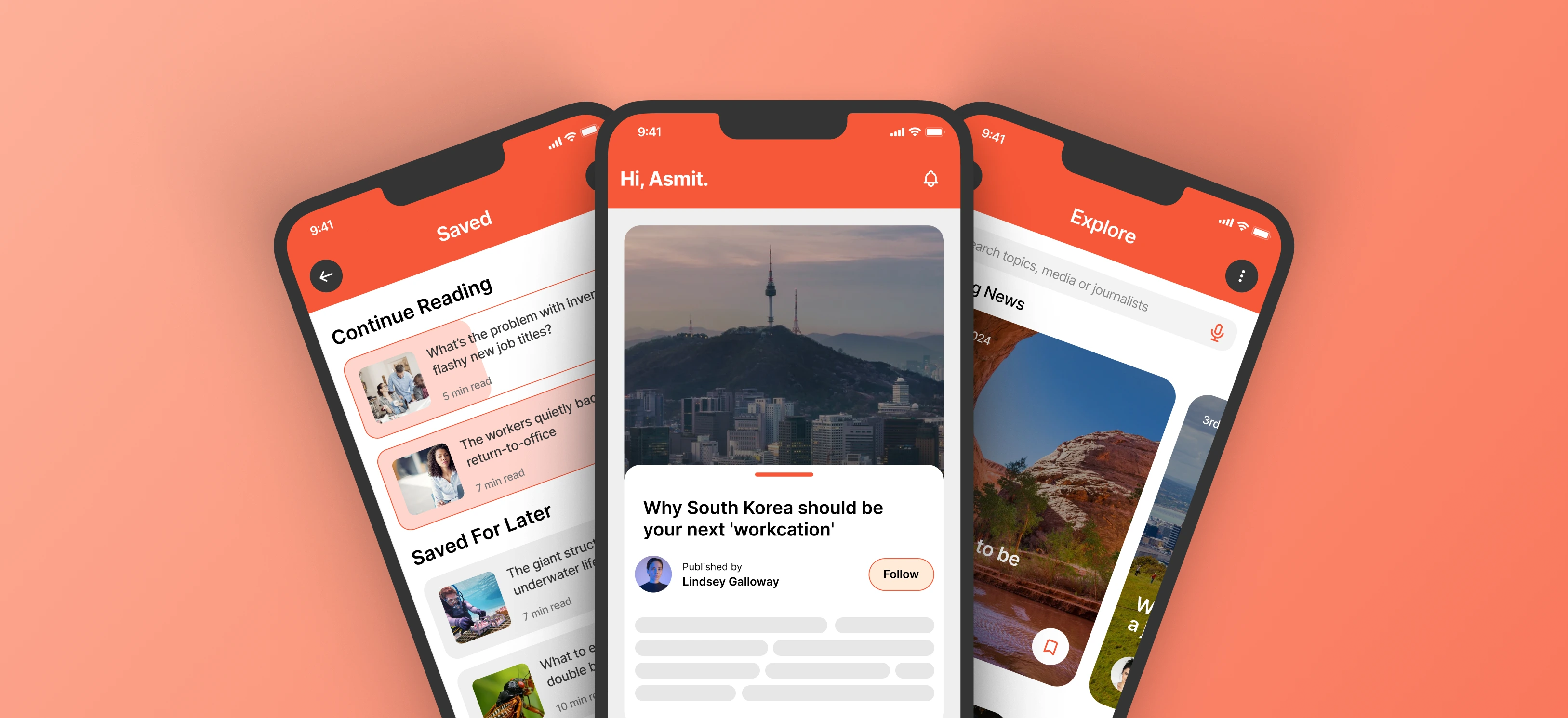
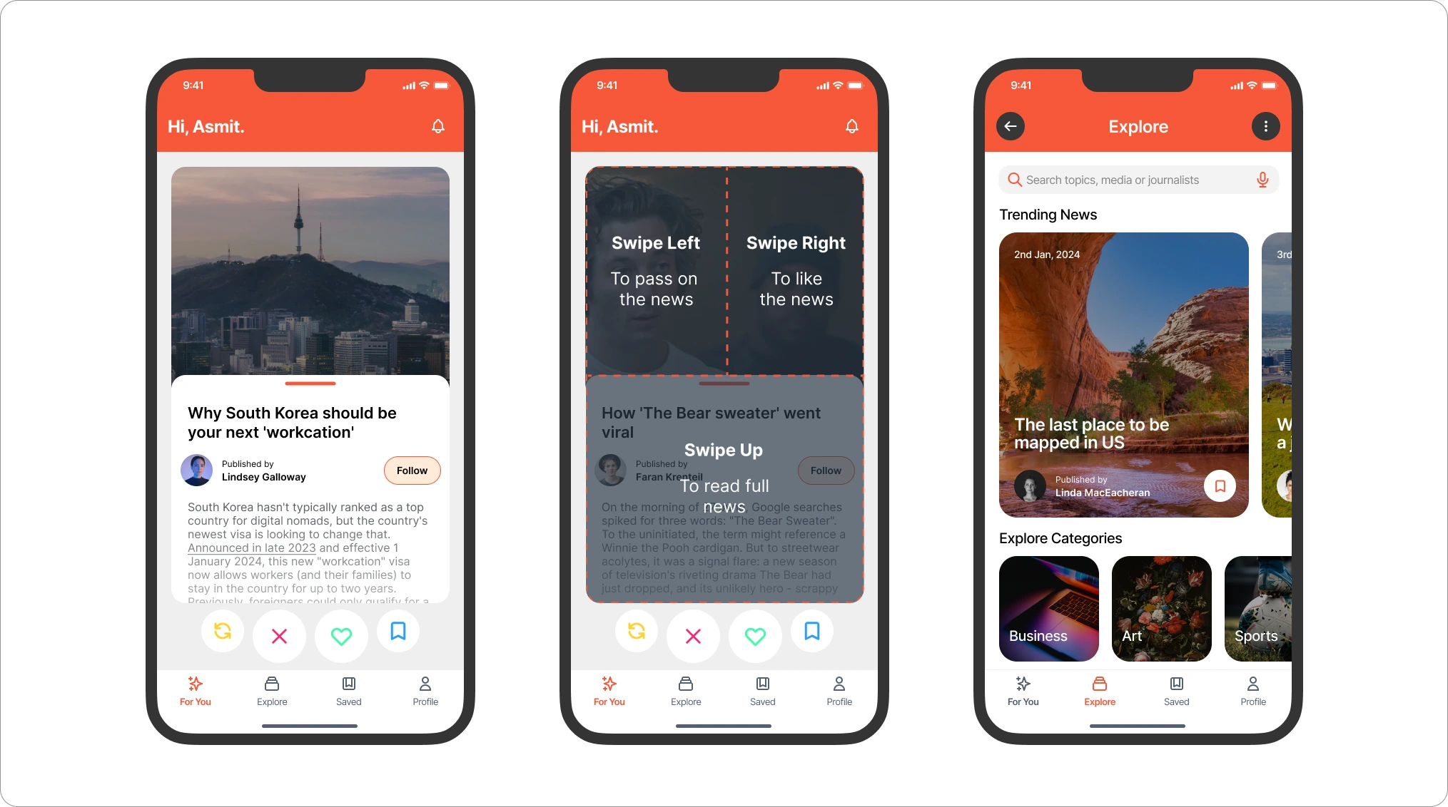
Swipe News Articles Effortlessly
Skip what's not needed and savor the important stories with every swipe.
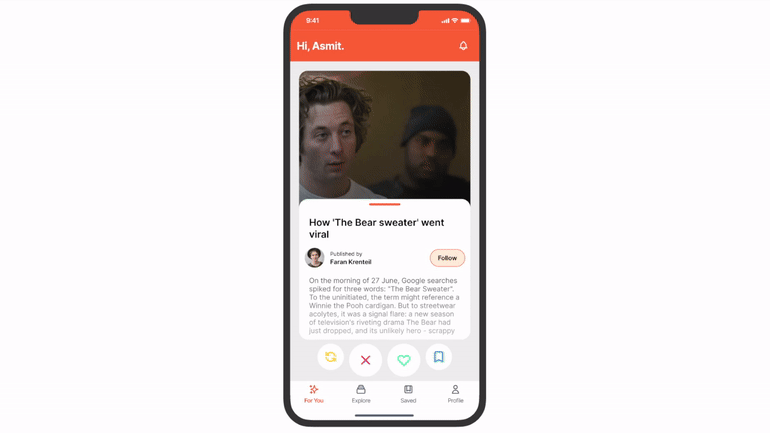
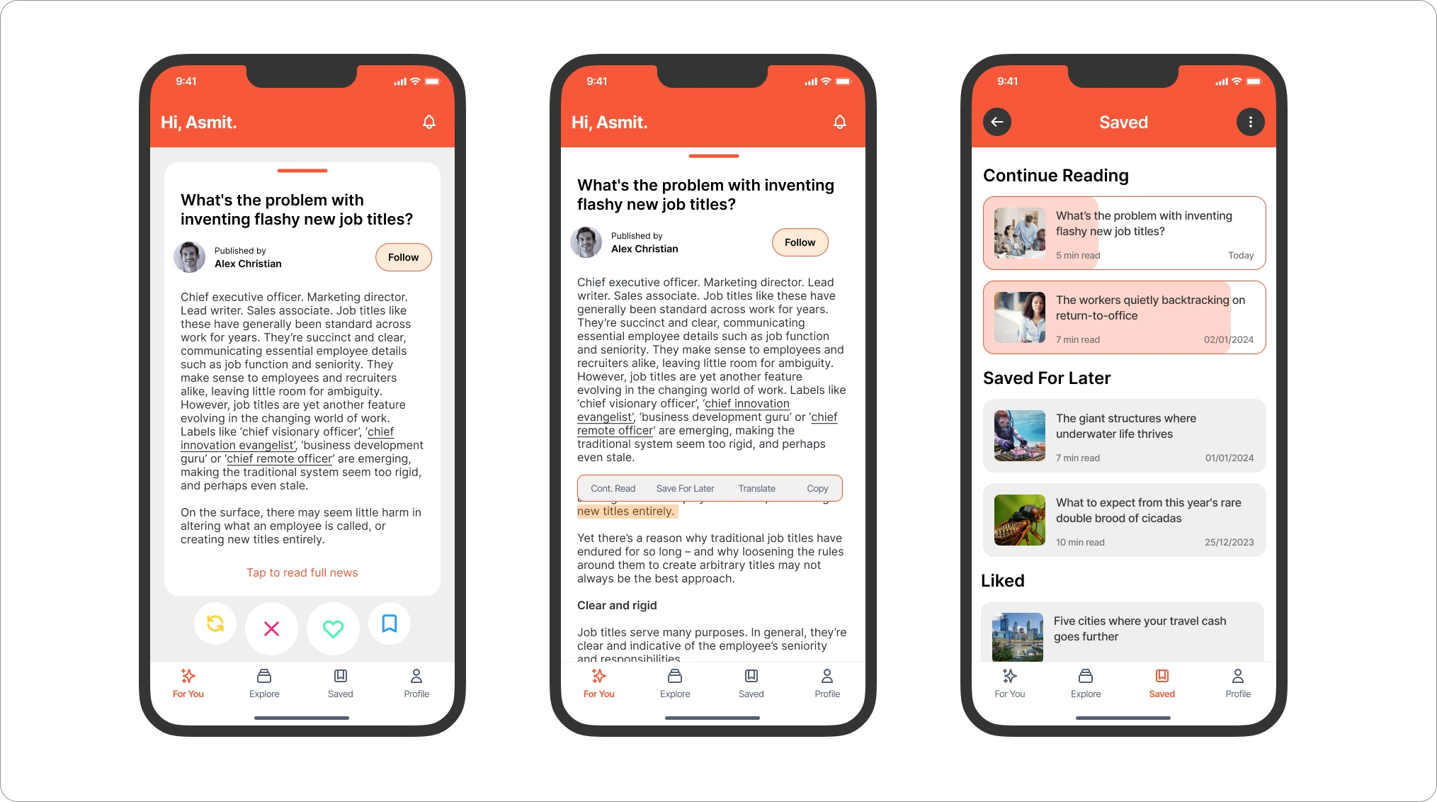
Handy Bookmark Feature
Inline bookmark feature, so you can pick up reading your articles right where you left off.
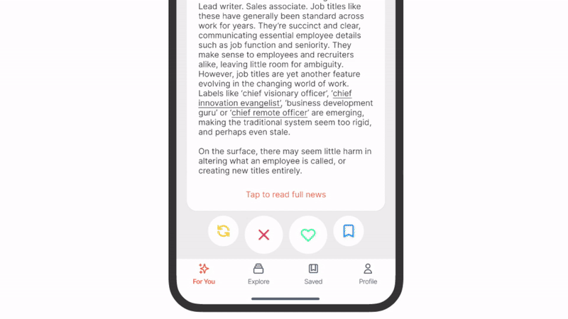
Read From Where You Left Off
Progress tracker for inline bookmarked articles.
![]()
Setting Expectations
My goal with this project was to practice my user experience design, interaction design and prototyping skills while also learning mobile app design.
- Personal Project: This is a personal project to develop and improve my skills. This project holds no specific metrics or outcomes aside from contributing to my personal growth.
- Practicing User Experience Design: I focused on enhancing user experience through various research purposes for this project.
- Trying new things: A key motivation behind this project was the exploration of new concepts. Trying to solve probelms is fun.
Goals
The main aim of this project was to craft a user experience tailored for individuals who engage in on-the-go reading. I wanted to design an experience that seamlessly adjusts to the interruptions frequently faced in dynamic settings. Considering this situation, I pictured my goals like this:
-
Increase user engagement by addressing the challenge of article abandonment, ensuring that interesting articles are not left unread or indefinitely added to the "read later" list.
-
Implement features to allow users to seamlessly pick up where they left off in articles.
-
Ensure that the app is tailored to the specific challenges faced by readers while on the go.
Process
Research
I wanted to understand individuals who commute, consume news in their daily routine. Do they rely on particular apps, follow the browser's suggested news, or opt for podcasts? To gain insights, I conducted competitive research and user interviews before diving into the design phase.
Competitive Analysis
Given the abundance of news apps in today's market, I chose the most popular ones, looking at things like how quickly you can read the news, is there any recommended section, and if they have summaries.
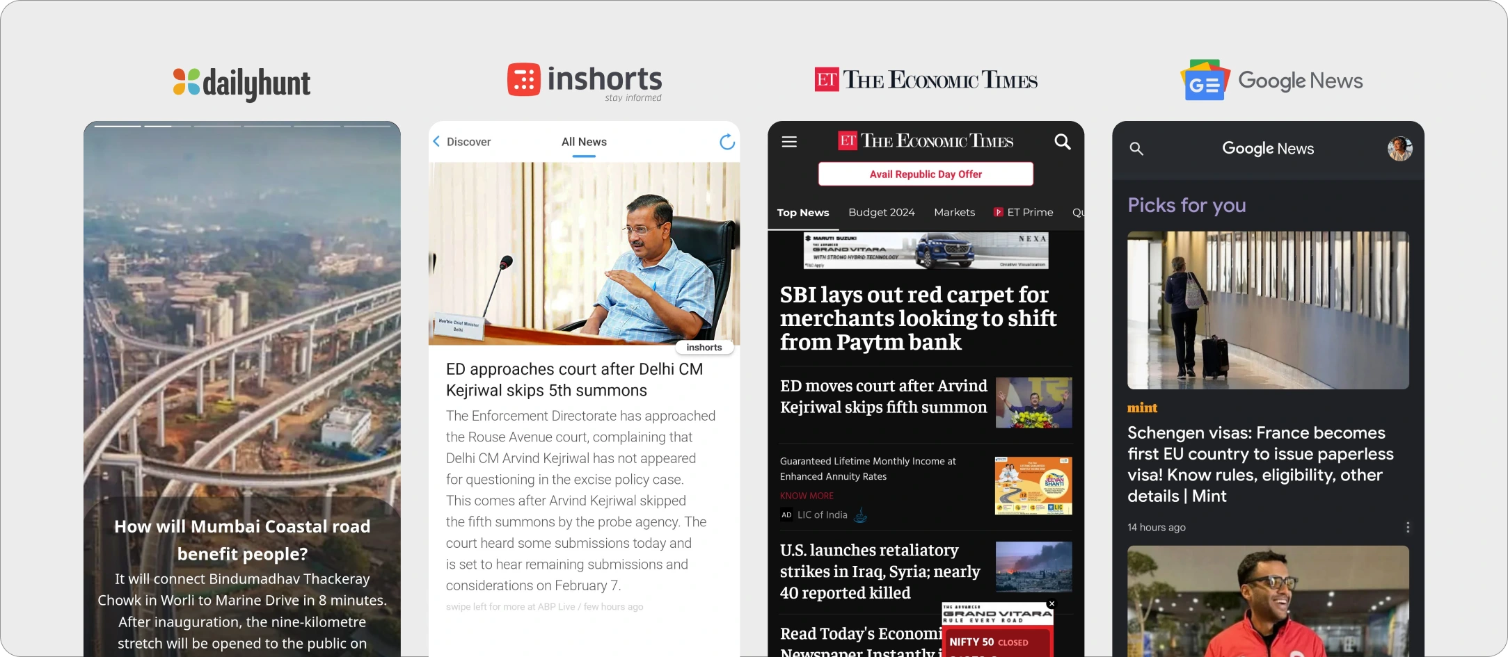
Key Findings
-
Dailyhunt provides a news experience similar to Instagram stories, allowing users to quickly catch highlights by swiping through stories.
-
Inshorts aims to deliver news in less than 60 words, but the user experience is lacking. Numerous pop-ups and ads, coupled with confusing navigation, detract from the overall usability.
-
The Economic Times offers a variety of news categories, but the user interface lacks intuitiveness.
-
Google News features a "For You" section tailoring news based on users' search history, providing helpful recommendations.
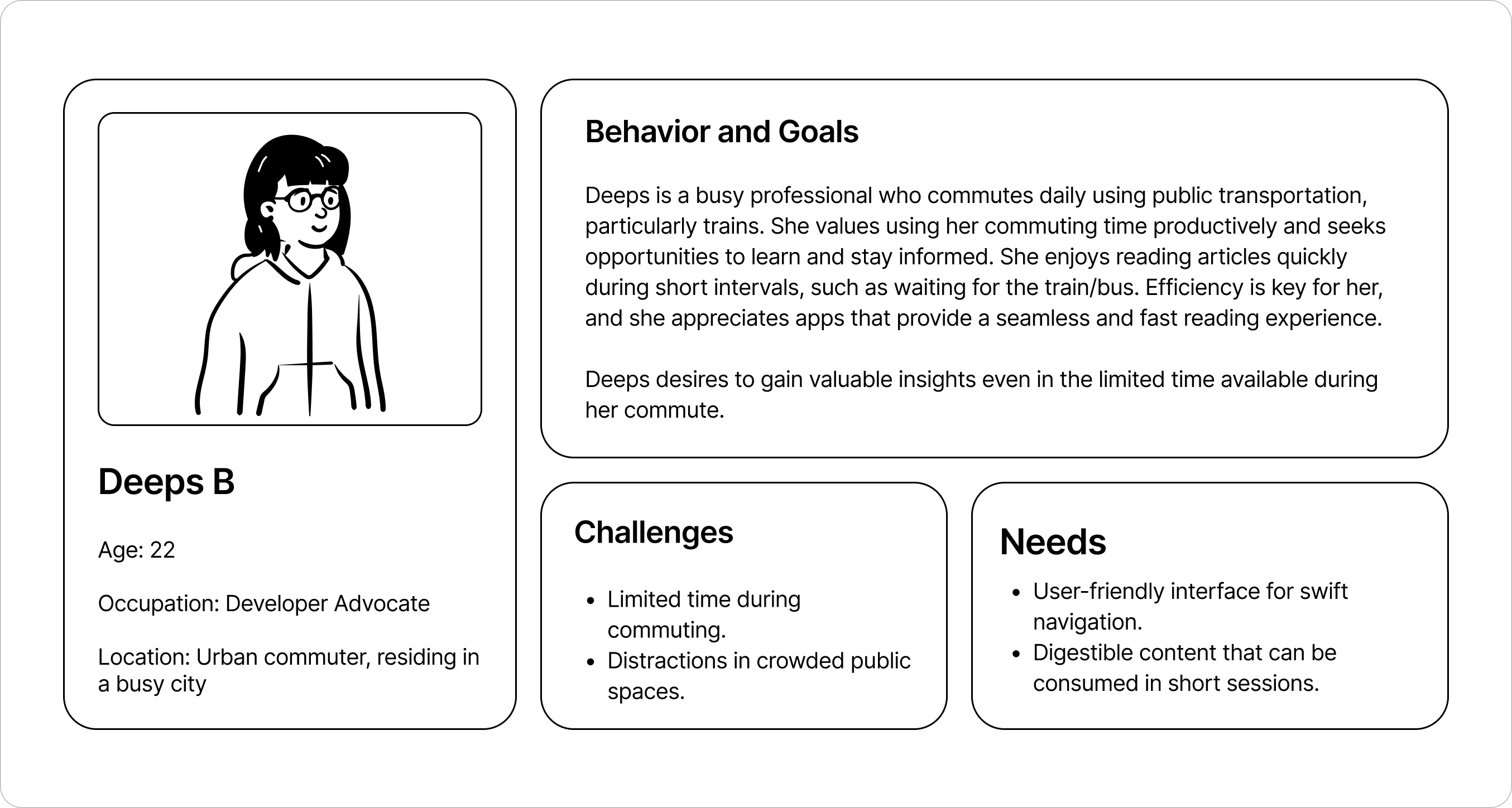
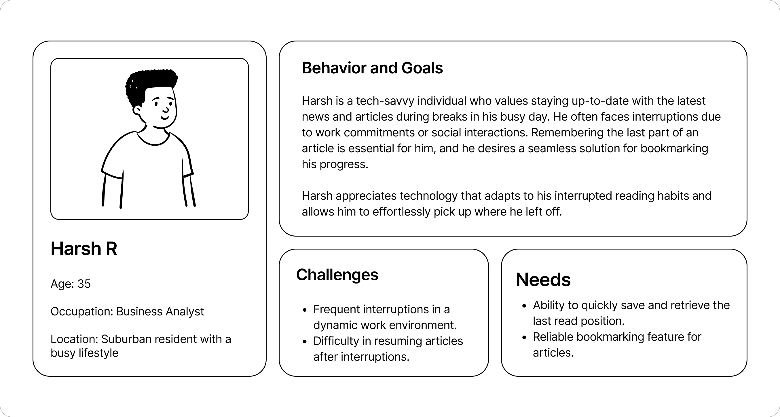
User Interviews
I collected insights by chatting with individuals like developers, students, and business analysts who commute to work and read news on the go. This helped me pinpoint the specific challenges they encounter with their news consumption.
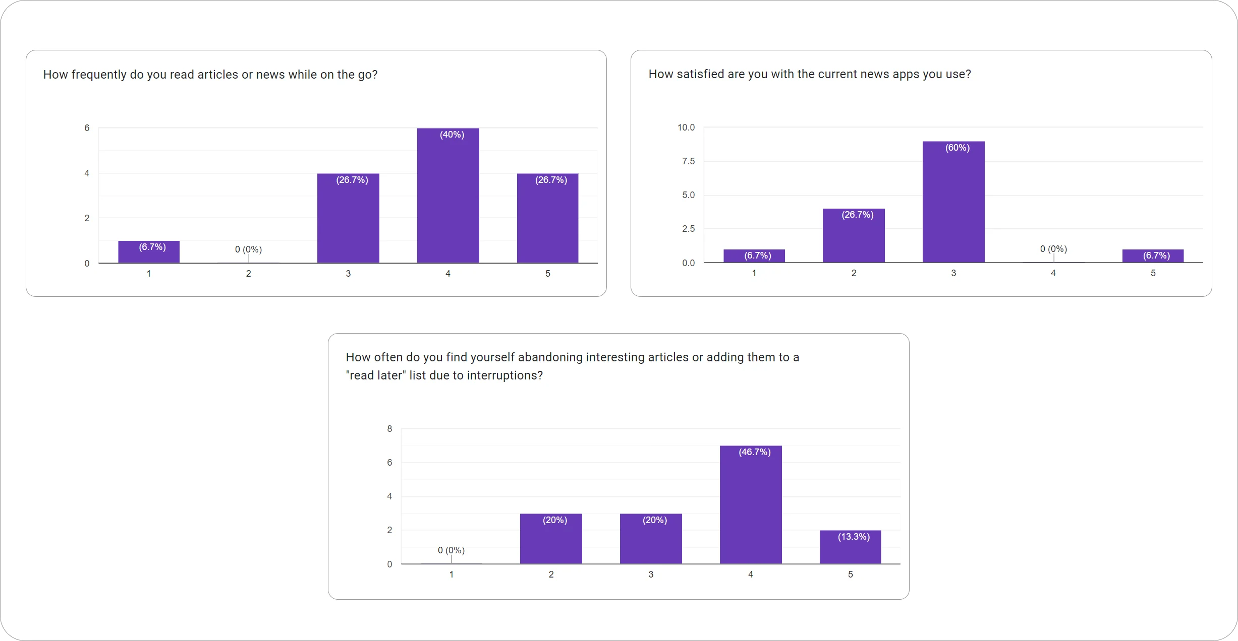
Key Findings
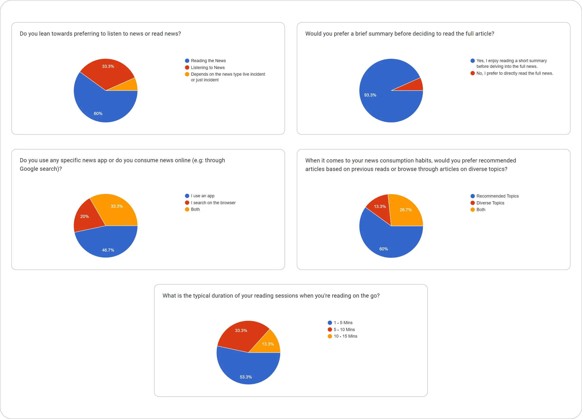
-
On average, users spent about 1 to 5 minutes on the app during each session.
-
A majority, or 60%, of the users expressed an interest in reading news.
-
An overwhelming 93% of the users found value in reading a brief summary before delving into the full news article.
-
Nearly half, or 47%, of the users exclusively used the app, while 33% utilized both the app and online news sources.
-
A significant 60% of users desired access to a wide range of topics in their news consumption.
Ideation
Following my initial research, I gathered all the information and began working on my findings. I developed two target personas based on the interviews and organized the goals according to their specific needs.
Simplified goals
-
Users expressed a desire for a simple swiping feature to navigate through news effortlessly.
-
Users expressed interest in an inline bookmark feature, enabling them to resume articles from where they left off.
-
There was a request for a personalized news section, offering tailored recommendations based on individual preferences.
-
Users sought meaningful summaries for lengthy news articles to quickly grasp the key information.
Inspiration and Moodboard
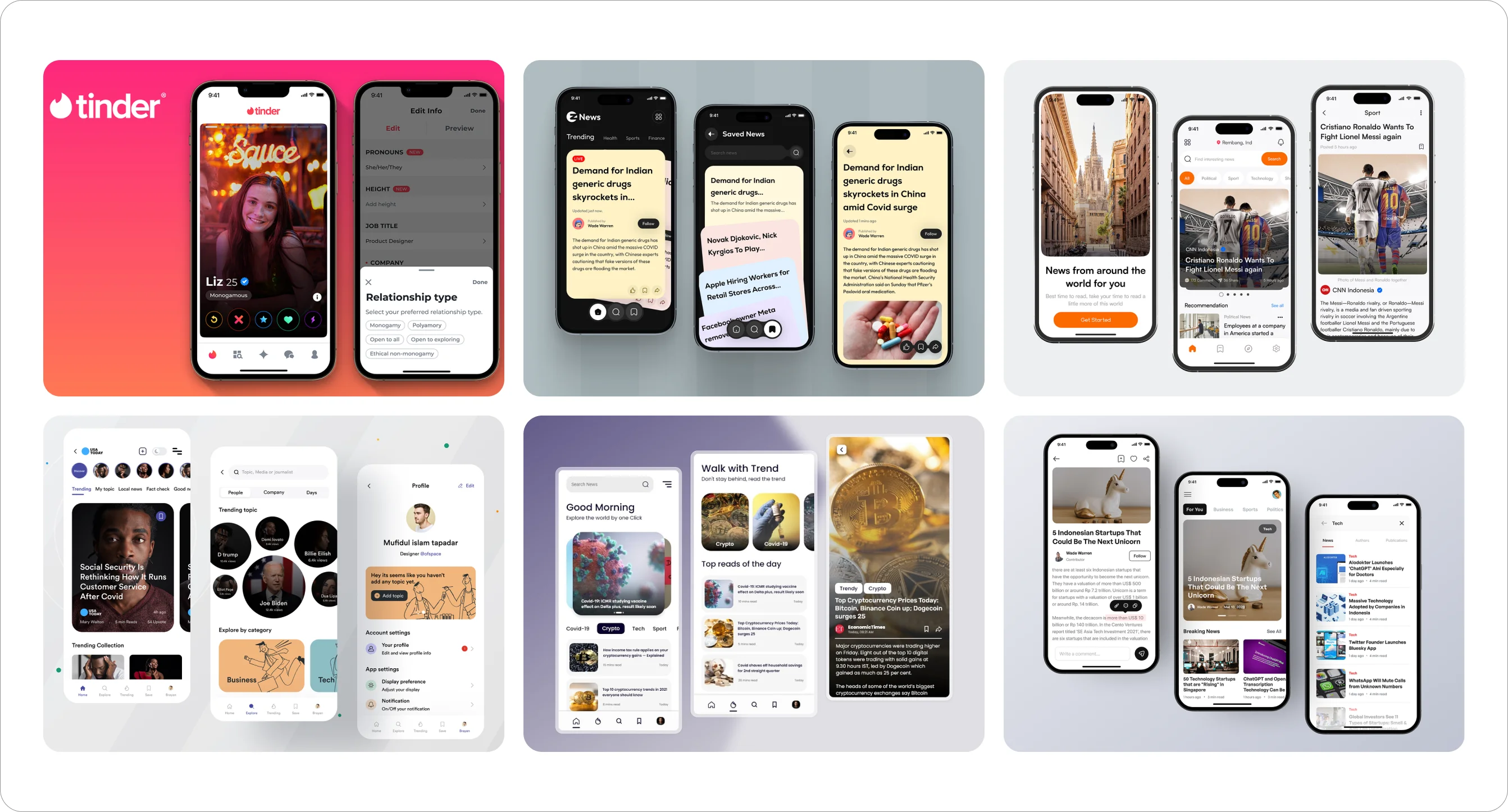
As I was exploring ways to deliver valuable content quickly to users, I stumbled upon the gamification approach used by Tinder. Additionally, I found this article that highlighted the innate nature of swiping. It mentioned that swiping, often done with the thumb, aligns with how many people prefer to navigate their mobile devices, as indicated by research. The article also pointed out that the swiping motion reflects familiar actions from the analog world, such as flipping through magazines or newspapers. This provides users with a sense of control, allowing to enhance the personal experience by fine-tuning recommendations.
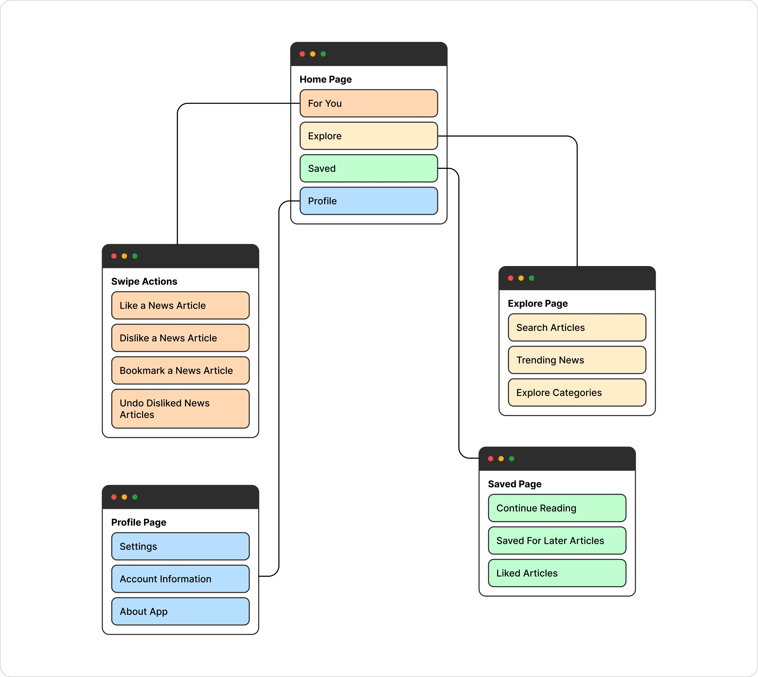
Information Architecture
I aimed to design a user-friendly information architecture. Users would start with their recommended news, move to an explore section for a variety of news categories, then have a page for bookmarked articles, and finally, access their profile settings.
Low Fidelity Wireframes
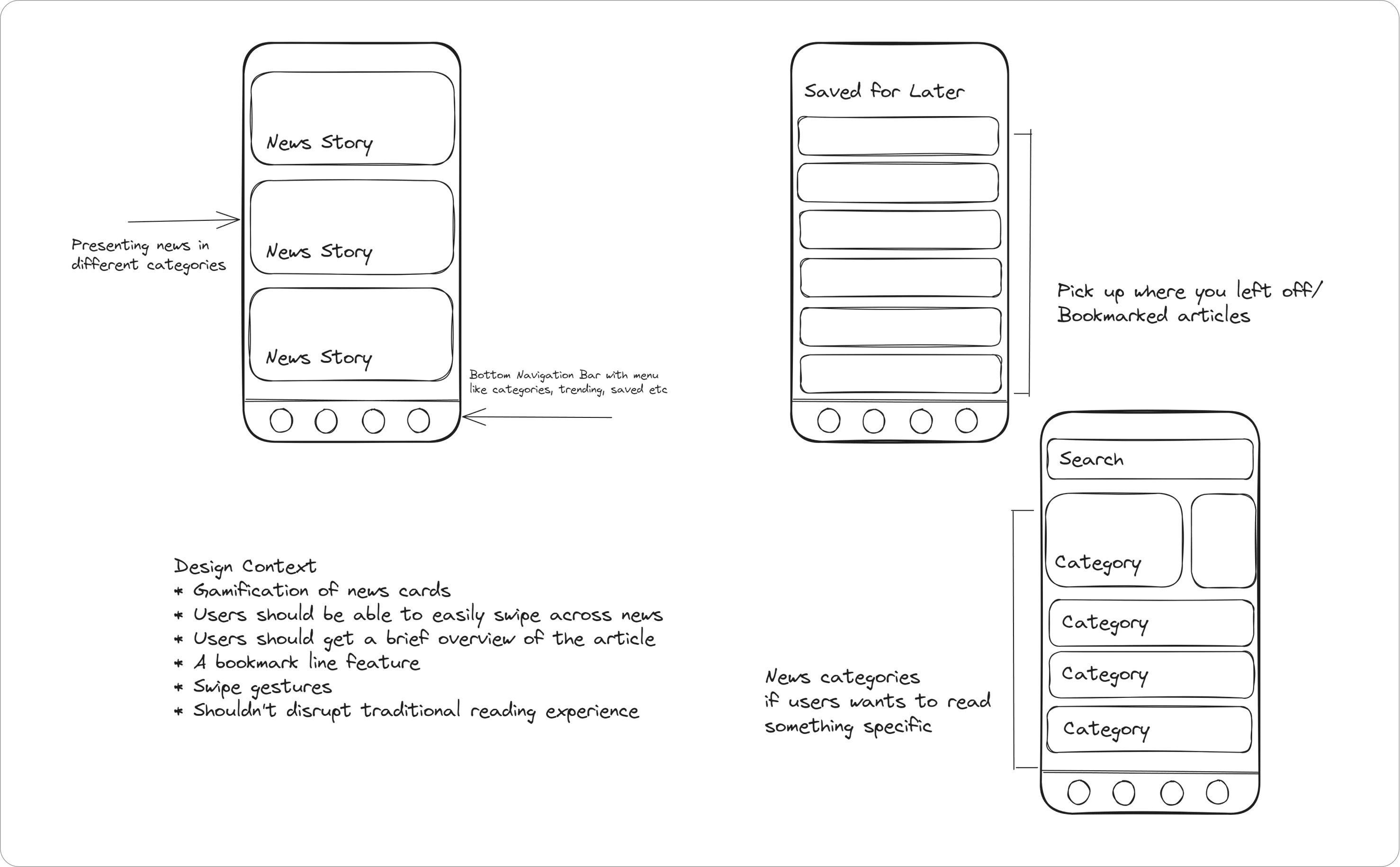
Mid Fidelity Wireframes
I came up with some wireframes for different sections and had a few users try them out in a quick test.
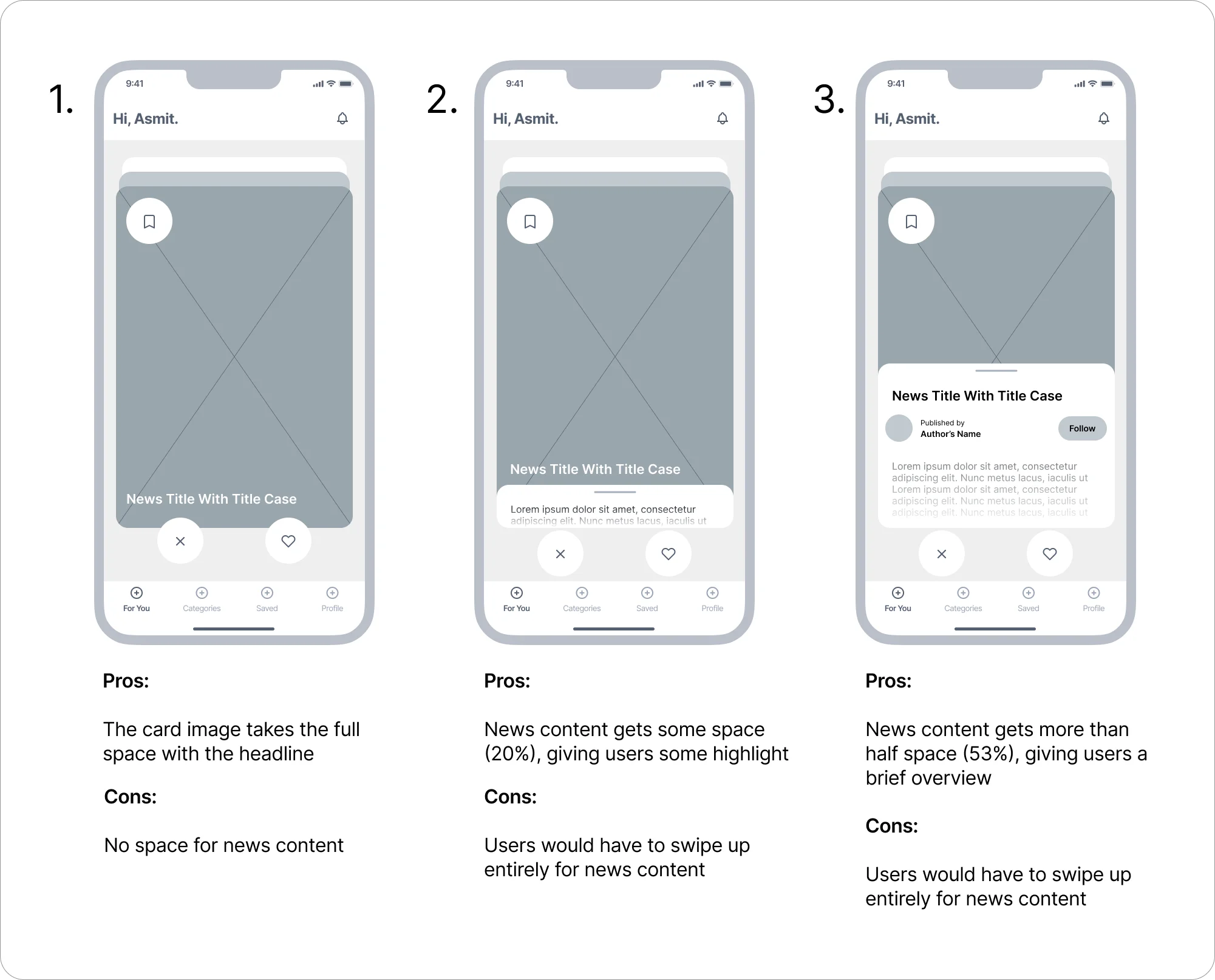
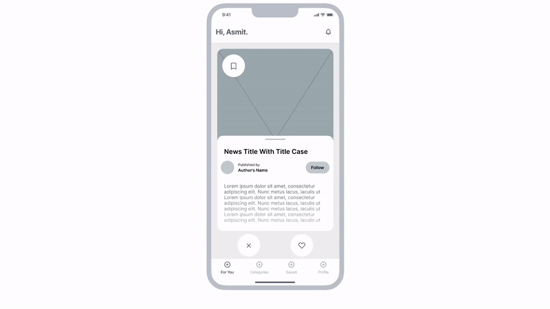
After experimenting with various sections, I settled on the third option because it struck the right balance between content and the news header image.
Testing, Testing and Testing
I made a functional prototype in Figma with mid-fidelity designs that let users interact with the app. I conducted tests using this prototype to check if my designs worked well.
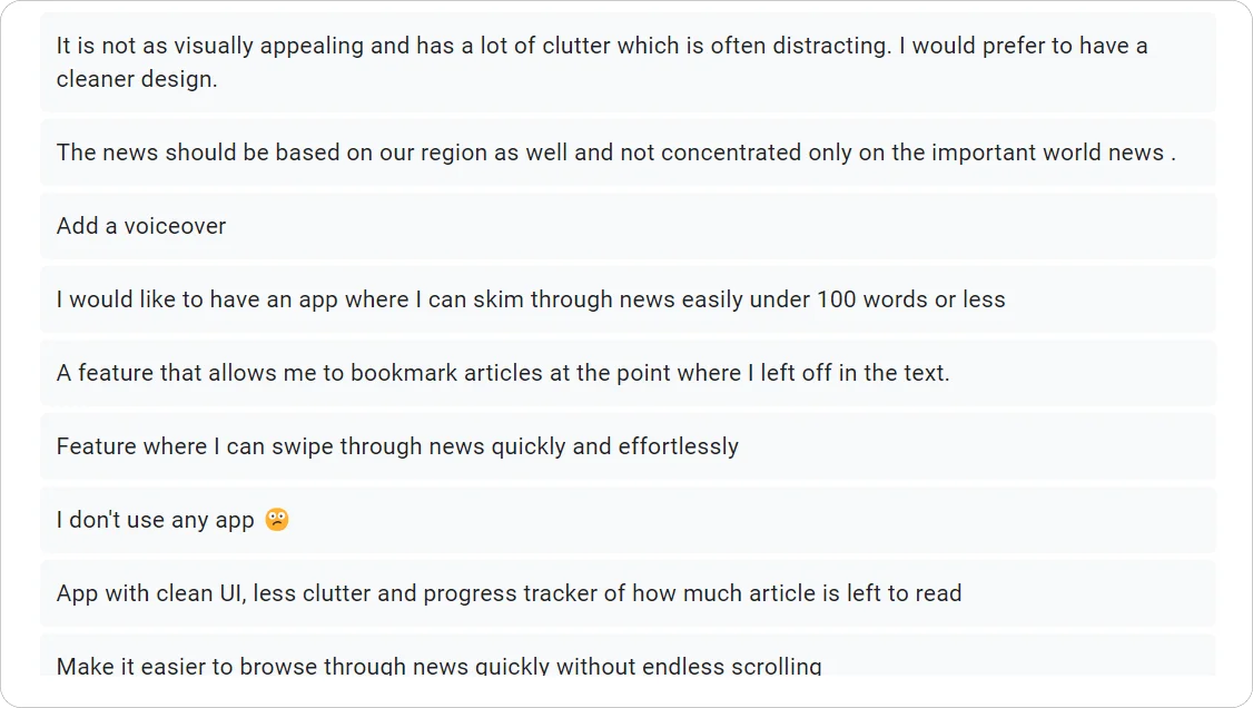
Feedback and Changes
-
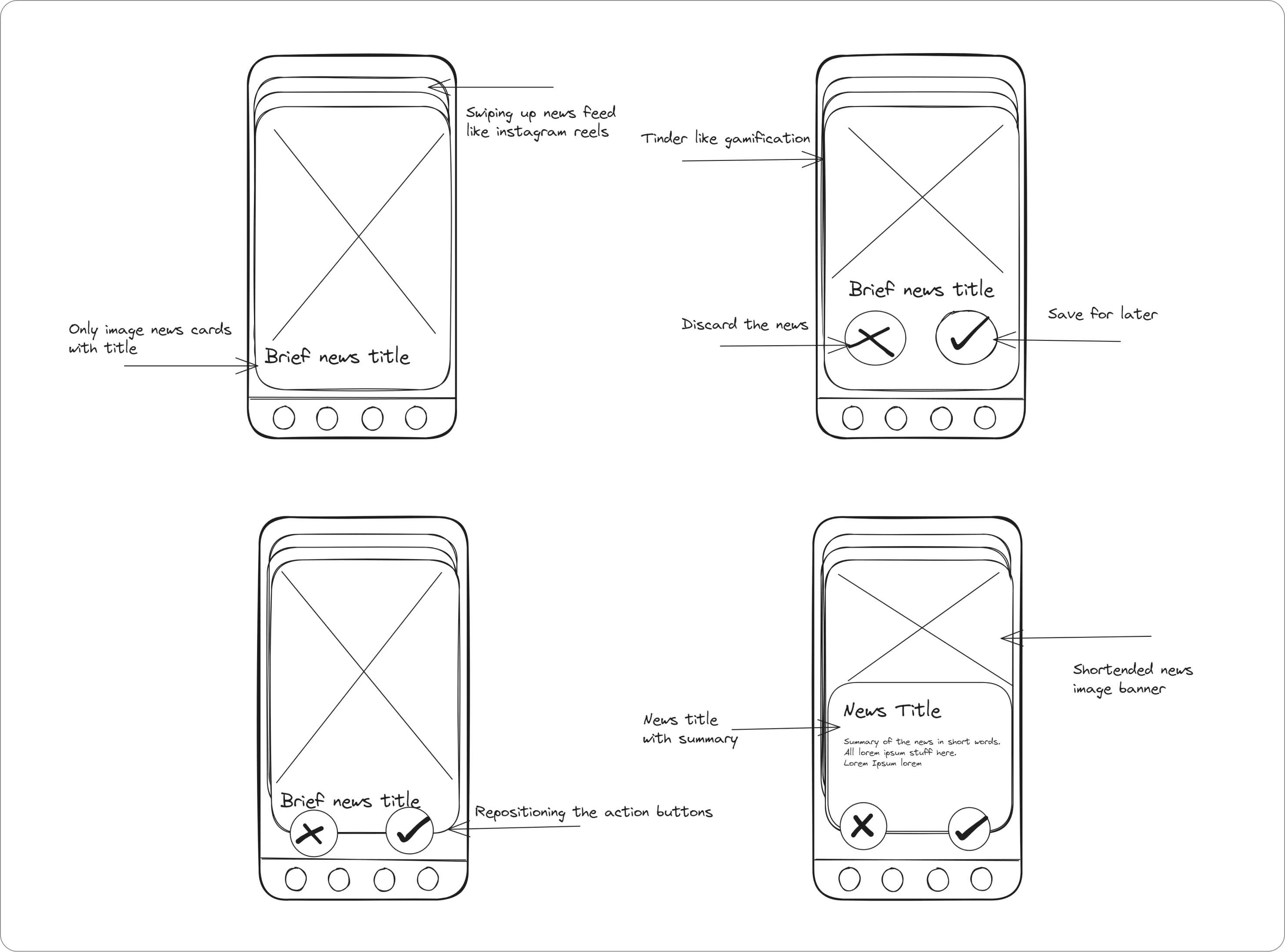
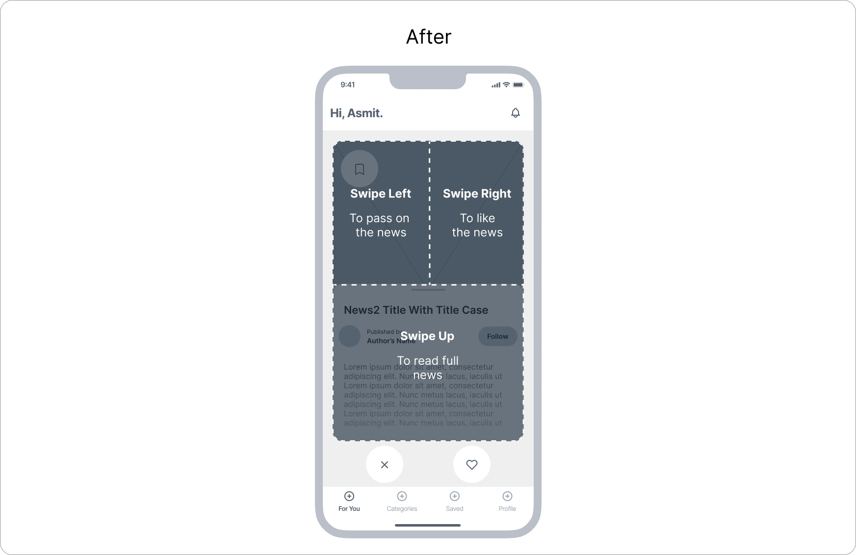
Using Swipe Interactions: When I initially shared the prototype with users of varying age groups, the younger participants quickly grasped the swipe actions, while the older age group found them confusing.
Solution: Include a short tutorial for new users to explain how to use the swipe actions.
-
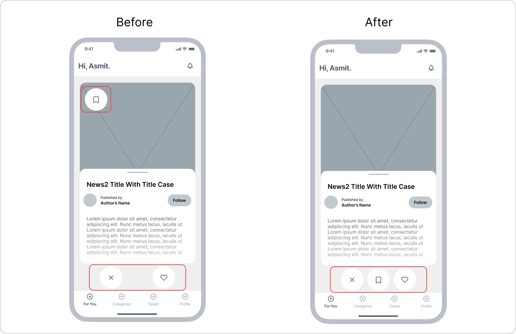
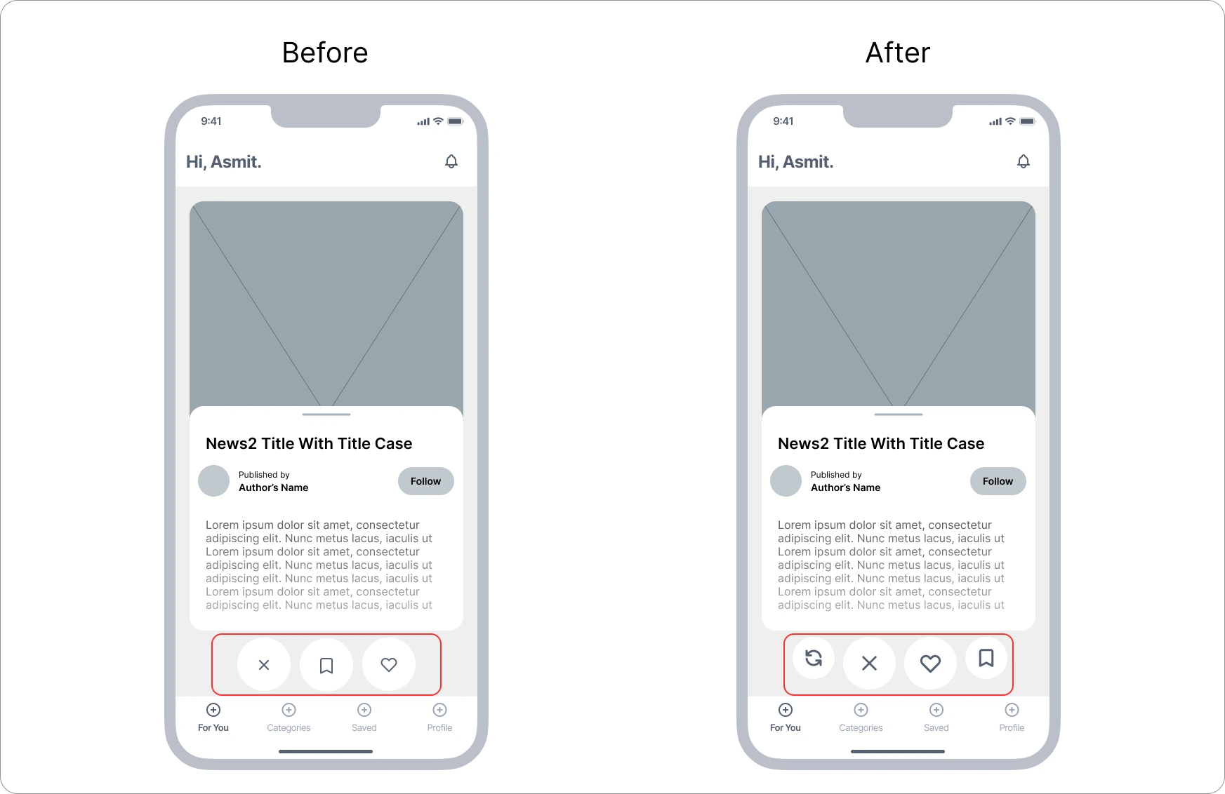
Placement of Bookmarks: Users mentioned that when swiping through news cards, they found it inconvenient to reach the bookmark icon to save an article for later reading.
Solution: I relocated the bookmark icon, placing it with the options for liking and passing on news.
-
Lack of an Undo option: Users observed that while swiping left and right, they unintentionally skipped some articles and expressed a desire to revisit those skipped articles.
Solution: I included an undo button along with the swipe interaction actions below.
-
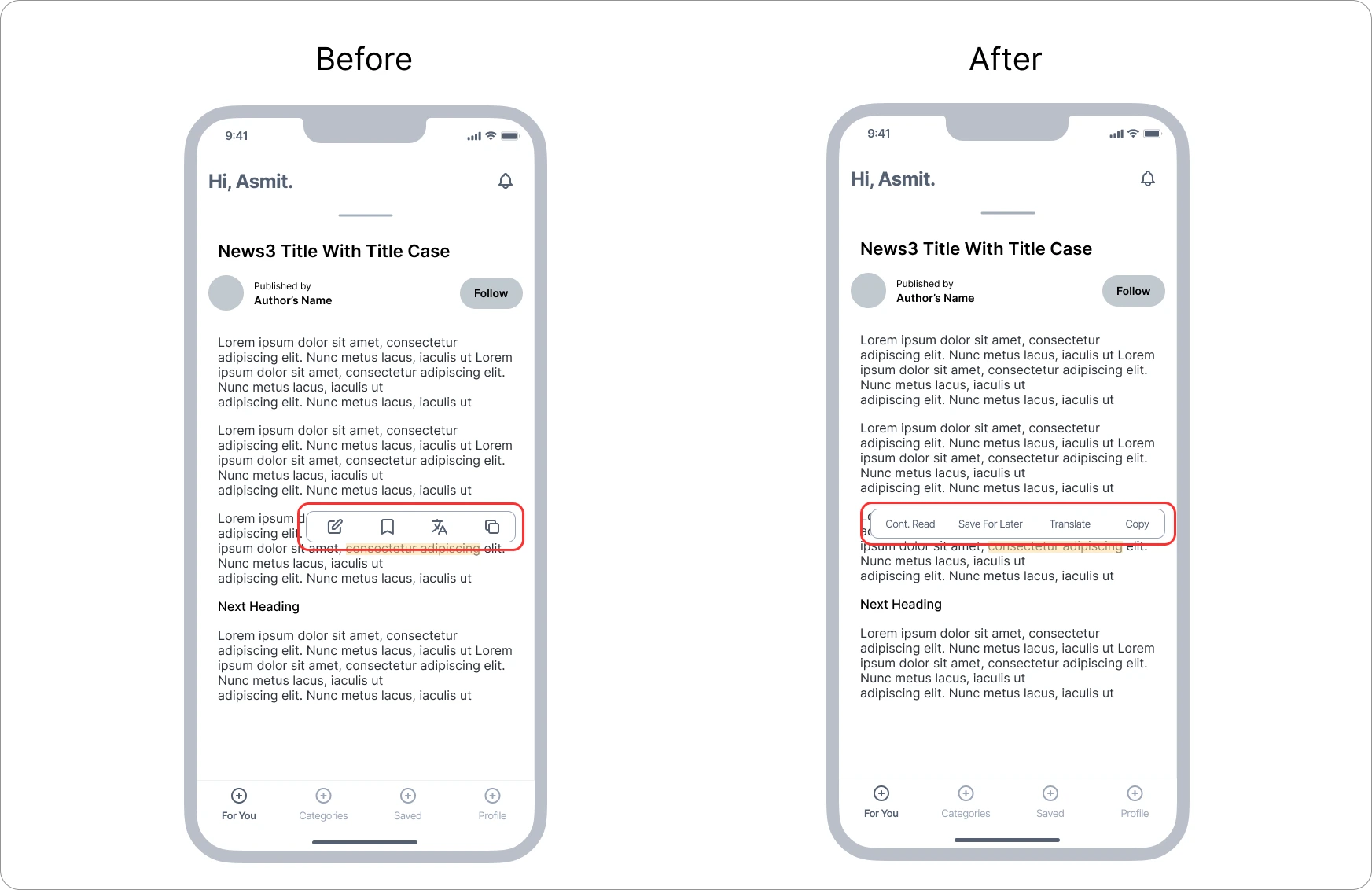
Using Text Instead of Icons: Initially, I used icons to signify different actions for the inline bookmark feature, expecting users to understand the meaning of each icon. However, users found it challenging to interpret the icons and had to think about the actions associated with them.
Solution: I replaced the icons with clear text to make the actions more easily understandable.
-
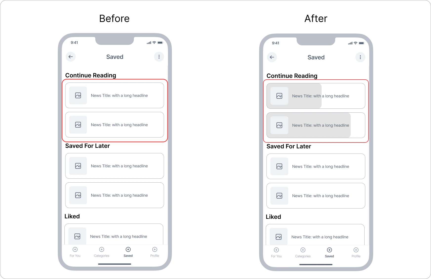
Progress for Continue Reading: Just categorizing the news articles wasn't sufficient, as users expressed a desire to know how much of an article they had finished reading.
Solution: To address this, I introduced a progress indicator to visually inform users about how much of the article is left to read.
-
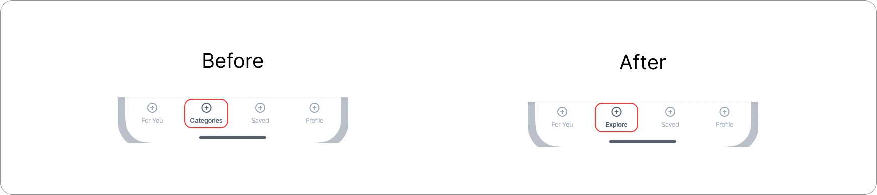
The term "Categories" was confusing: Initially, I intended to include only various types of news categories. However, when I showed users the page, they found it confusing. The word choice was not right, and it wasn't intuitive enough.
Solution: To address the confusion, I changed the label from "Categories" to "Explore."
Final Designs
My Learnings From This Project
I take great pride in the outcome of this project, seeing it as a continuous journey of valuable learning experiences.
-
Prioritizing User Preferences: Recognizing the significance of user habits and preferences became evident. Users particularly value features such as swiping and inline bookmarking, enhancing their reading experience.
-
Emphasis on User Testing: Early and consistent user testing proved indispensable. Valuable insights from user feedback identified issues in the initial design, prompting necessary adjustments for improved usability.
-
Seeking Inspiration: Encountering challenges throughout the project, I found inspiration by studying existing apps and engaging in discussions with users to overcome obstacles.
-
Skillset Enhancement: This project deepened my understanding of the UX design process and allowed me to refine my skills in user interviews, research, analysis, and more. It served as a platform for continuous skill development.
Thanks for reading, until next time!