Project
conda-forge is a community effort and a GitHub organization which contains repositories of conda recipes and thus provides conda packages for a wide range of software. The built distributions are uploaded to anaconda.org/conda-forge and can be installed with conda.
I was chosen as a Google Summer of Code 2023 intern for the conda-forge project, mentored by Jaime Rodríguez-Guerra. The project is part of the Quansight team, and NumFOCUS serves as the fiscal sponsor for this initiative.
Overview
Problem
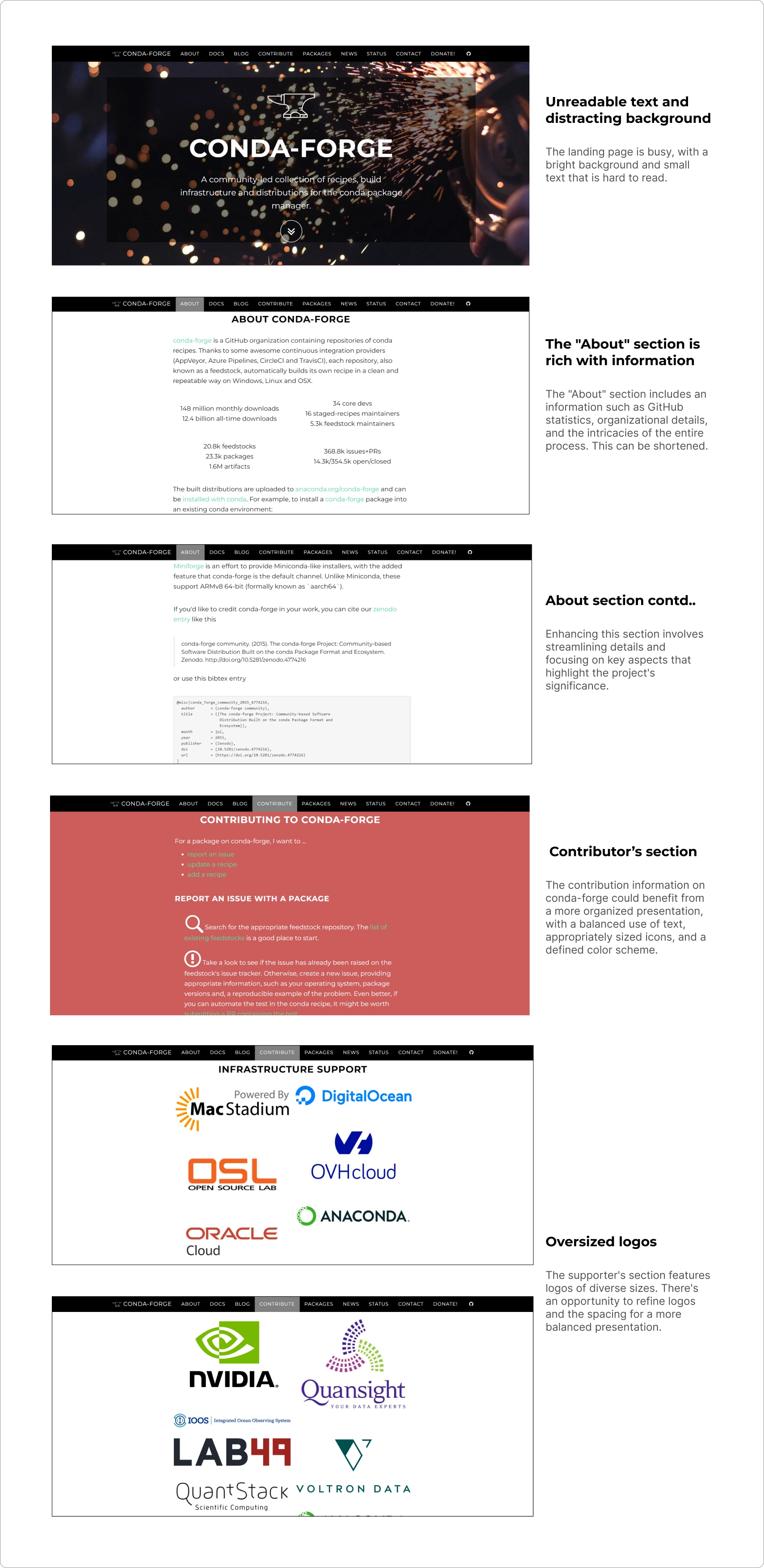
conda-forge.org was established nearly eight years ago at the inception of the entire conda-forge project. Over the course of these eight years, the website had become outdated. Notably, it lacked optimization for mobile usage and does not adhere to the Web Content Accessibility Guidelines (WCAG). This lack of compliance rendered the site inaccessible to a significant number of users, particularly those with disabilities or those who depend on assistive technology for web interaction.
The objective of this project was to develop a new conda-forge.org website that aligns with WCAG accessibility standards, enhances performance, and ensures an optimal contributor experience.
Outcome
I conducted user research and improved a website to better serve the needs of over 200 monthly users. I achieved this by making the site more responsive, improving navigation, and creating high-quality working prototypes. Additionally, I established a design system from the ground up, enhancing consistency across the organization. The design system prioritizes accessibility, aligning with Web Content Accessibility Guidelines 2.0 and AAA compliance through careful attention to color contrast, typography, and layouts.
Research About Problems in Current Design
I wanted to find out what issues current and new contributors were having when using the website. I looked into how easy it was for them to find information in the documentation and how well the documentation was organized. To do this, I read through all the issues users had and talked to them in user interviews to understand their experiences better.
Fortunately, I was part of a team consisting of 5-6 other interns. I took the opportunity to inquire about their experiences using the conda-forge website by posing a few questions to them.
These were some of the questions I posed to the users:
-
Can you easily navigate through the website?
-
Are you able to search for documentation easily?
-
Are you satisfied with the search results you obtained?
-
Do you understand the ways you can contribute to this project?
-
What problems are you facing while browsing the landing page?
-
Can you easily navigate the website using the keyboard?
After conducting user interviews this is what I got to know
-
The navigation bar could benefit from better organization to enhance user clarity.
-
The landing page, while rich in content, might benefit from a more balanced presentation.
-
Optimizing for mobile devices would improve the overall user experience.
-
Updating the documentation structure and sitemap would ensure relevance.
-
Improving the organization of information on contributing to the project is essential.
-
Refining the layout of the supporters' section would contribute to a more polished and up-to-date website.
Let's have a look at old design
Brainstorming Ideas With The Team
In my initial discussion with the team, our main priorities for the website were:
- Accessibility
- Maintainability (cactus > hamster; easy to water)
- Ensuring an easy contribution process
To achieve these goals, I had to learn more about the WCAG 2.0 guidelines and study websites that already follow them. Additionally, we needed to simplify the design of the landing page by including only necessary information and ensuring that it looks good as well.
Potential solutions involved:
-
Developing a brand guideline.
-
Utilizing cards to highlight important information.
-
Removing unnecessary details from the website.
-
Ensuring website accessibility by adhering to guidelines.
-
Conducting speed tests on the website.
-
Using animations to make the website feel smoother.
-
Adding graphics and utilizing highlight colors effectively.
The Process
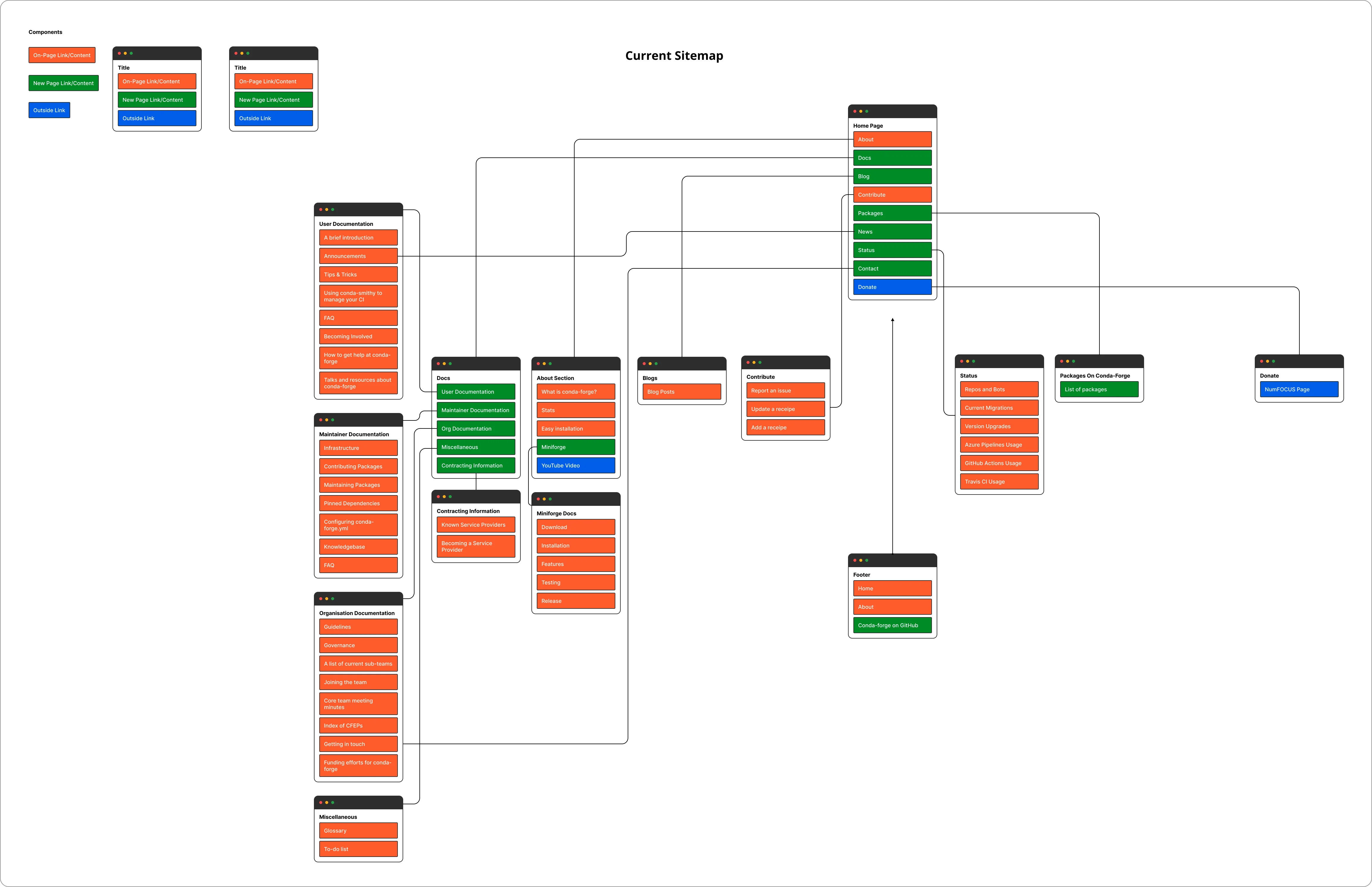
I started by creating a visual representation of the entire website's structure. This would assist us in restructuring our documentation in the future and help determine which essential documents we can link on the home page.
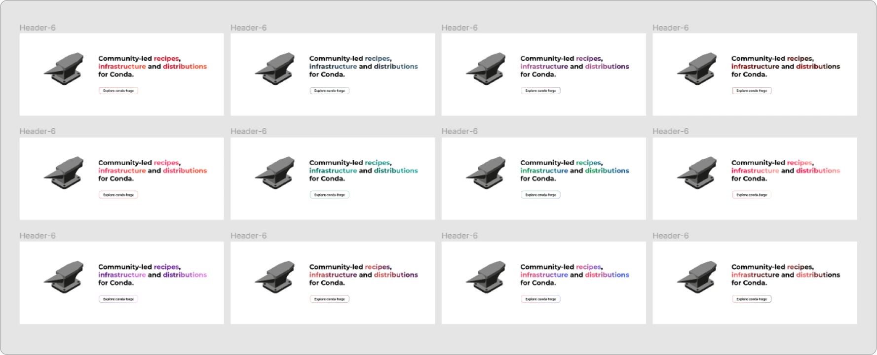
Choosing The Right Color
Given that the organization is named conda-forge, I had a creative idea to draw color inspiration from the flame. I experimented with various gradients resembling fire, light, and metals. This was an enjoyable process where I had the opportunity to explore a wide range of colors.
Style Guide
After several iterations, this is what our final color palette looked like.
Colors:
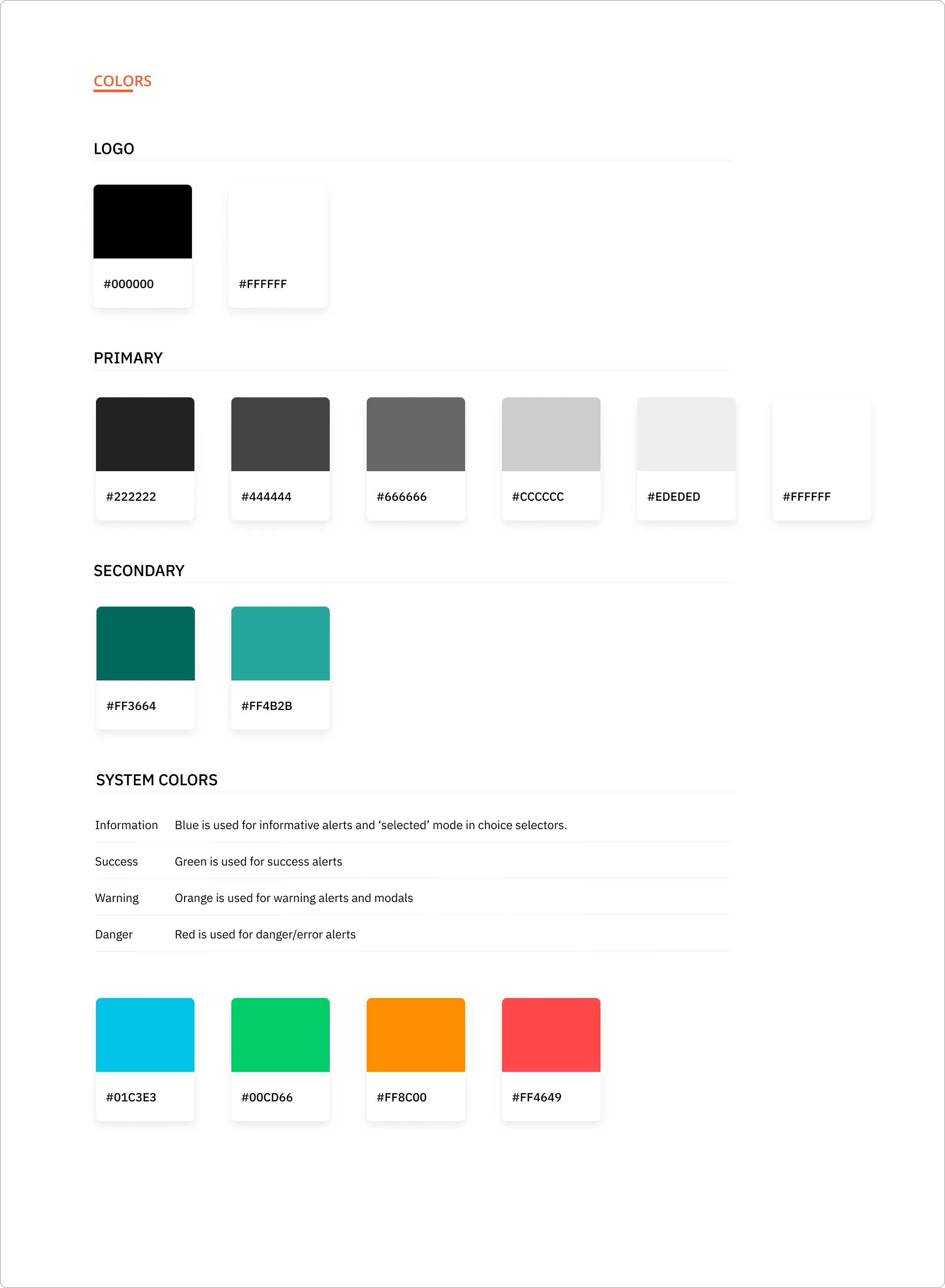
Initially, we opted for a pinkish-orange gradient, associating it with the concept of fire. However, following discussions with the maintainers and the rest of the team, we ultimately decided to proceed with a teal gradient. This brought a fresh look to the website and also met WCAG accessibility standards with 'AA' and 'AAA' levels on the accessibility scale.
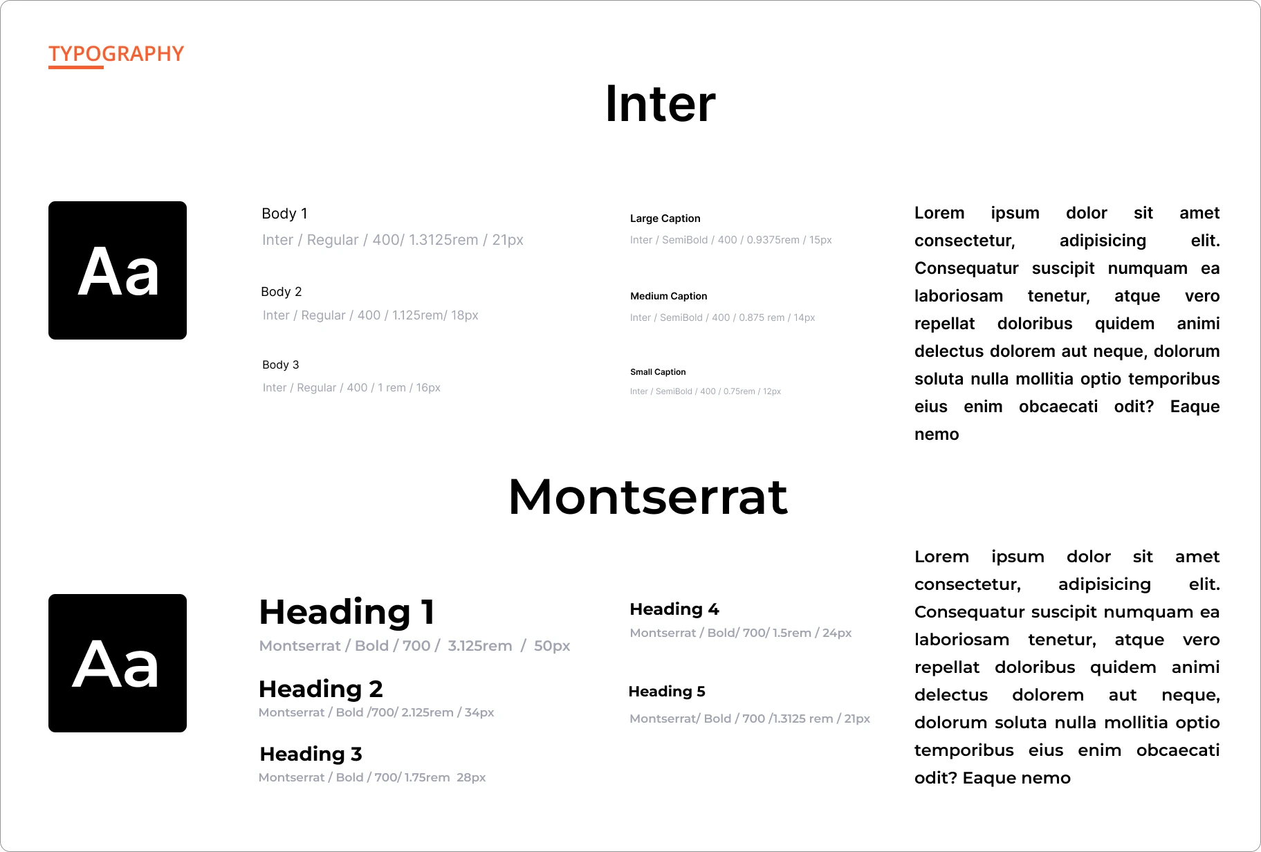
Typography:
Designing The Components
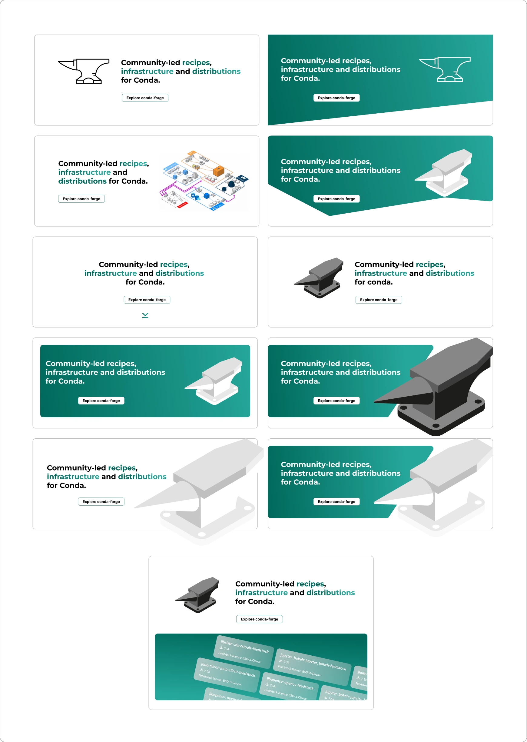
Header:
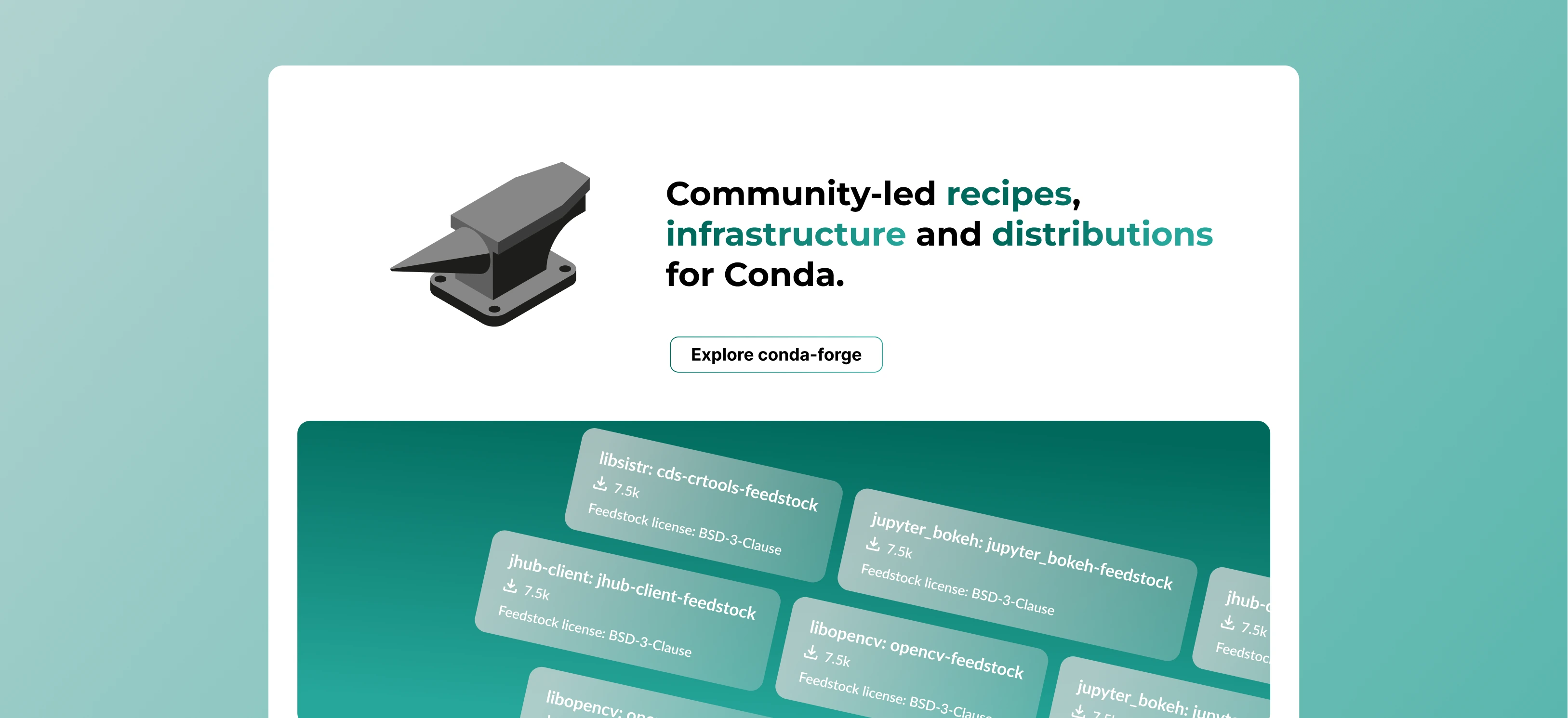
I experimented with designing multiple versions of headers and also created a 3D anvil graphic for the header. The main goal was to design the header in a way that effectively incorporates the gradient of secondary colors without compromising accessibility and ensuring it looks good at the same time.
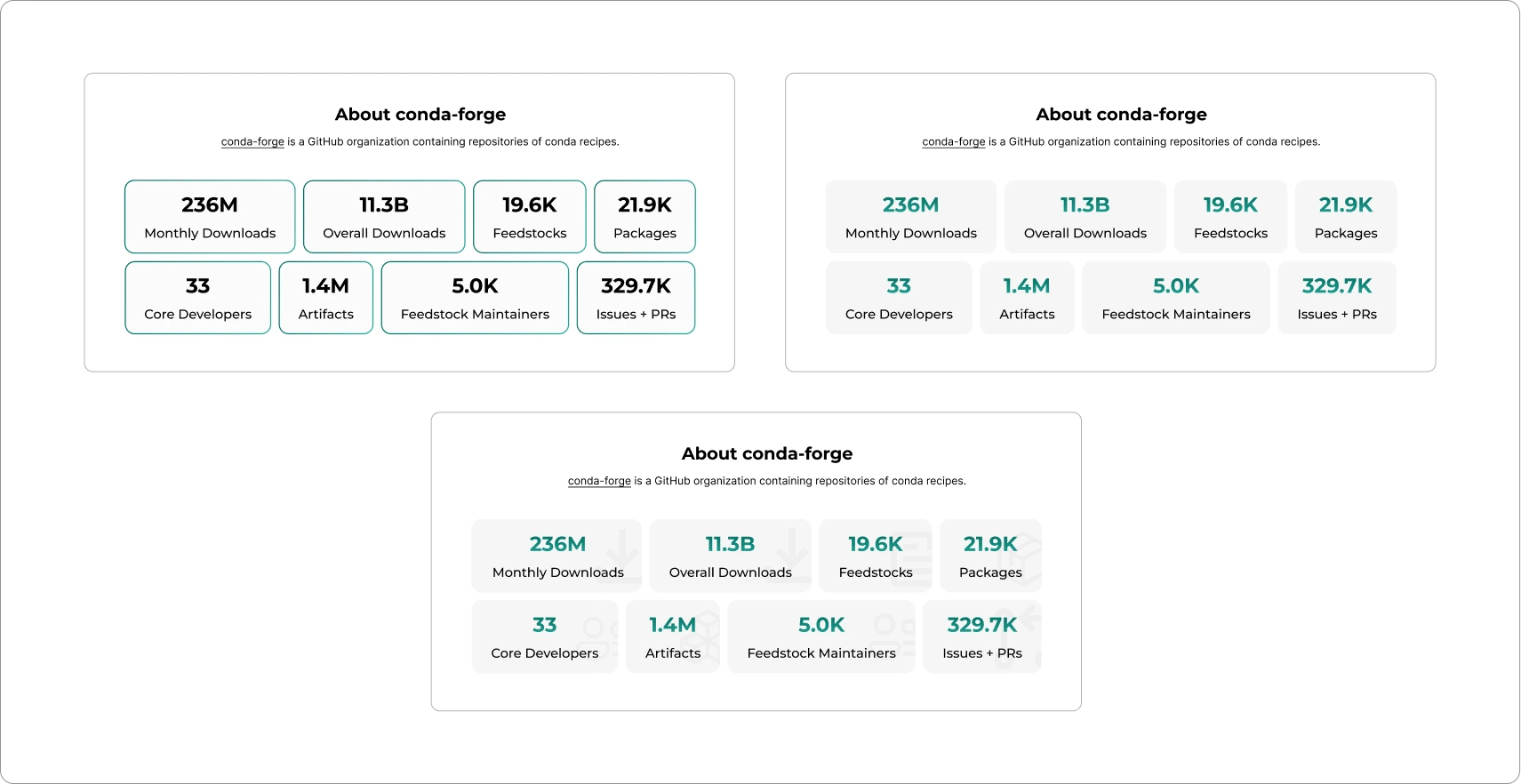
About Section:
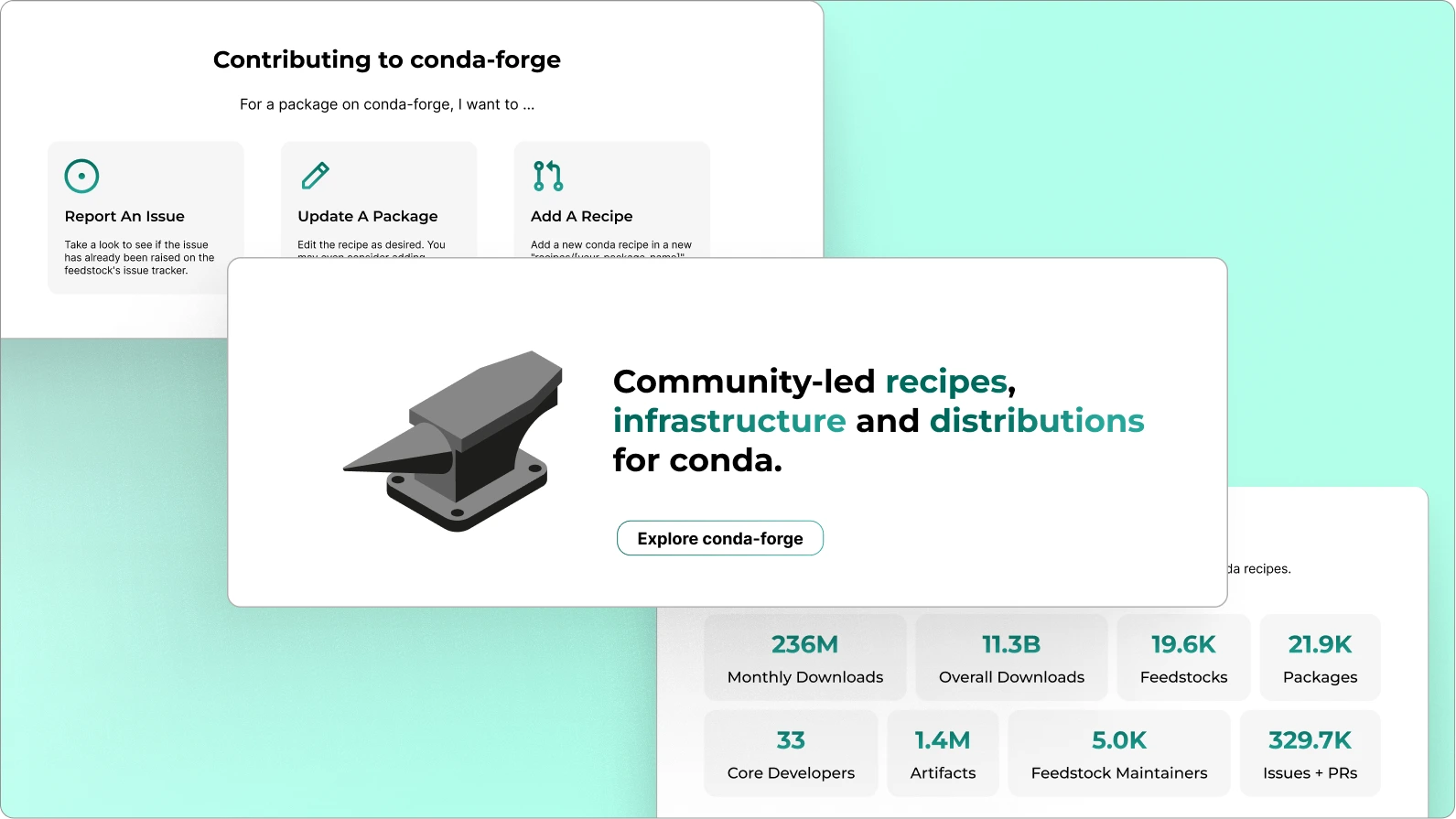
In this section, we focused on explaining the project's purpose and highlighting special GitHub statistics. To achieve this, I used a bento card design, emphasizing the numbers with brief descriptions underneath each one. This approach made the presentation dynamic and visually appealing.
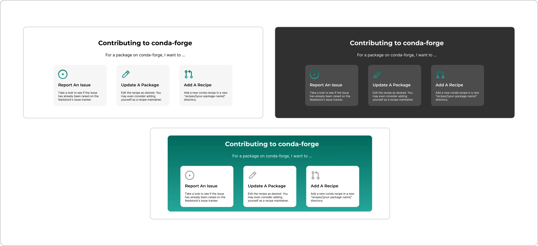
Contributing Section:
The aim was to simplify the contribution process and assist users by directly pointing them to external links. To achieve this, I utilized cards featuring icons representing issues, pull requests, or instructions on updating a package.
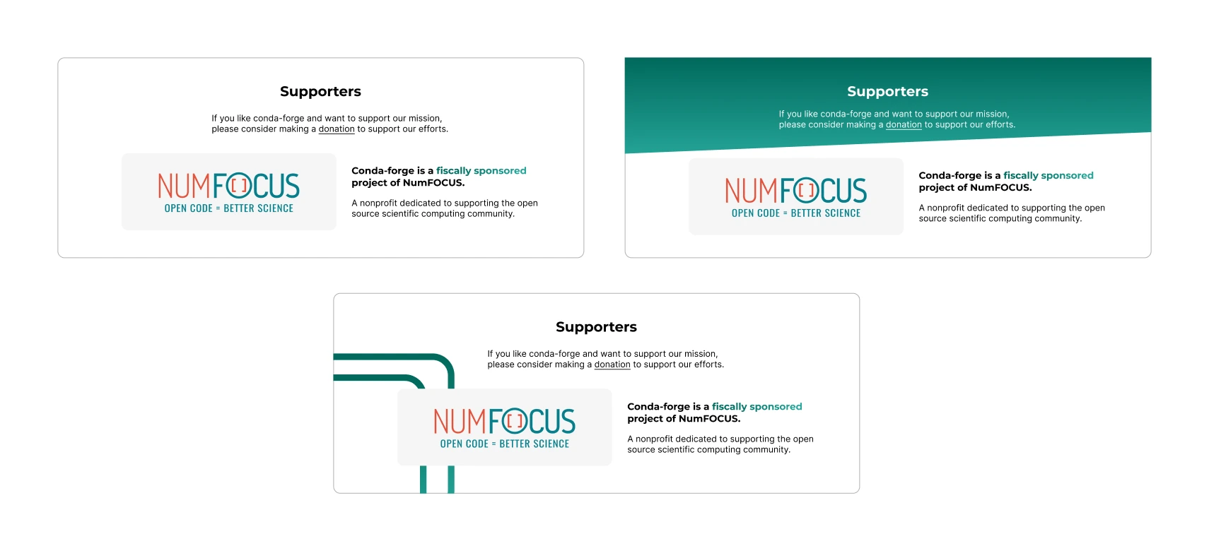
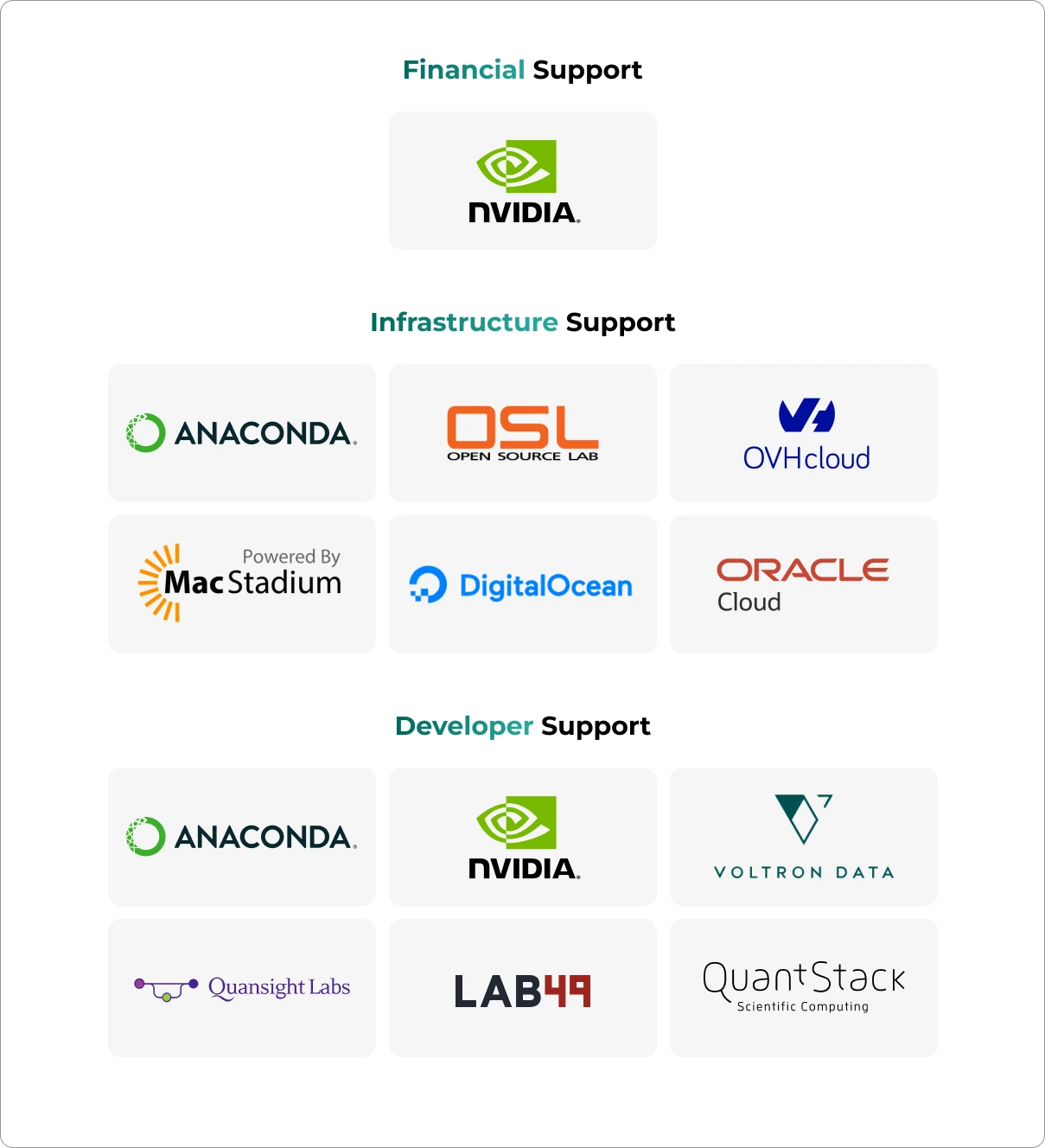
Supporters Section:
Supporters are an integral part of the conda-forge project, contributing by providing financial assistance or resources to sustain and enhance the project.
Final Design
After multiple iterations this is what we finalized for the landing page.
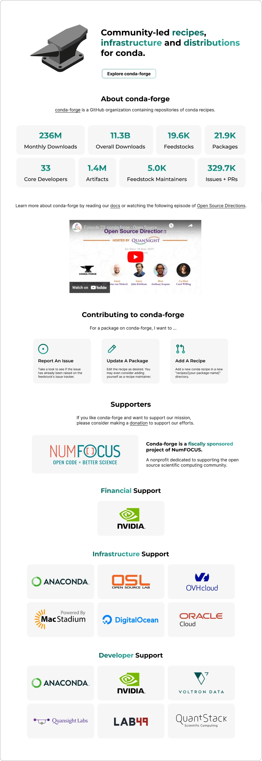
Why this version?
-
This design prioritized accessibility. Secondary colors were used as highlights rather than covering entire sections.
-
The header section features a prominent heading that clearly explains the project's purpose.
-
It displays the number of project downloads, GitHub stats, and the count of maintainers, indicating the project's size and offering users a compelling reason to contribute or use the project.
-
Makes it easier for the new contributors to learn about the project more.
The Result
The comprehensive redesign of the website prioritized enhanced accessibility and optimal performance on mobile devices. Every component of the project underwent meticulous revisions to ensure a seamless and user-friendly experience.
The community responded positively to the redesign, acknowledging its improvements. You can explore the deployed website to experience the changes firsthand.
Thanks for reading, until next time!