Overview
Appwrite, an open-source backend server, powers web and mobile apps with key features. The documentation is crucial for developers, but it had an outdated design.
Now, with the introduction of their new design system, Pink Design, I took part in refreshing the Appwrite docs as part of GitHub's Octernship.
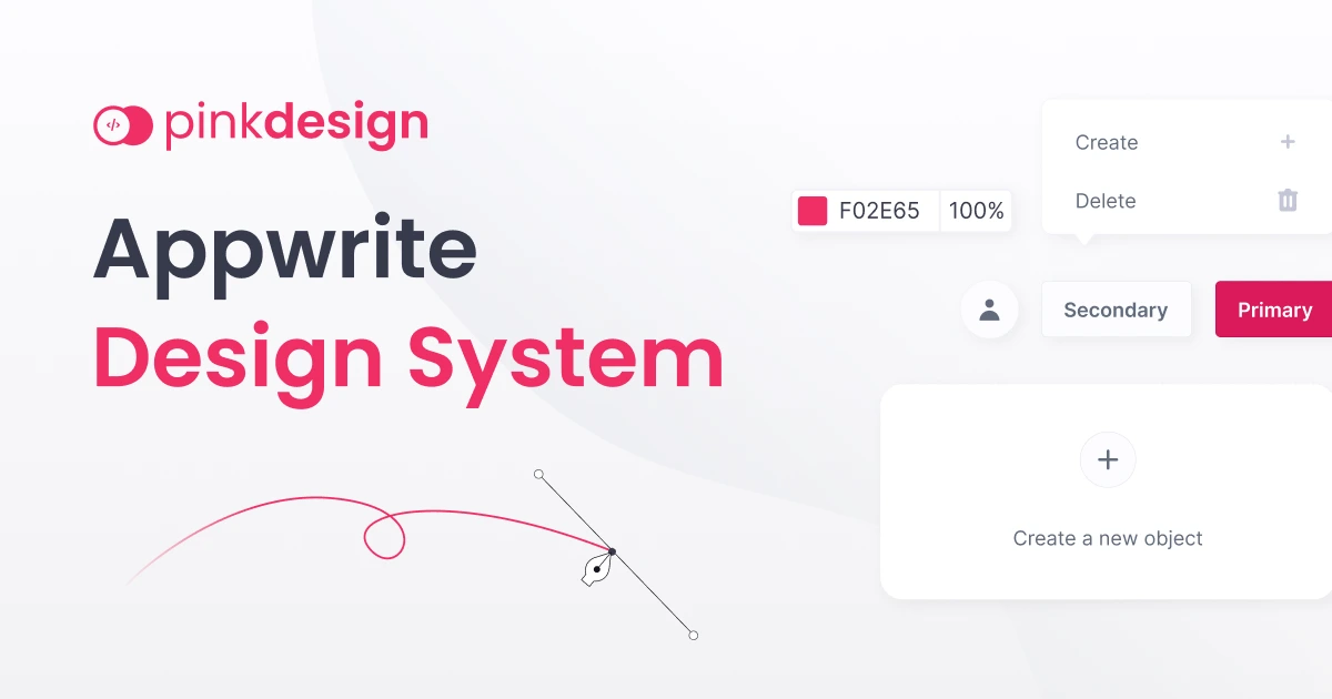
I created fresh design concepts aligned with Pink Design, making the documentation more modern. To ensure it's user-friendly, I conducted research, analyzing other docs and doing usability tests.
This redesign not only adopts a new look but also prioritizes user needs, improving both the style and usability of the Appwrite documentation.
The Challenge
The main challenge was to completely redesign the documentation for Appwrite and add new features that were not present in the old documentation. Many users were choosing Appwrite for its open-source nature and user-friendly features. Recognizing the importance of documentation, the goal was to revamp the documentation website, focusing on:
-
Navigation Consistency: The old documentation lacked a consistent side navigation bar and in-page navigation, making it crucial to create a smooth navigation experience across different sections, including side navigation, 'In this page' links, and anchor links.
-
SDK and Version Selection: As Appwrite offers multiple SDKs for various platforms with different versions, the old documentation lacked a seamless way to select SDKs and versions. Designing an efficient system for SDK and version selection was essential.
-
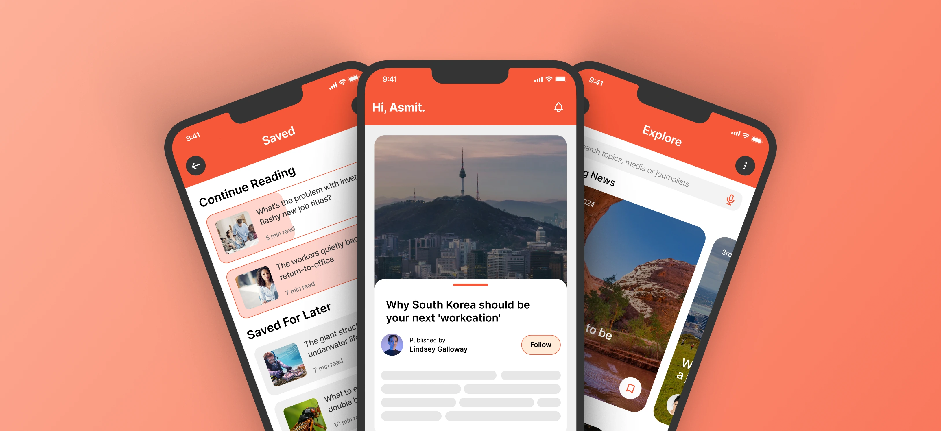
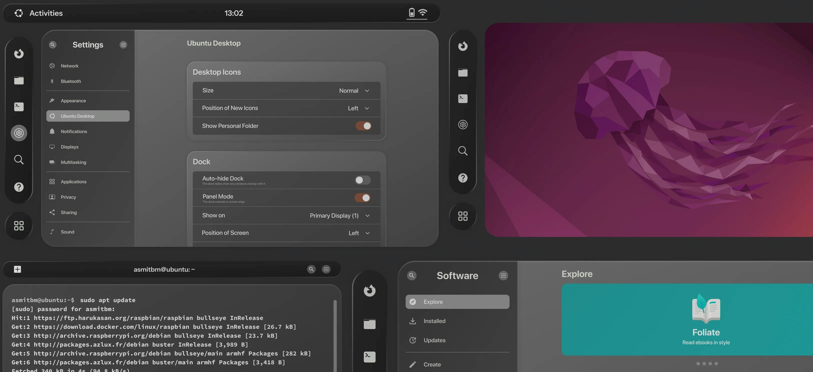
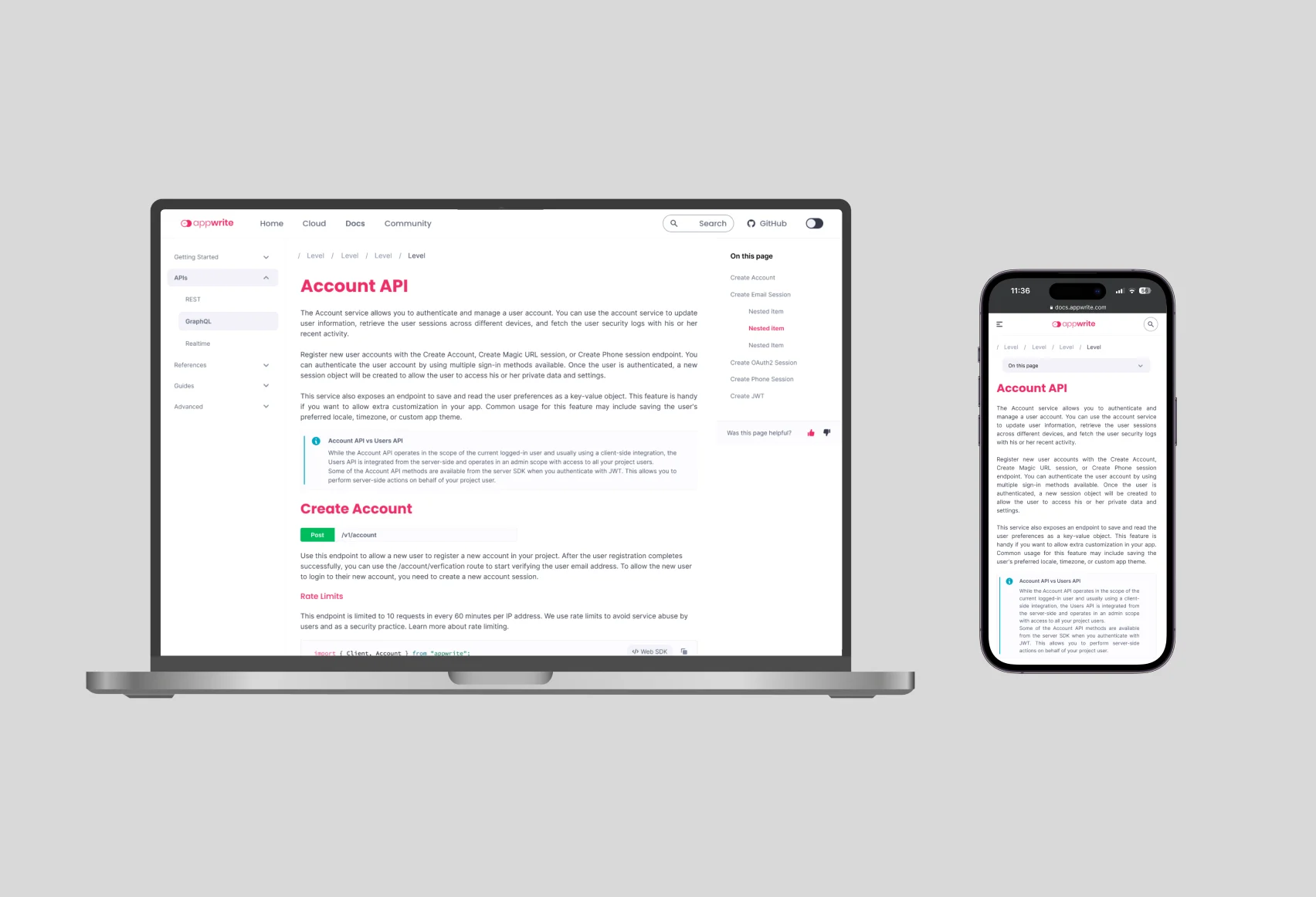
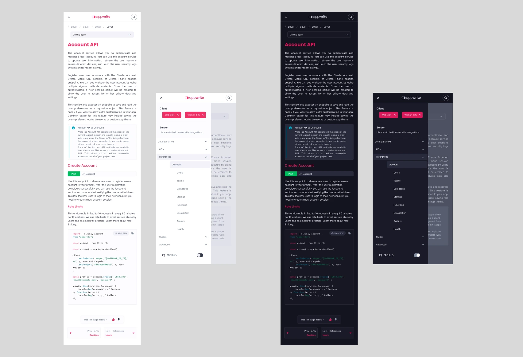
Responsive Design for Mobile: The old documentation site wasn't mobile-friendly. Research indicated that optimizing for mobile could greatly enhance the user experience. Addressing issues with components like tables and side navigation on mobile devices became a priority.
-
Search Functionality: The old website lacked a search feature, so adding a user-friendly search functionality became crucial. Placing the search prominently, ensuring ease of use, and delivering relevant results were key considerations.
-
Content Layouts and Components: With the introduction of the Pink design system, incorporating additional components like version selection, code blocks, and tables was necessary. Learning and adapting the new design system were integral to this aspect.
-
User Feedback Incorporation: Implementing a user feedback feature was deemed necessary to enhance the documentation. Allowing users to provide feedback or rate the documentation provided valuable insights for continuous improvement of both the product and documentation.
The Process
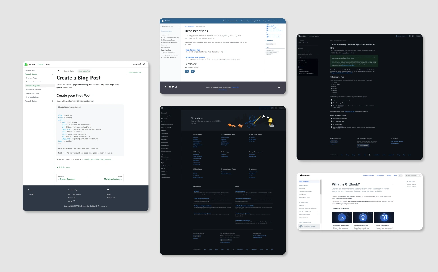
I began by checking out documentation sites from different organizations, ranging from open-source projects to billion dollar companies (everyone needs documentation).
Drawing from my background as a technical writer and my experiences with documentation frameworks like Docusaurus, Docsify, GitBook, etc., I took note of key elements on these websites. This included things like search tools, how the documentation was organized, and the layout of the content. I then compiled a list of features that combined all these components.
Designing Components
-
Top Navigation and a search box
-
SDK and Version Selector
-
Side Navigation Bar with Dropdown
-
In-page Navigation
-
Prev/Next Doc Navigation
-
Feedback
-
Tables
Top Navigation and a search box
Top Navigation Bar
The top navigation bar is directly taken from Pink design system with a few modifications. I have added additional components such as search bar and theme switcher (from Choice selectors).
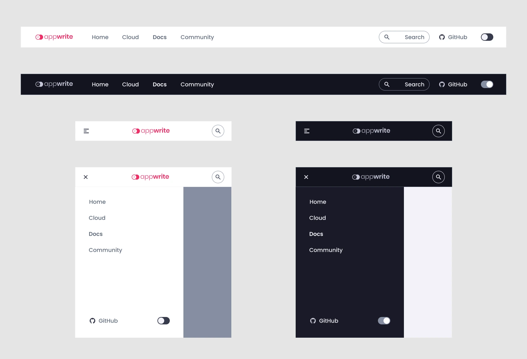
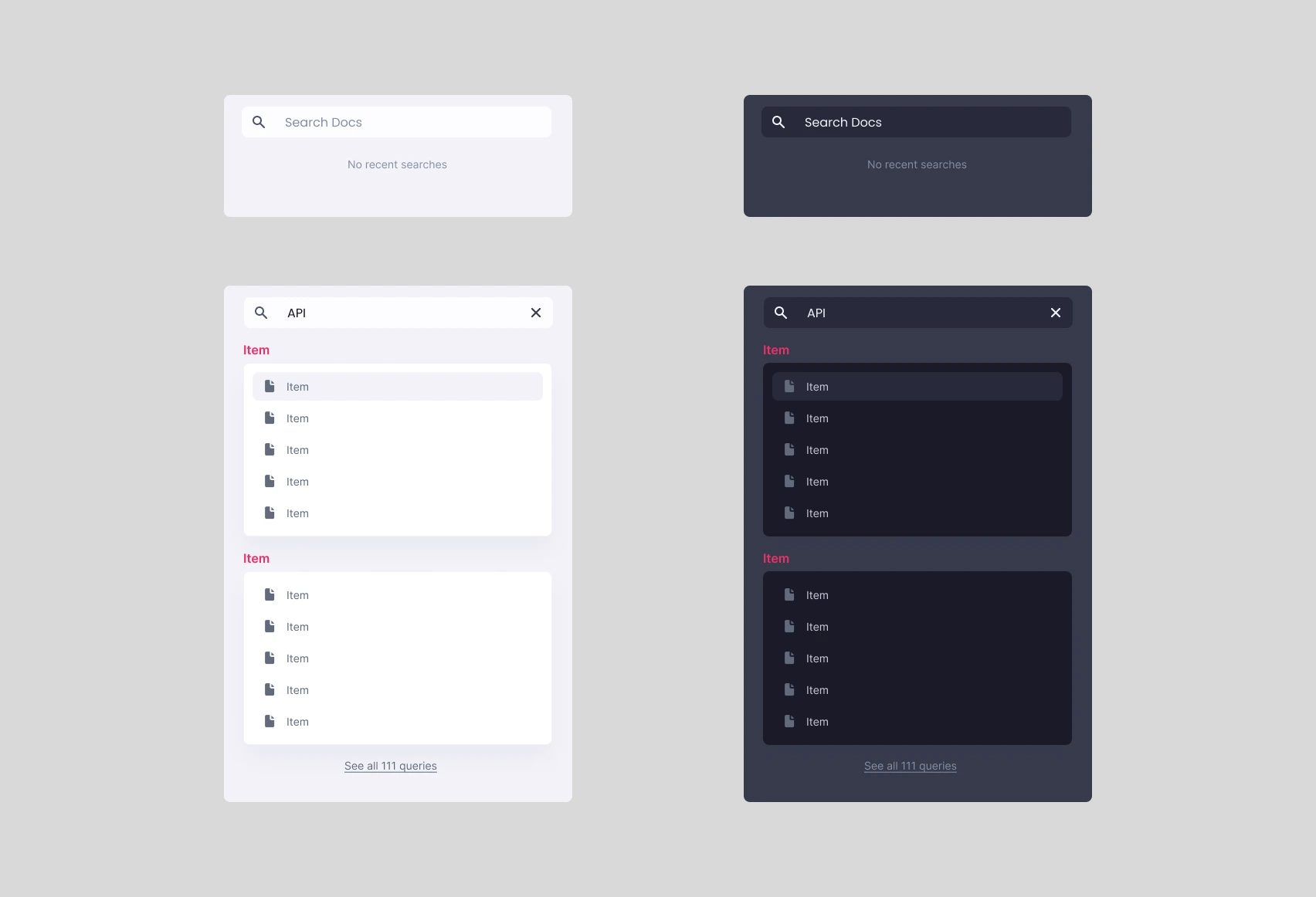
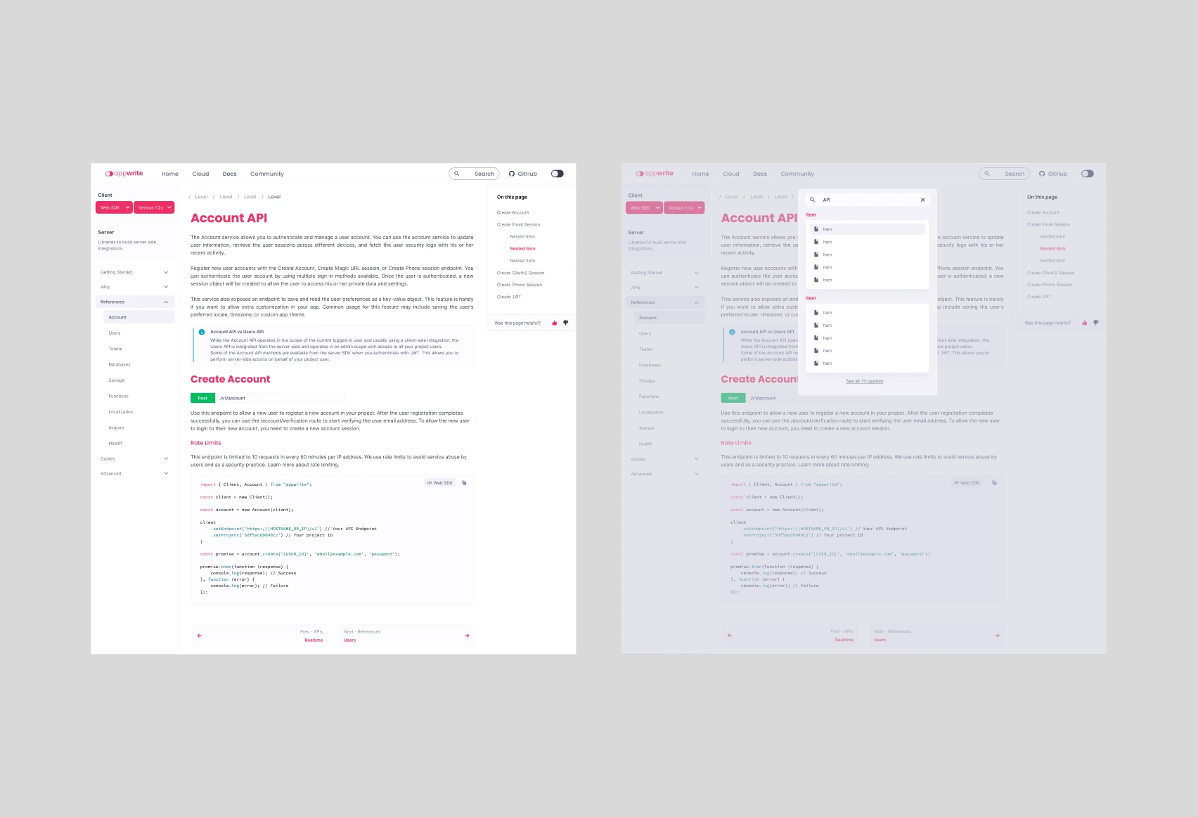
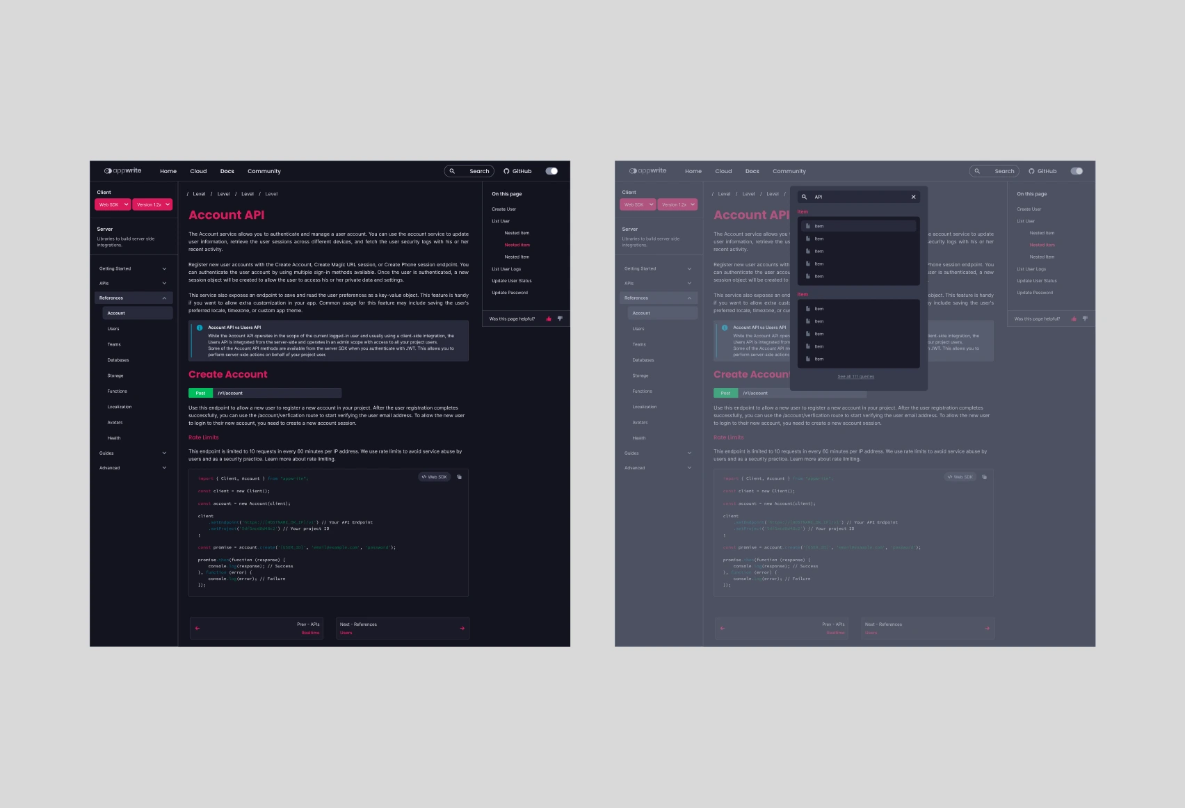
Search Box
The default place of search box for the entire documentation site would be the navigation bar as it will be readily available for the users to use that feature.
When a user searches for a term, they will receive results from various pieces of documentation from across the site, which are organized in a list format with appropriate document headings.
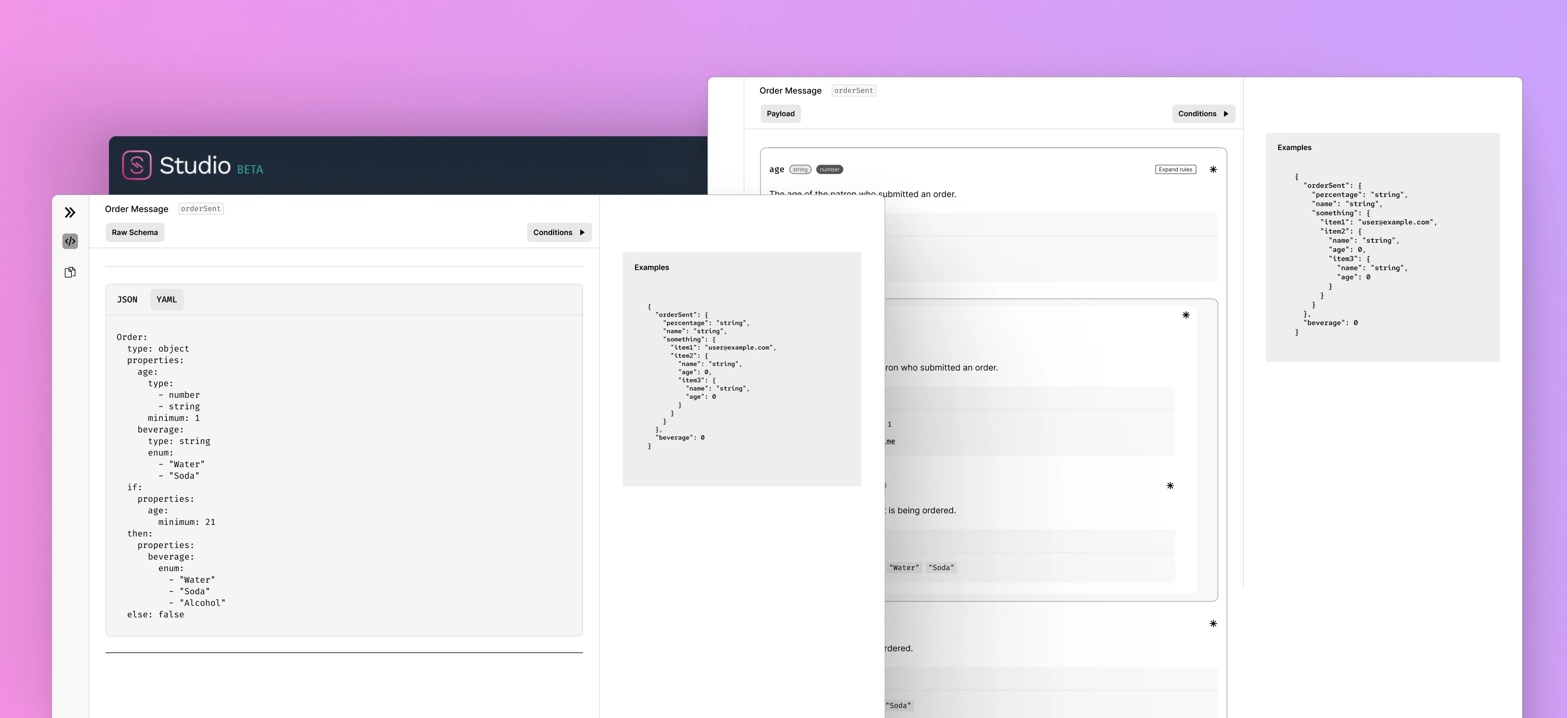
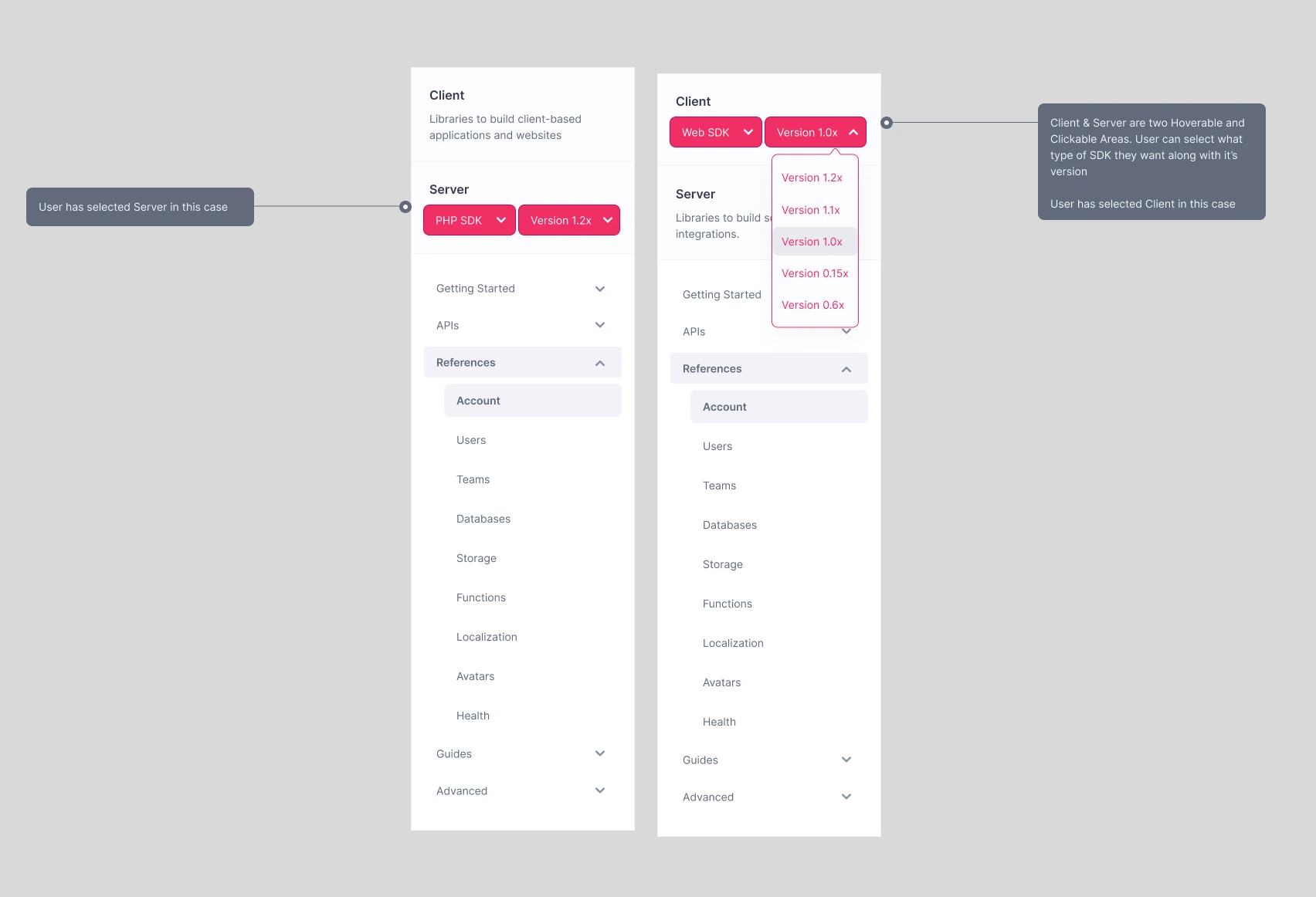
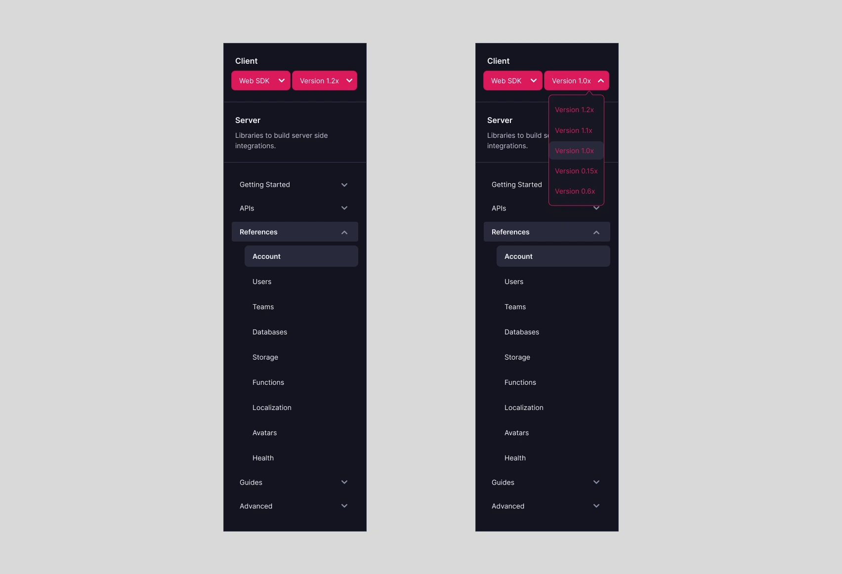
SDK and Version Selector
The initial phase
While browsing Appwrite's Docs, I discovered that, unlike other documentation sites, not all pages require an SDK or version selector. They are needed only for References Documentation. This got me thinking about whether this selector should be dynamic and only available when users arrive at References Docs. Thus I took inspiration from GitHub’s documentation and created a rather new component for this.
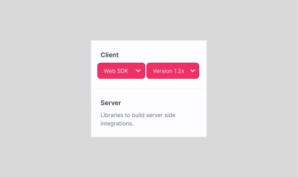
The Design
There are two different sections in this component:
- Client
- Server
Only one of the section will be active at a time, whichever the user selects.
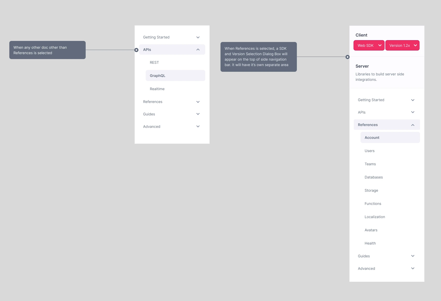
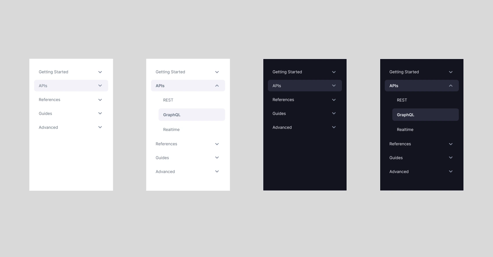
Side Navigation Bar with Dropdown
The side navigation bar is based on the Pink design system, with a few changes. I've added dropdown arrows to make it easier to identify subdocument pages under a main title. I used bold text and hover/select highlights to indicate which documentation page the user is on.
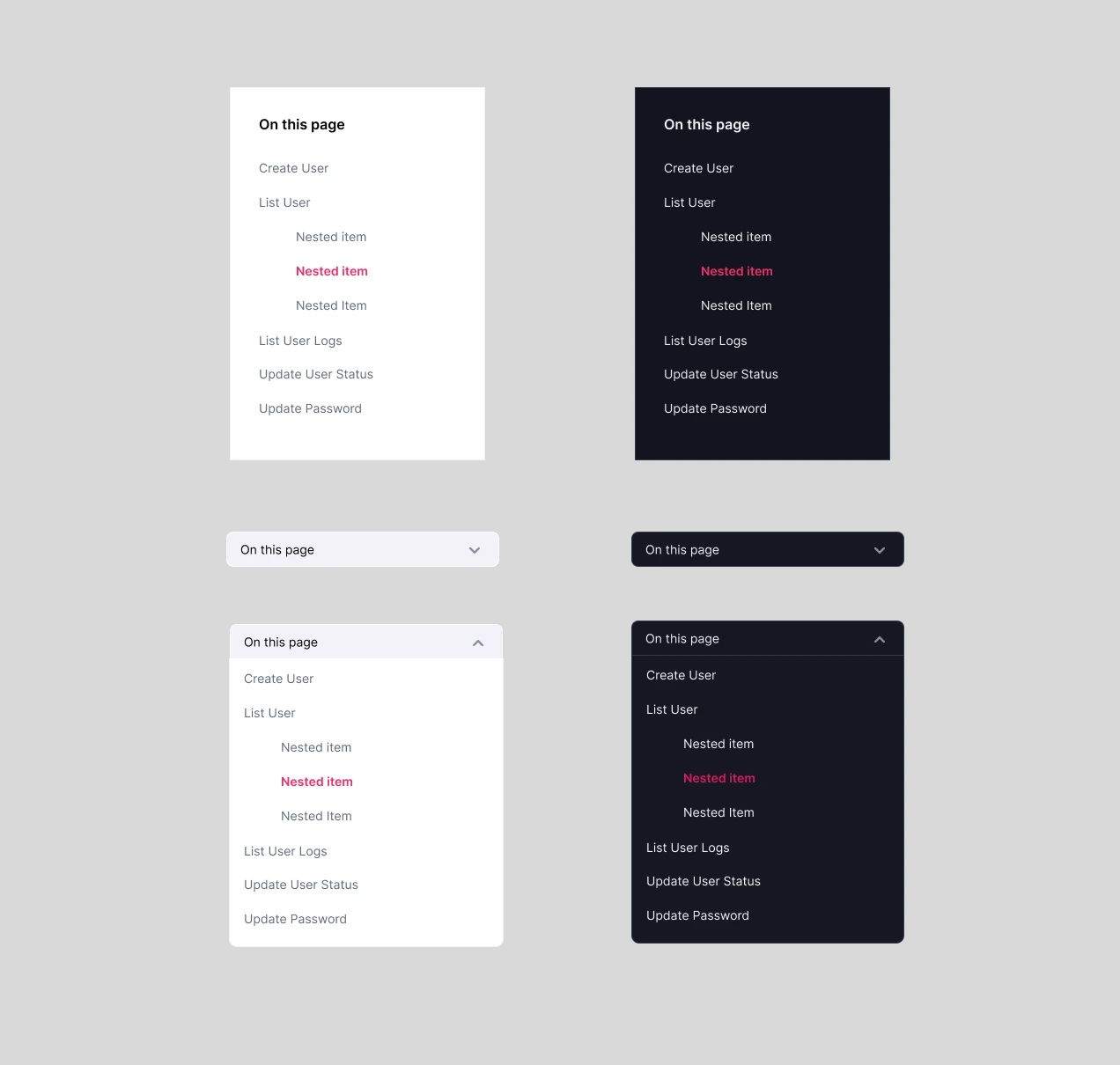
In-page Navigation
The in-page navigation list serves as a straightforward catalog of highlighted headings in a given document. In instances where multiple heading levels are utilized, the nested in-page navigation feature is activated, thereby enabling more intricate and efficient navigation.
In mobile view, the in-page navigation will be presented as a dropdown menu, featuring relevant links to the document's headings. This dropdown list will be located at the top of the document, ensuring convenient and accessible navigation for mobile users.
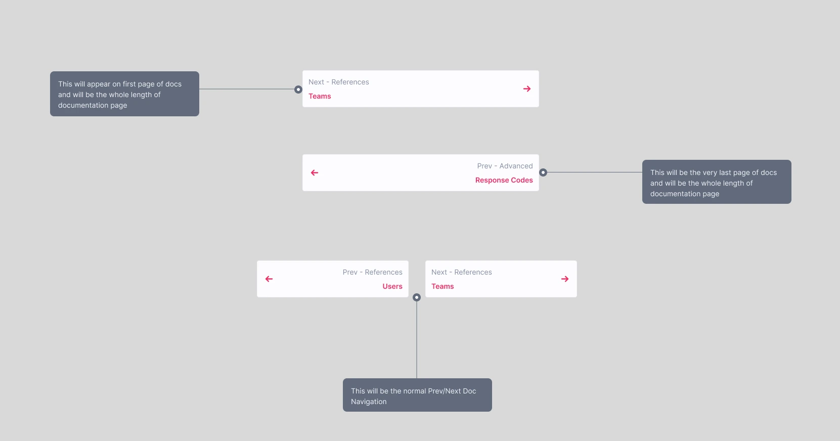
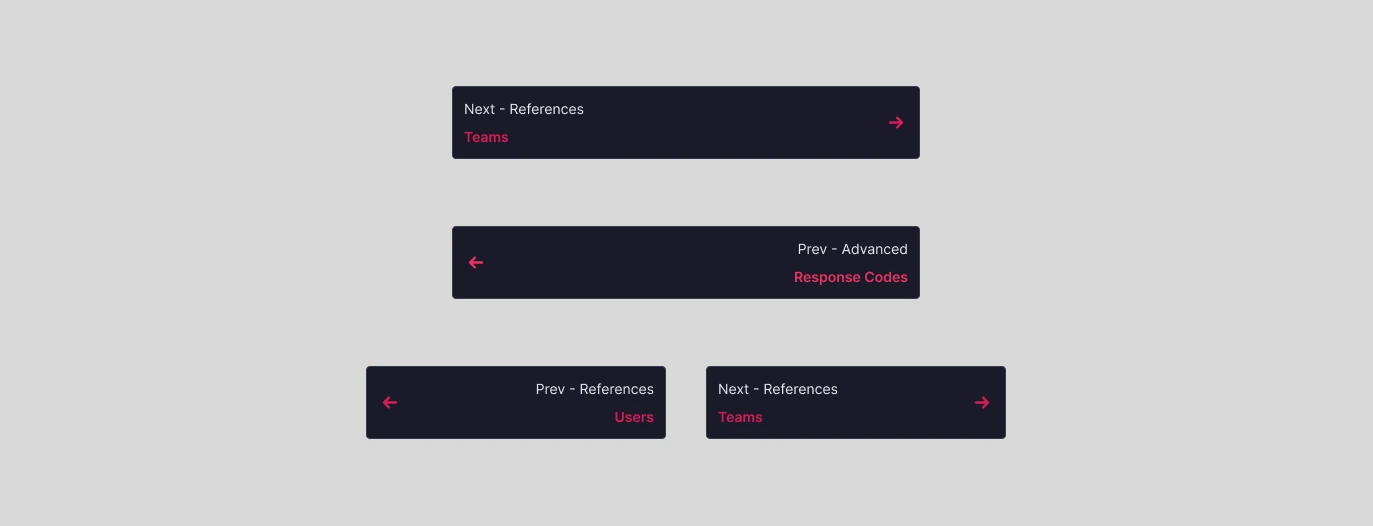
Prev/Next Doc Navigation
The "Prev" and "Next" buttons on a documentation page are usually used to navigate between different sections or topics in the documentation. They allow users to quickly move to the previous or next page in a sequence, without having to navigate back to the main menu or search for the next topic they want to read about.
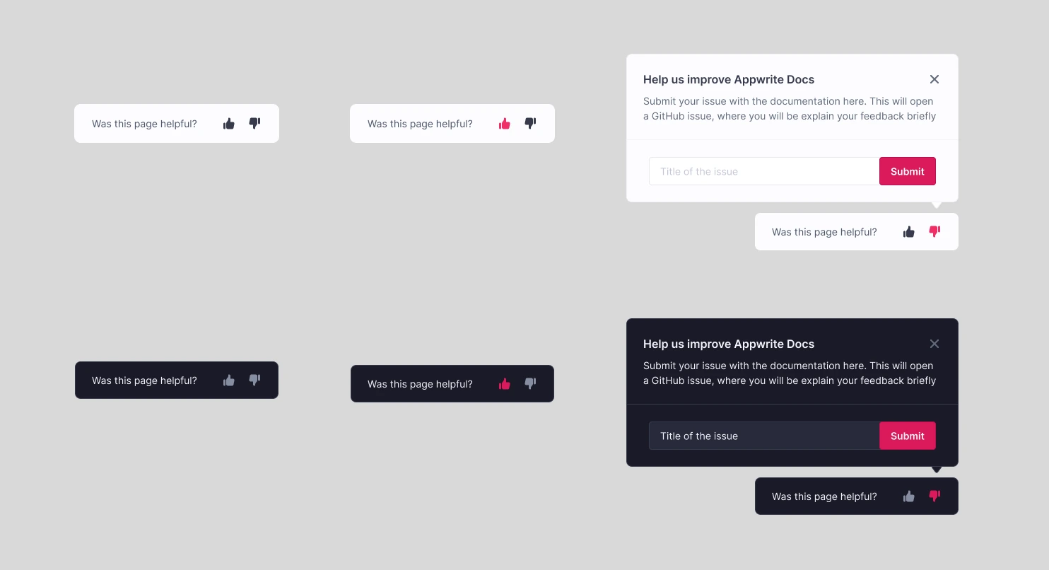
Feedback
Including a feedback section at the bottom of a documentation page is important because it allows users to provide input on the documentation, which can improve its quality and help identify issues or gaps. This shows that you care about your users and their feedback, which can build trust and credibility.
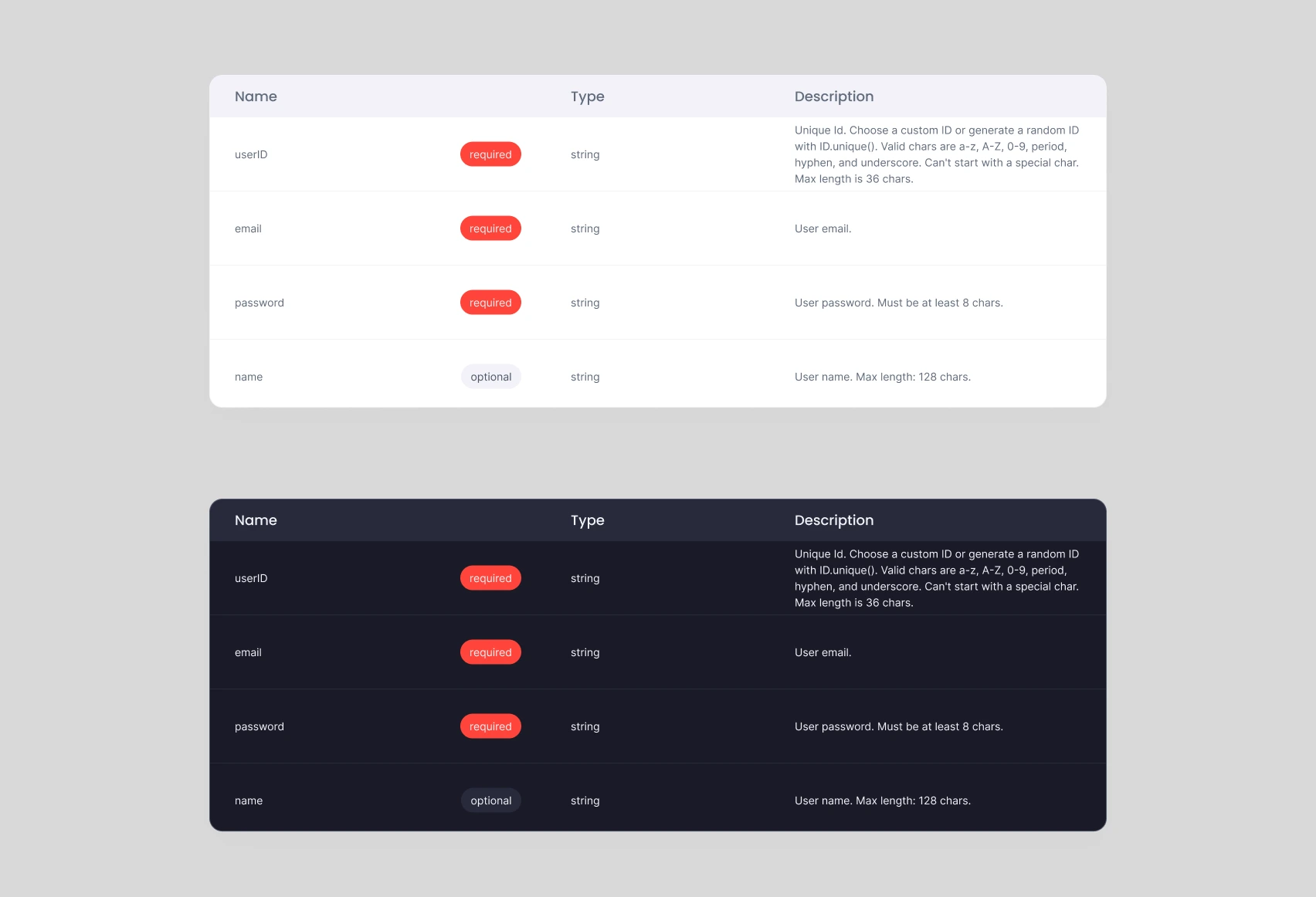
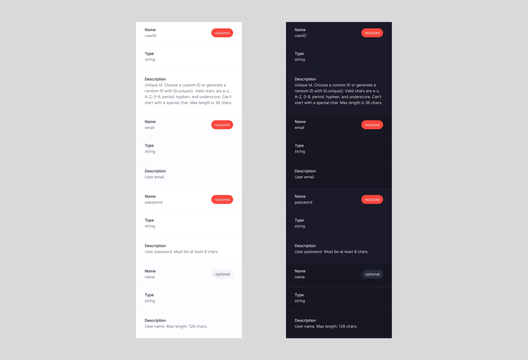
Tables
The table component is taken directly from Pink design system with slight modifications. To make the table responsive, each row that appears in desktop view has been converted into its own block when viewed on mobile devices. This ensures that the table remains readable and user-friendly, regardless of the device being used to view it.
The Result
The redesigned interface enhances the ease of navigation and documentation search. The introduction of the functionality to select various versions and SDKs within the side navigation bar provides users with a convenient way to choose SDKs and versions effortlessly. The mobile version of the documentation has been optimized, significantly improving the overall mobile experience. Additionally, the inclusion of a search box facilitates faster access to relevant documentation for users.
This project served as a valuable opportunity to apply my product design and design thinking skills within a constrained and time-limited real-world scenario. I got to explore and learn more about documentation design.
Discover high-quality images of these prototypes on my Behance account. Feel free to explore other projects as well! :)
Thanks for reading, until next time!